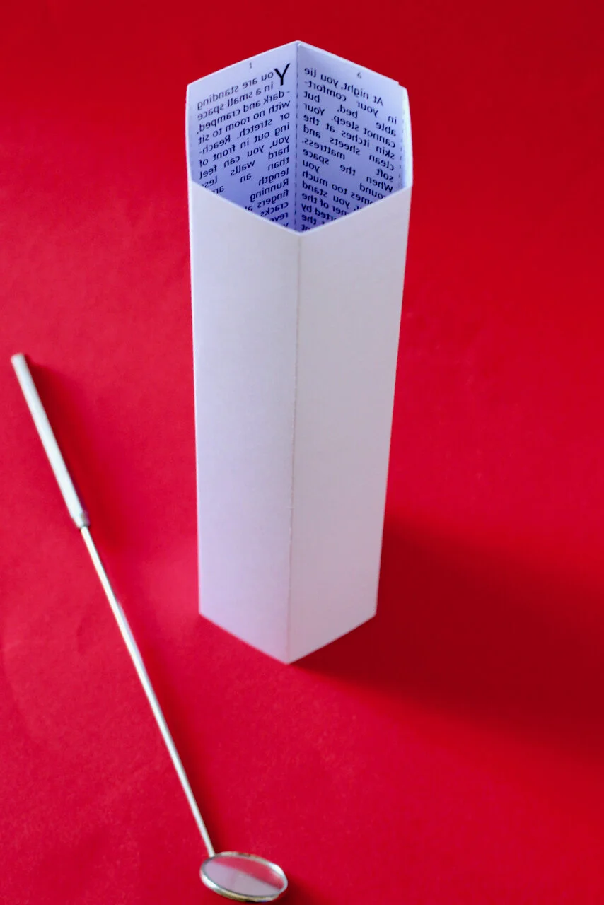
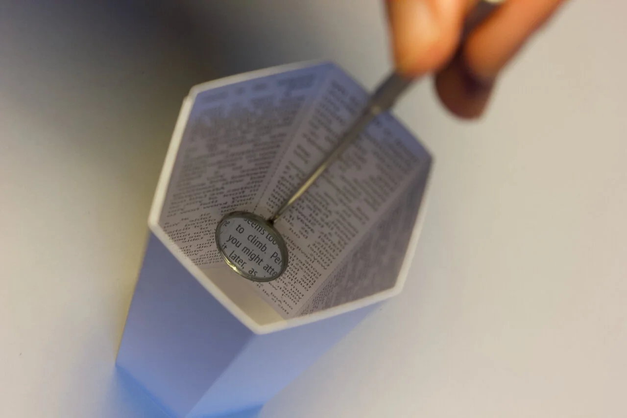
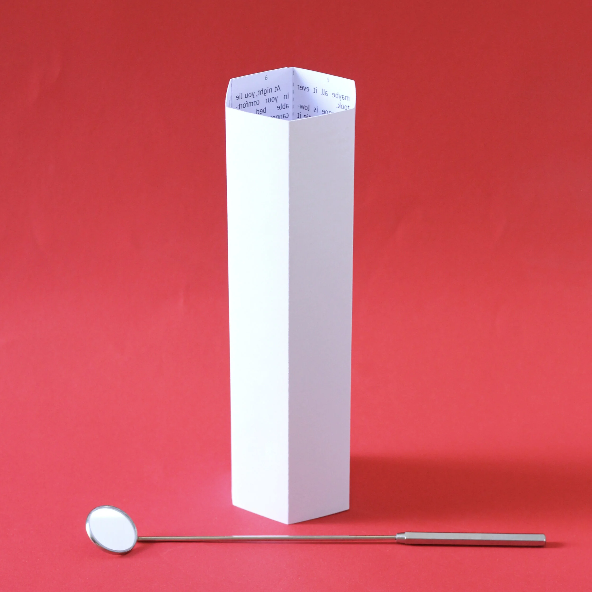
A free-standing short story about imprisonment, printed in reverse and read with a dental mirror.
This edition is pre-printed, scored and includes a professional-quality larangeyal mirror. Simple assembly required.
B&W, card
Overview
Oubliette is a story written on the walls of a free-standing vertical structure. The text is printed in reverse and must be read with a dental mirror.
Background
The first draft of Oubliette was written in 2020 as a short story exploring themes of constraint and freedom. The short (<1000 word) piece is sort of timeless and could be anyone and anywhere at any time. The use of second person perspective (“You”) is meant to put the reader directly at the bottom of the oubliette and directly understand the desire to get out and then, later, why someone might want to go back.
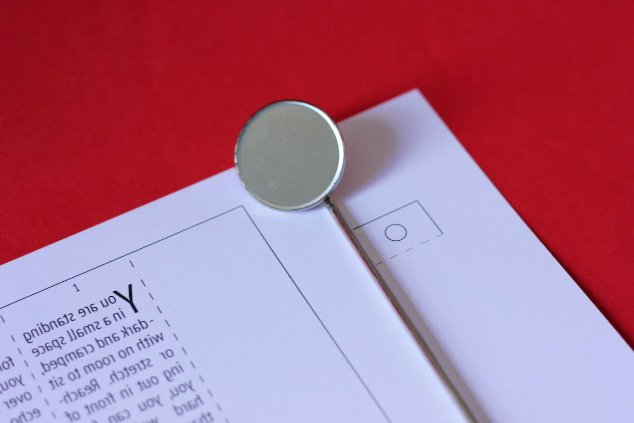
As I was experimenting more and more with putting text in physical forms other than flat pages, it seemed obvious to put ‘Oubliette’ in an oubliette. As reading the bottom lines would be difficult with the naked eye, I decided to print the words reversed so that they could be read with a long dental mirror.
A real oubliette has rounded walls, but mine would use a hexagonal cylinder as it would be able to lay flat. Initially, I wanted Oubliette to appear to be a thin book that would open up to reveal a pop-up structure inside. The first prototype was made from corrugated card, with text pasted on as strips of copy paper.
This prototype was documented in a short video which was uploaded to Youtube.
The first version was way too big, however, as the stem of the dental mirror wasn’t long enough to reach the bottom of the chamber. This made the text in the bottom sections unreadable.
A second version, scaled down to roughly A4 landscape, was made with grey board and coloured paper. While semi-authentic in its representation of the stone walls, the colour made it all feel a bit chintzy. I also couldn’t solve the problem of how to integrate a floor and a grille over the top. Various methods were tried, but none of them worked very well. Having them flap around, not really fitting or attaching to anything, made me hate the whole piece.
Trying to set the text took a few different approaches. I had wanted the reader to have to move the mirror both up and down the chamber walls to read the text. This proved even more confusing and although I had written the text, laid it out and constructed the piece even I couldn’t follow it. As the circular head of the mirror is only 25mm in diameter, the text was typeset as thin columns, first as one word per line, with two columns per wall.
Nothing was working very well, so I took things back to basics. I reduced the text to one column per wall, setting it in a condensed typeface that allowed for more than one word per wall. I also removed the lid and floor appendages and set the structure in simple white card of sufficient weight to stand, but also light enough to run through a printer. This one-sheet card has lines for cutting and scoring, but is a simpler and more elegant version of what came before. While this was the right move, I do sort of miss the more convoluted version. I’m sure there will be other stupidly complicated pieces in the future.