GROW
A book for plants, to encourage growth.
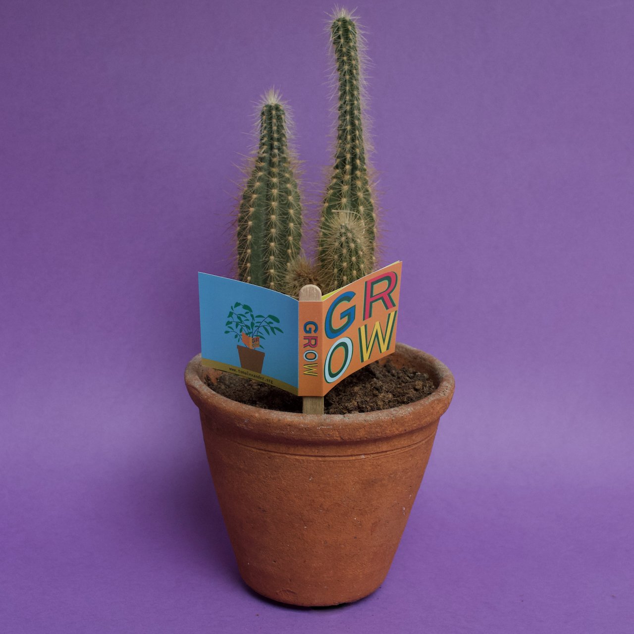
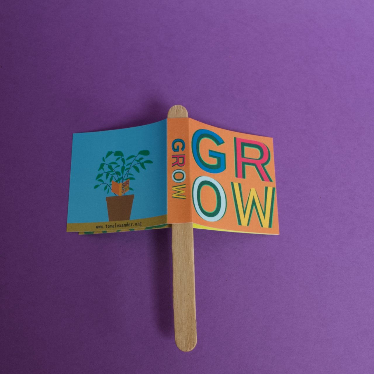
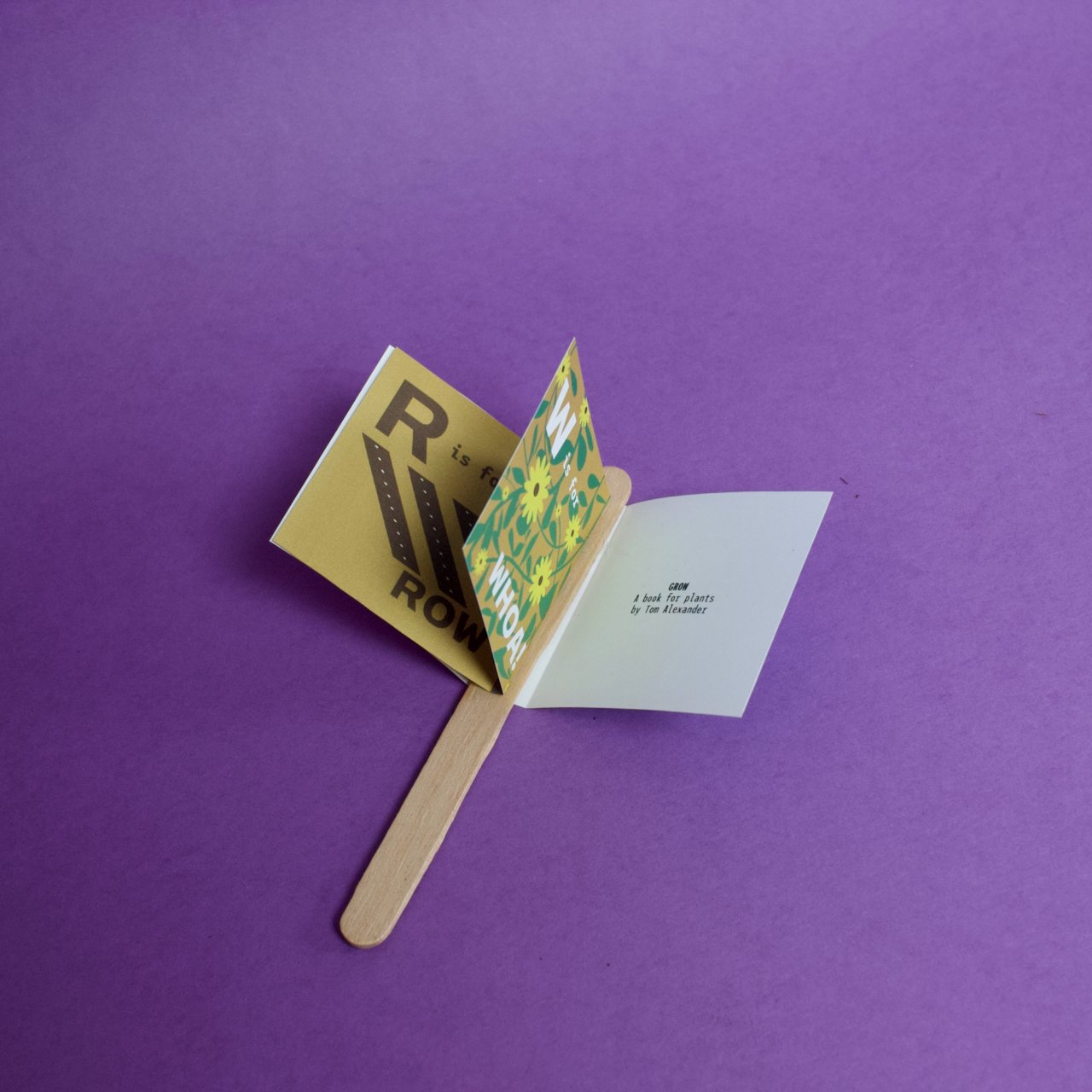
Paper and Wood, 115 x 10 x 50 mm
Overview
A book for plants, to encourage growth
Background
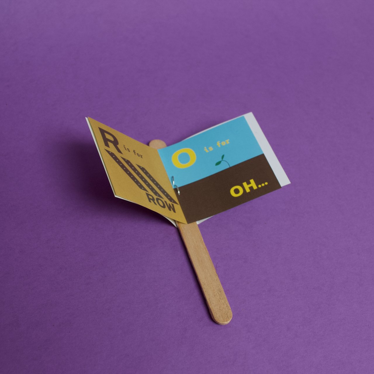
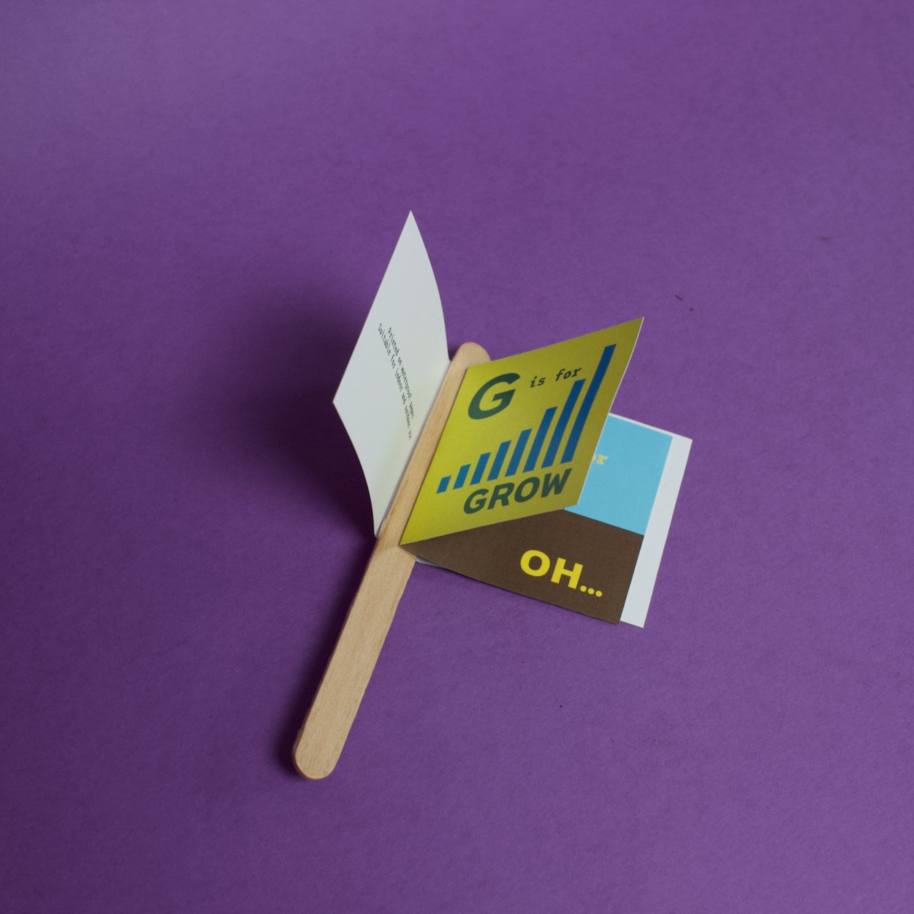
These little paperback pamphlets are printed on waterproof paper, which means they should survive outdoors or at least a watering or two. The simple story encourages even the most remedial plants to strive for more. There was originally going to be a more complex narrative and perhaps even a range of plant books for different species at different stages of their lives. Eventually, though, I hit upon the (fairly stupid) schema used in the book:
G is for Grow
R is Row
O is for Oh…
W is for Woah!
Which is pretty silly, but made me chuckle.
Construction was mostly about figuring out which way to put the staples and whether the book needed a ‘spine’ or not. In the end, I decided to cover the stick with the book title. I figured it was more aesthetically pleasing. A heavy duty staple binds it and hot glue is osed to cover that staple with the cover.
Six Six Six
One hundred and eleven six-word stories about hell, in three editions.


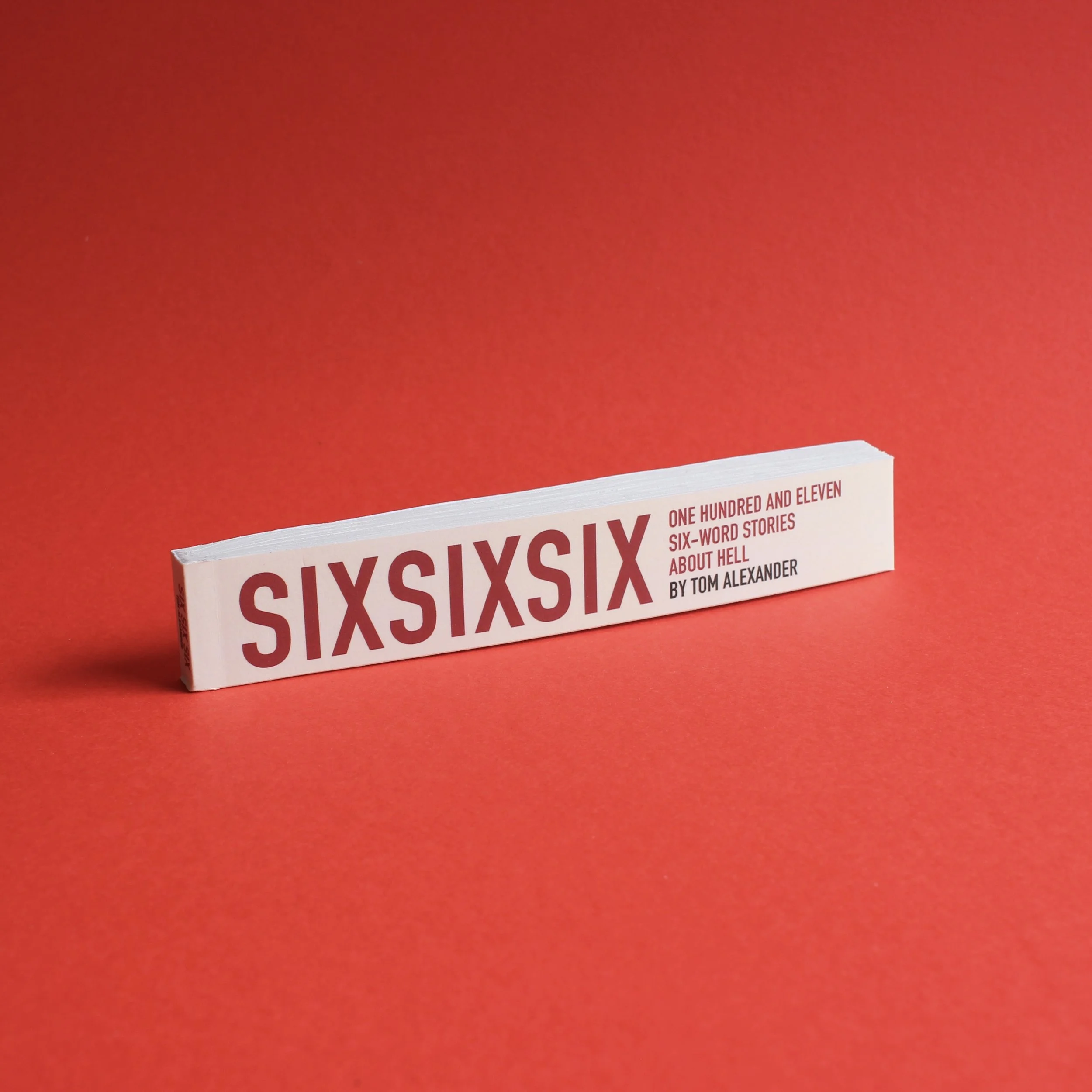


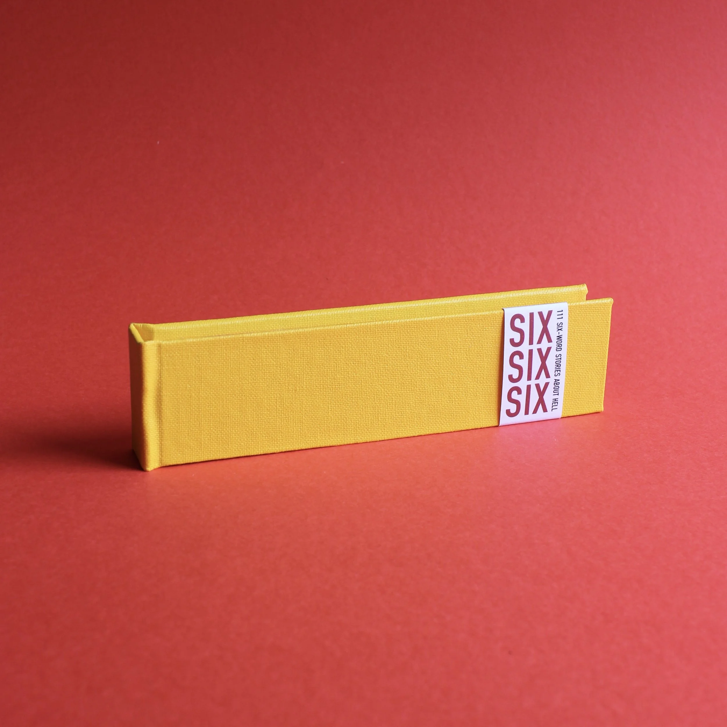
One hundred and eleven six-word stories about Hell. This is one of only 6 handmade limited edition hardbacks telling the story of Lucifer’s exile from heaven, his reinvention as Satan and his infernal revenge against those that wronged him. But, y’know, funny.
Hardback, 145 x 37 x 10mm
Paperback, 151 x 25.4 x 10mm
ebook, PDF format
Overview
One hundred and eleven six-word stories about Hell, in three editions.
Background
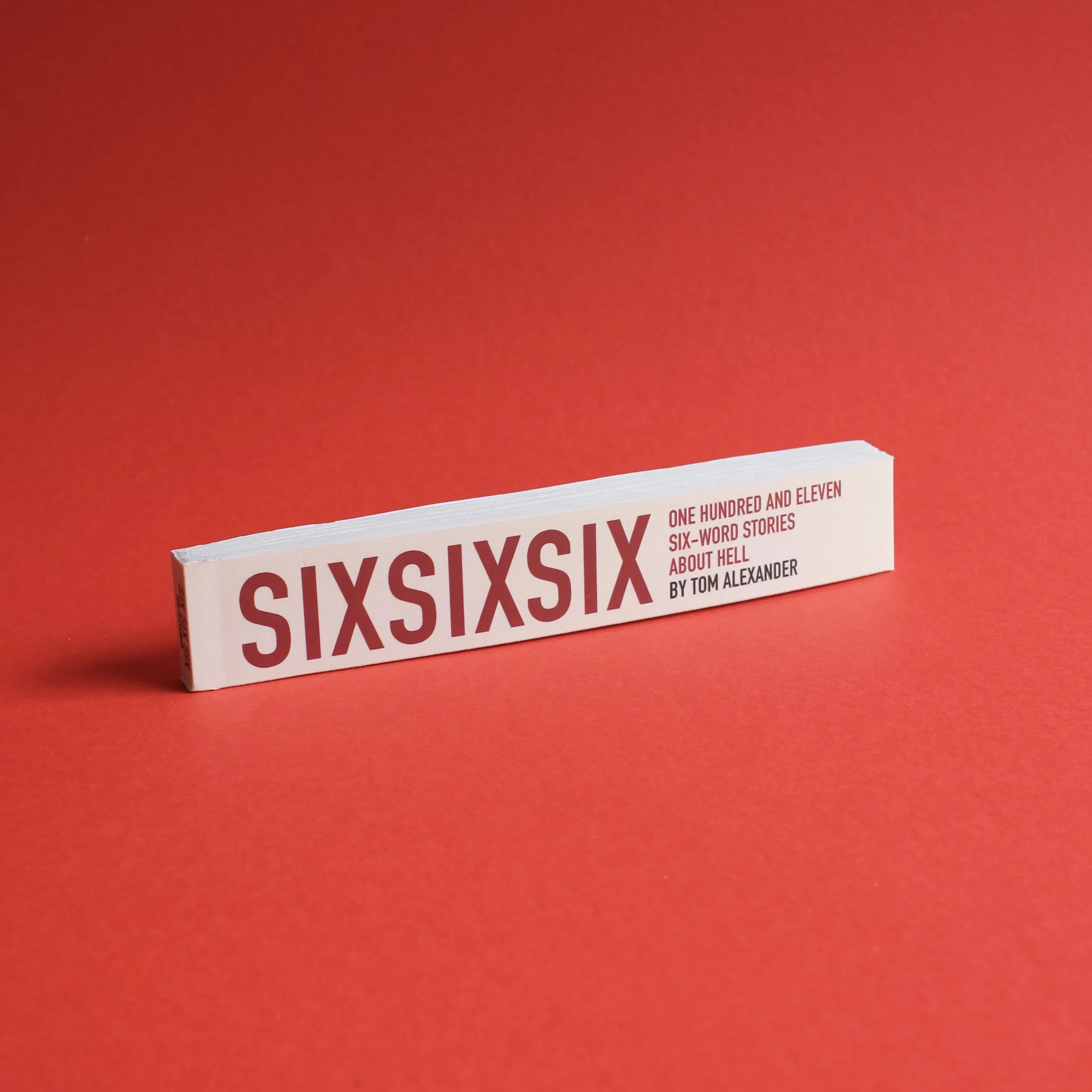
One hundred and eleven six-word stories about Hell. This is one of 60 limited edition paperbacks telling the story of Lucifer’s exile from heaven, his reinvention as Satan and his infernal revenge against those that wronged him. But, y’know, funny.
I really like projects with constraints. When I made films, some of the best work we did was in projects where we were given briefs with tight parameters, most notably shooting and editing within 48 hours. Those pieces were inventive and had a kind of manic energy to them which wouldn’t have been possible if they’d had more time or resources. I’ve often set myself guidelines to follow trying to chase that high, sometimes successfully and sometimes… not. Perhaps it’s getting older, but I’ve come to appreciate a bit of time to think, to ruminate and reflect on the work. Perhaps that means it doesn’t have the raw energy of more frenzied projects, but I think for the most part it does mean it comes out better. Maybe.
But there is something appealing about projects which fit within certain parameters. Those don’t have to be time based. In fact, I’ve found myself less able to work to those self-imposed deadlines for anything more than three days. (The last one was the 3 Day Novel Competition, which produced a novella I was pretty pleased with. It didn’t win, but did make the shortlist.) When it goes beyond that short intense burst, other things sort of get in the way and I can’t make it work. That said, sometimes you see something where the pieces fit together perfectly in your head. So it was with Six Six Six. I’ve been thinking about the six word story for a while now, mostly due to my friends at TYPE! magazine, who feature them in their brilliant bookmark literary journal. Obviously, I could have just written some six-worders and submitted them, but my grandiosity wouldn’t allow for it. Instead, this project came to mind, based first of all on the maths. One hundred and eleven six word stories equals six hundred and sixty six words total. That, obviously, is the Number of the Beast, so it made perfect sense to do a connected series of tiny stories about the Dark Lord himself. I’d make it into a book that would have 666 copies and sell them for £6.66 each.
And that’s what I’ve done. Almost. Some things have changed along the way. In the process of prototyping the physical books, it became clear that I had to make some hardback copies. I wasn’t about to do 666 of them though, so the idea of separate printings came to mind. There would be six hand-made hardbacks, sixty mass-produced paperbacks and then it seemed obvious to make six hundred ebooks. The pricing was obvious: £66.60 for the handmade books, £6.66 for the paperbacks and 66p for the ebooks.
Writing the stories was fun. I did it piecemeal over several months, jotting down any half-idea that came to mind and spending an hour or so twisting them into shape. Six words isn’t a lot, but it allows for a surprising amount of variation and experimentation. When I started amassing an amount of stories of what I thought was a decent quality, I started looking at the overall structure of the story. It’s basically Lucifer: My Fall and Rise of Lucifer, although I must say that my knowledge of the story comes more from popular culture than it does from scripture. Milton scholars should look elsewhere. I think it’s pretty entertaining, though, and I’m pleased with how it came out. The niceness of the hardbacks was a surprise and I’ve learned a lot about bookbinding through doing it. It’s another tiny fiddly project, though, and I’ve promised myself that next time I’m going to make something larger so I’m not dealing with teeny-tiny margins for error. I am almost certainly going to ignore my own advice, though.
Enormous thanks should go to the brilliant Jemima Kingsley, who created the system that allows me to sell individually numbered PDFs for next to nothing. Anyone looking for any sort of technical solution to a problem should hire her.
Context is Everything
A proposed financial awareness app that gives you insight into your spending.


Video, 2min, 2024
Overview
A proposed financial awareness app that gives you insight into your spending.
Background
I submitted a proposal for the 2024 Future of Money Design Awards about an idea that had been knocking around my head for some time. It’s an app called Context that would sit on top the contactless payment systems we all use every day, providing insights into where we spend our money. On a basic level this could include things like how the company treats its employees, its environmental record or whether they avoid tax. It would also make more philosophical comparisons about how that money might be used elsewhere in society or what it would mean to someone else in different economic circumstances.
The proposal was shortlisted and I was given a small budget to make it into a film. My initial idea was basically to read out the proposal with some demonstrative graphics, but my absolute horror at hearing my own voice recorded meant I went a different route. The final version uses stock footage and a mock up of the app and shows it at work. Nothing fancy, but gets the point across.
I attended an event at the Museum of London and was pleasantly surprised to be awarded first prize in a poll taken among the financial poobahs in attendance, meaning I got this nice shiny thing to put on my mantelpiece.
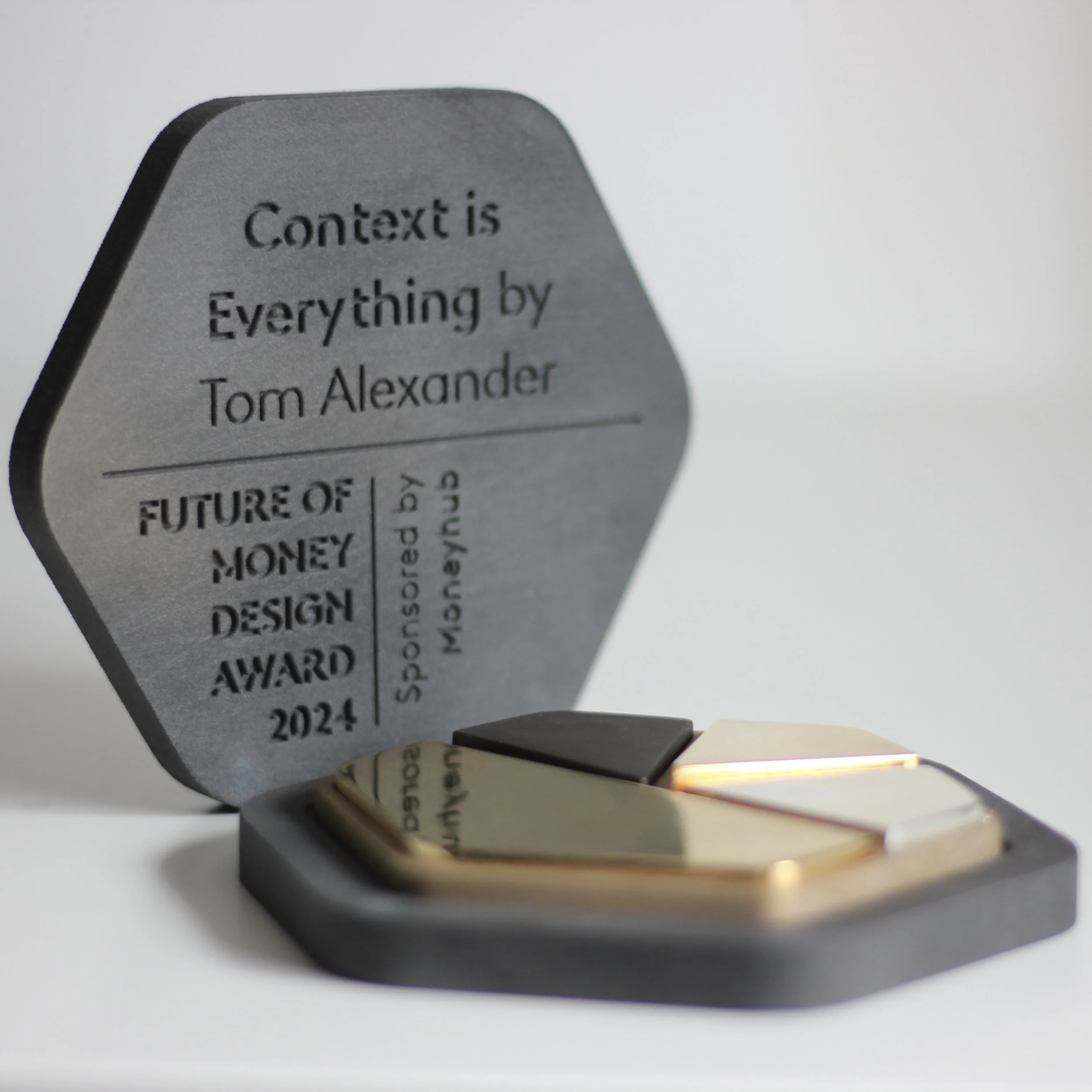
Details of the competition can be found at www.futuremoneyaward.com and the whole thing was sponsored by MoneyHub.
The Run
A story about good fortune and self-belief, told through coffee cups.
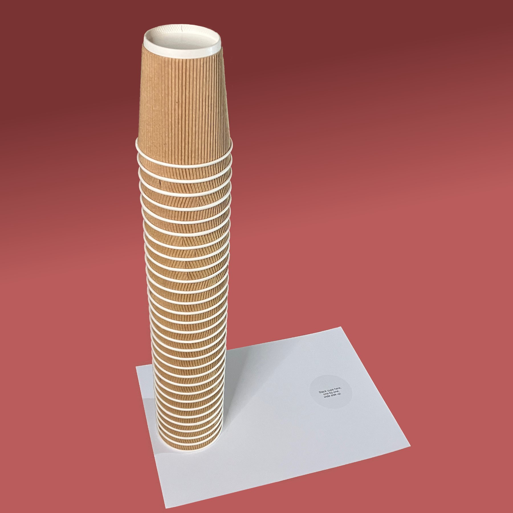
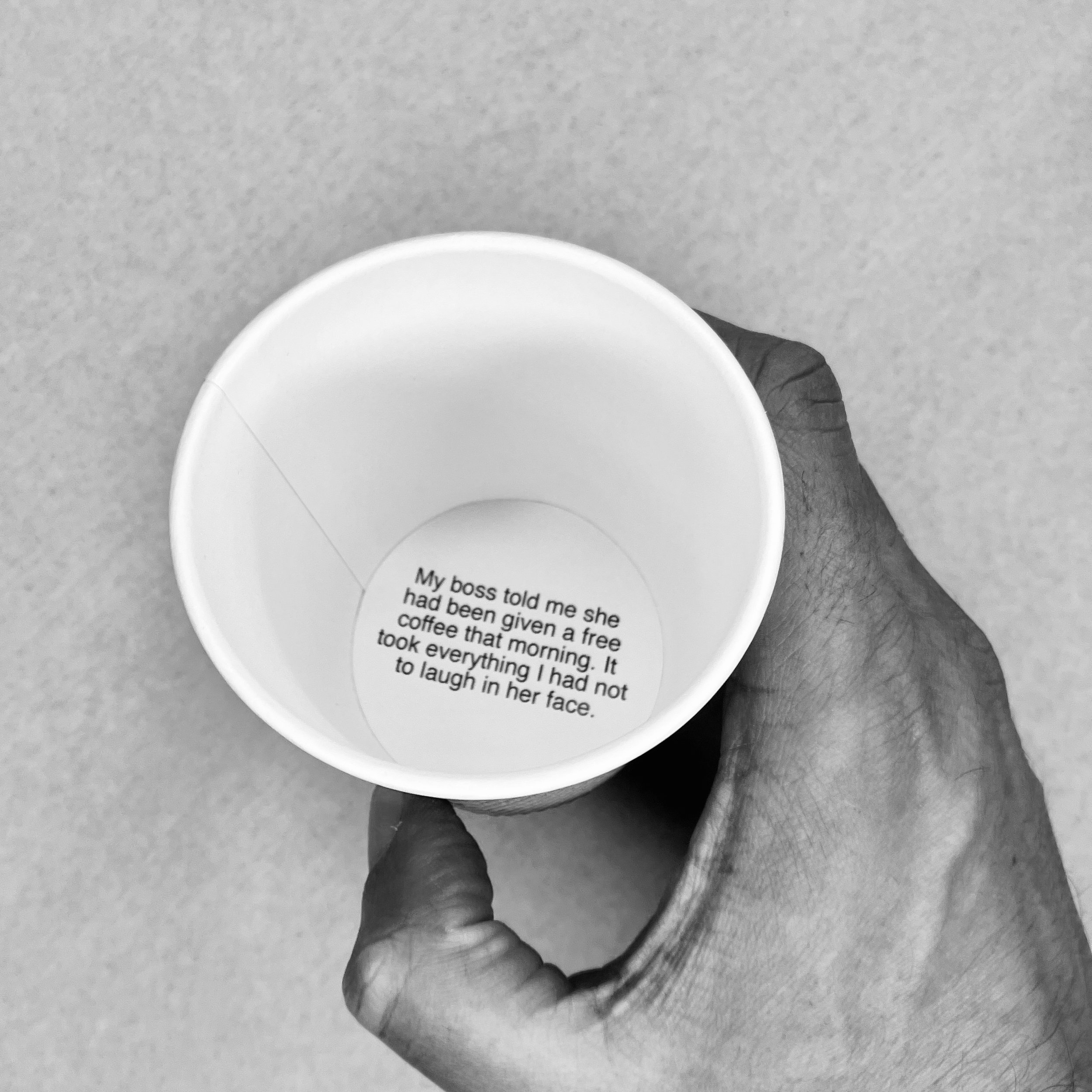
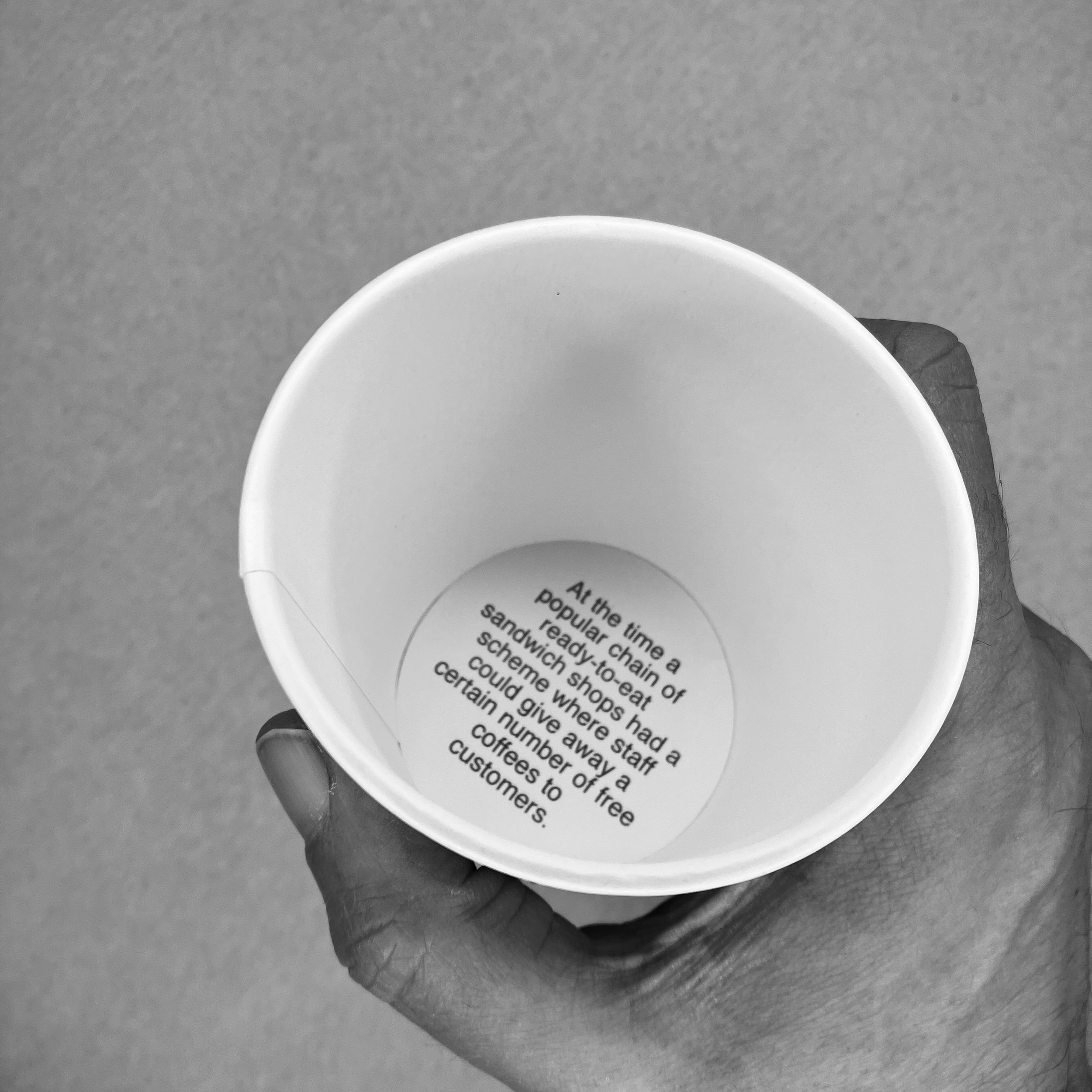
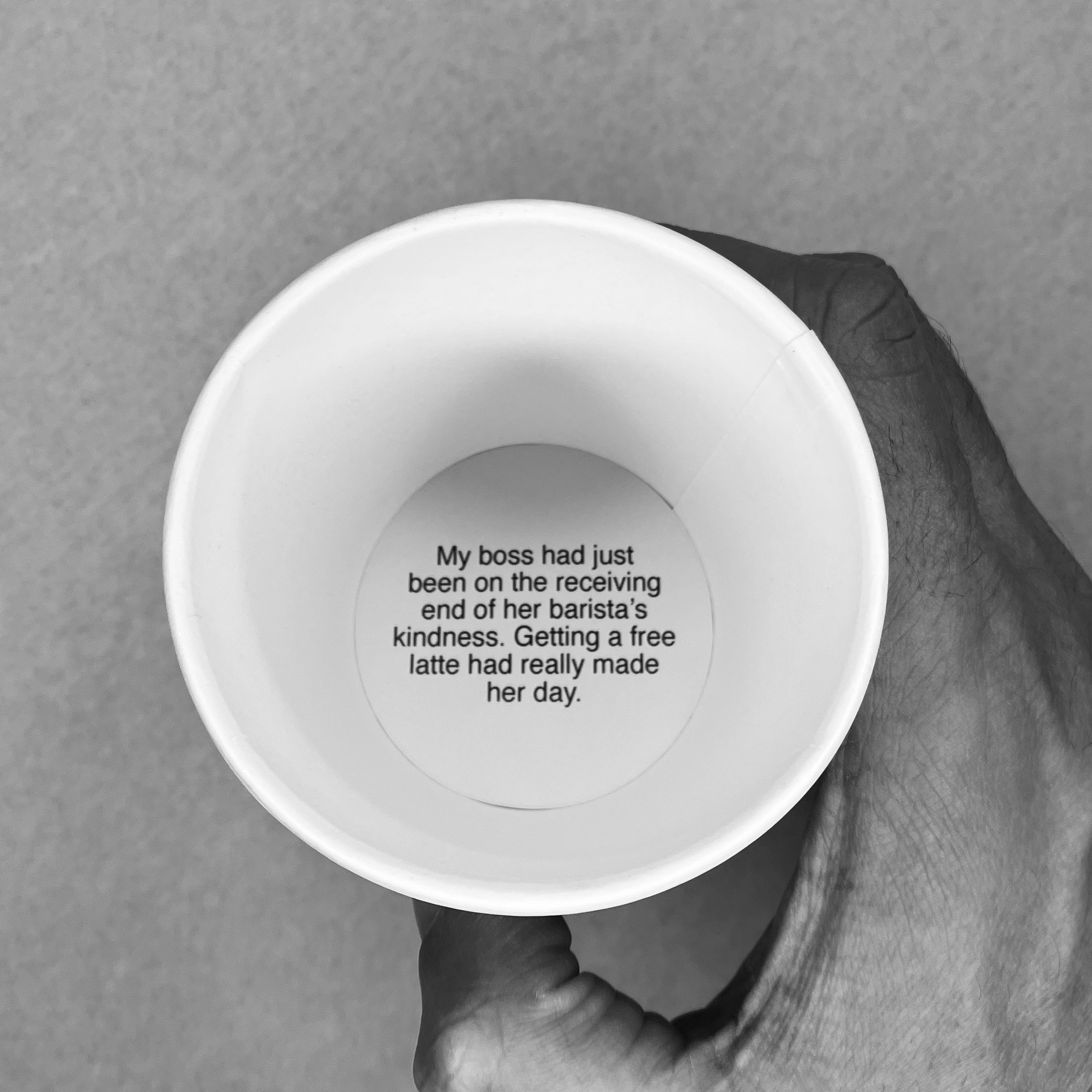
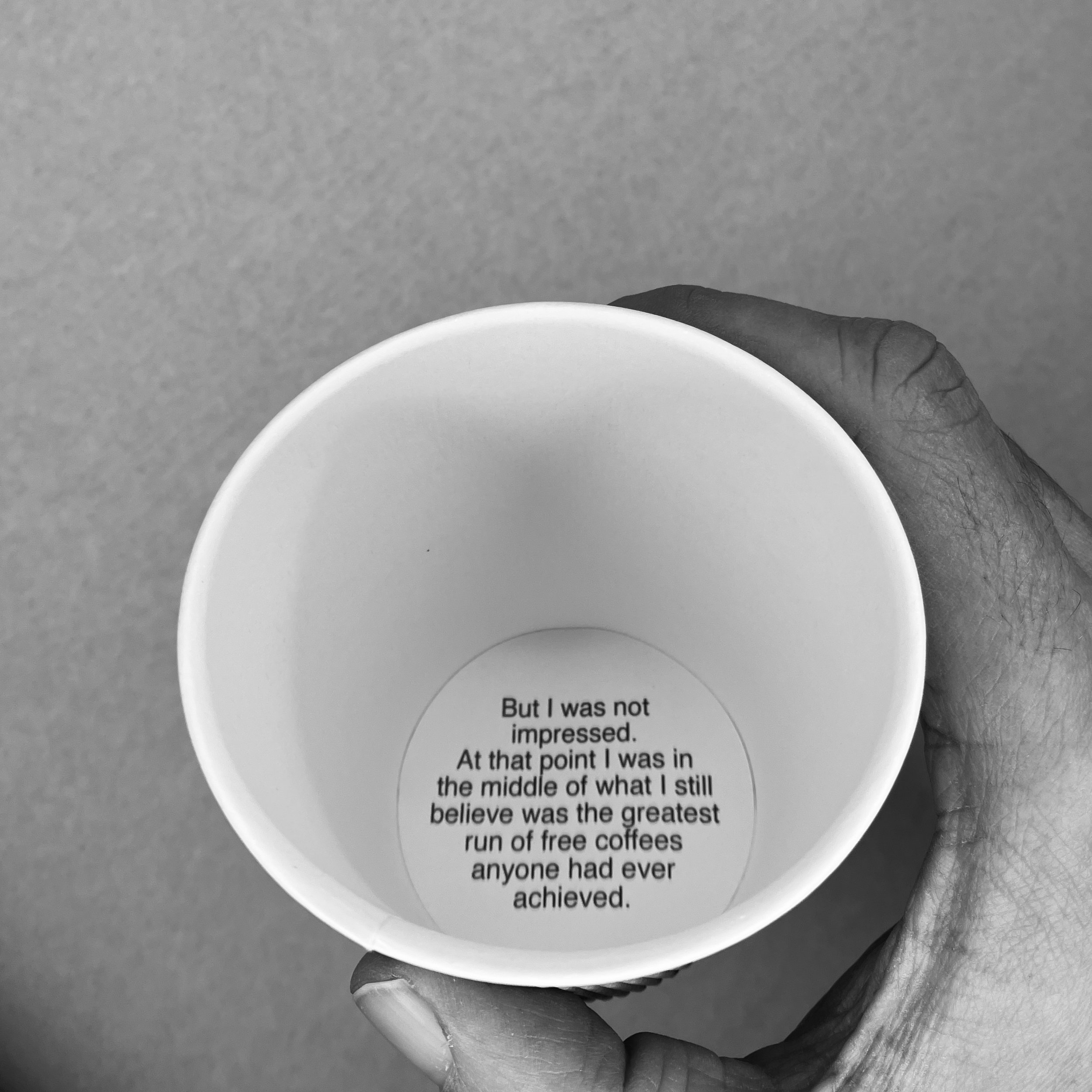
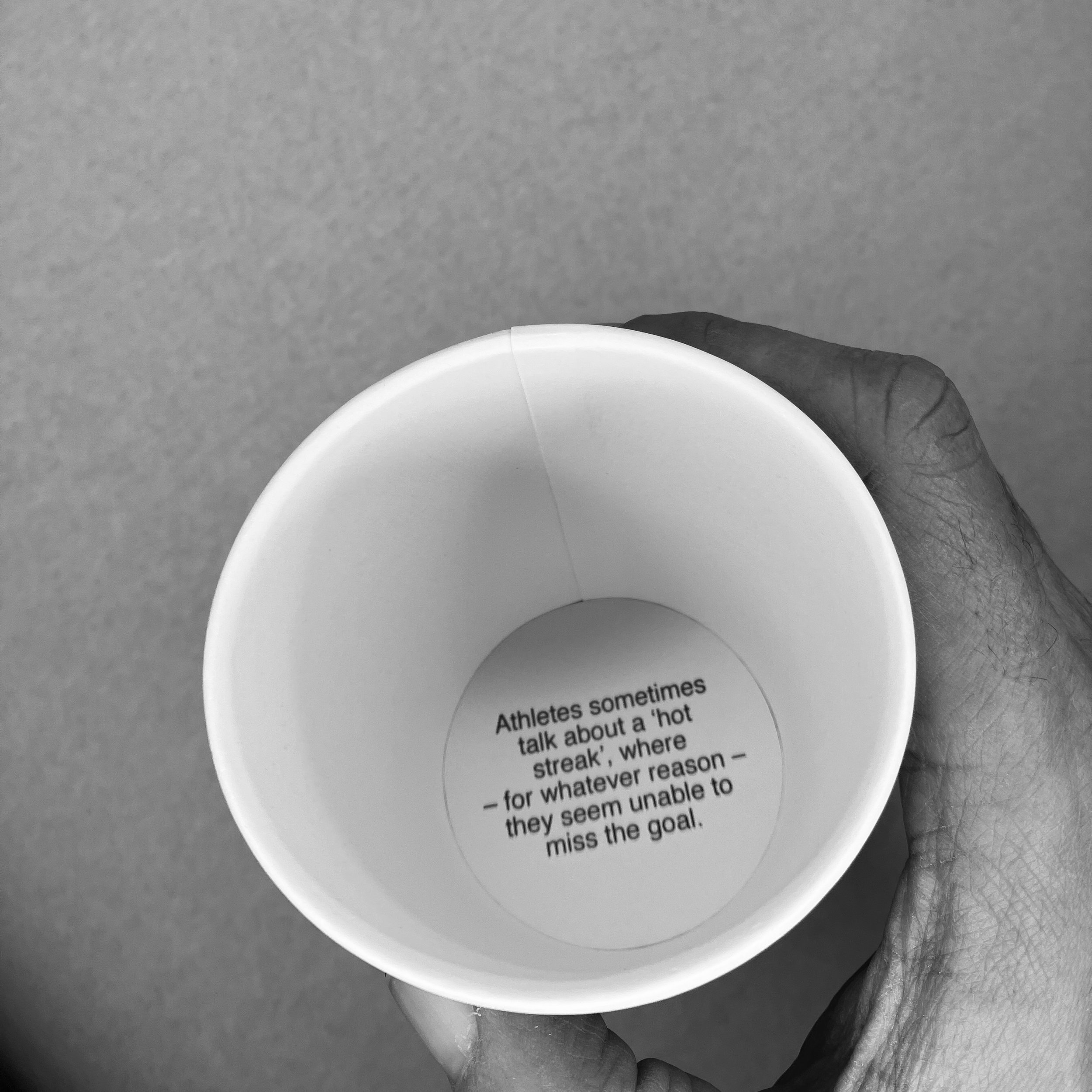
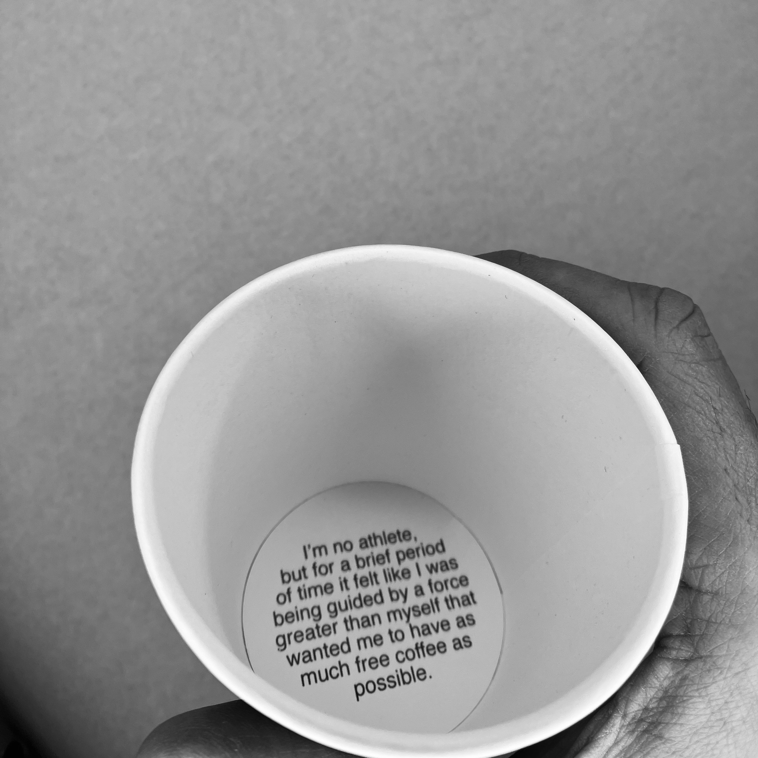
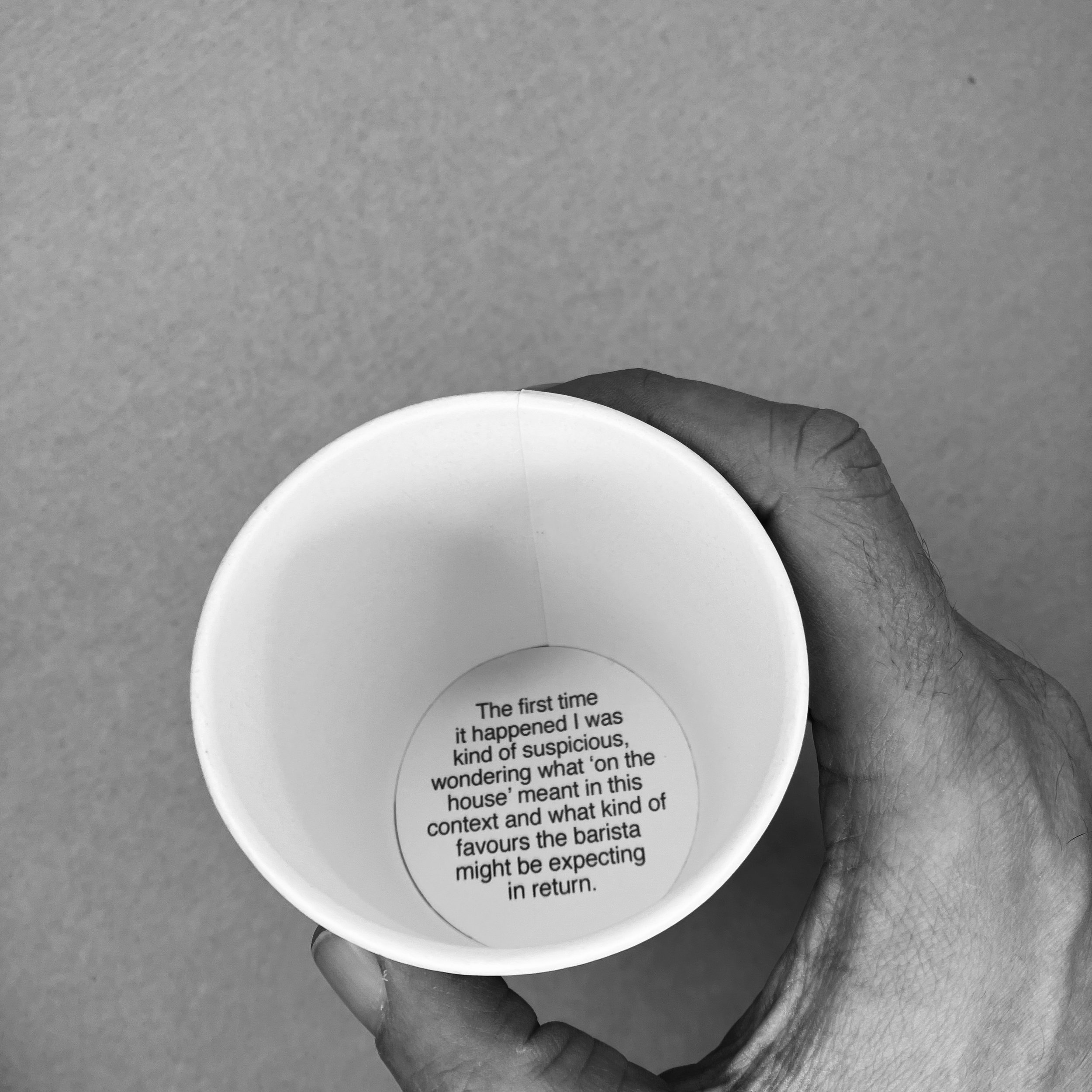
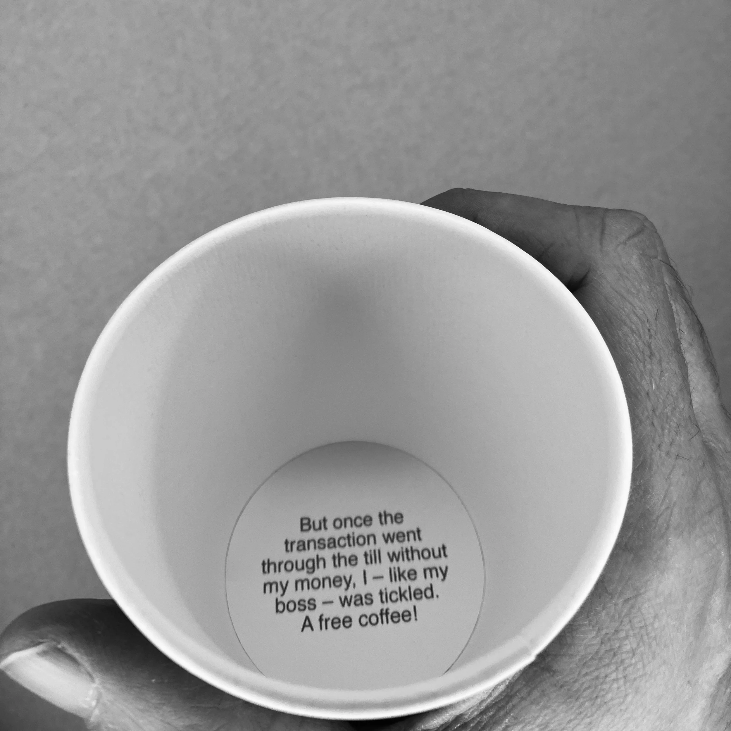
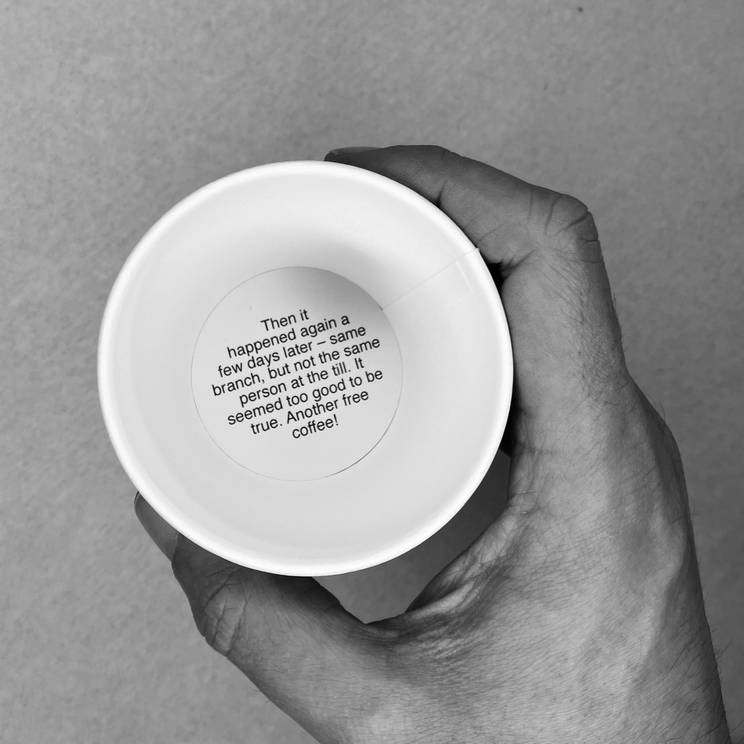

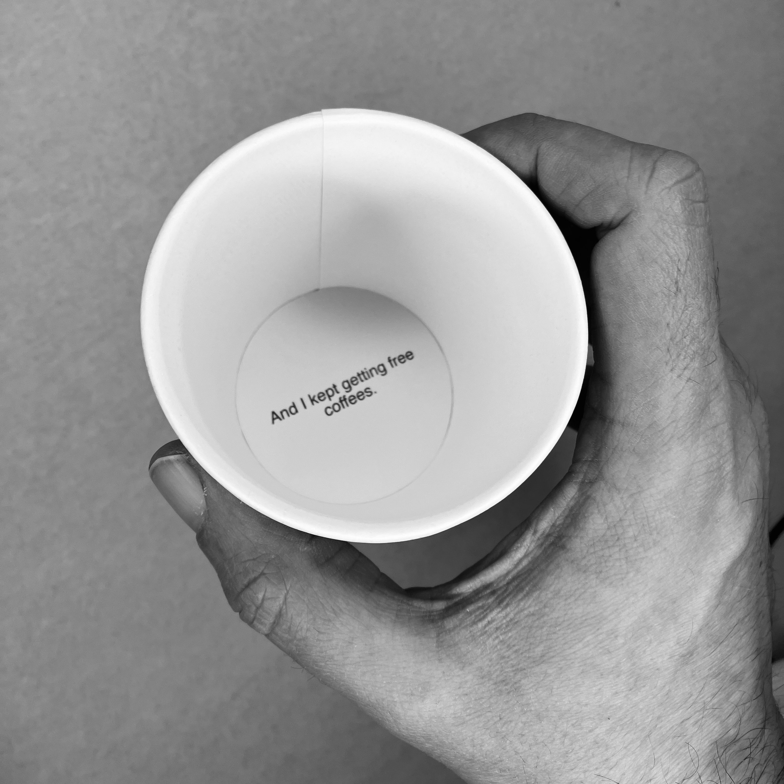
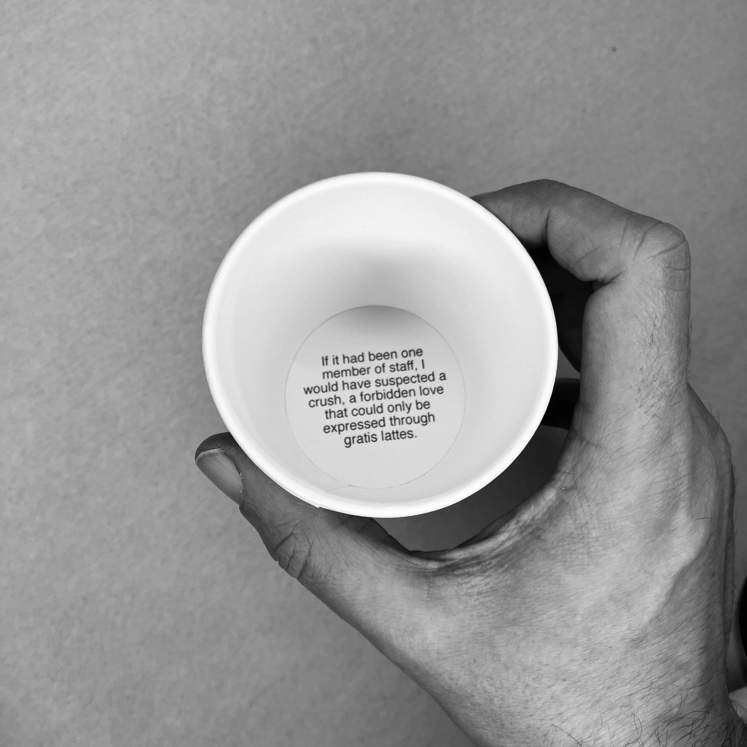

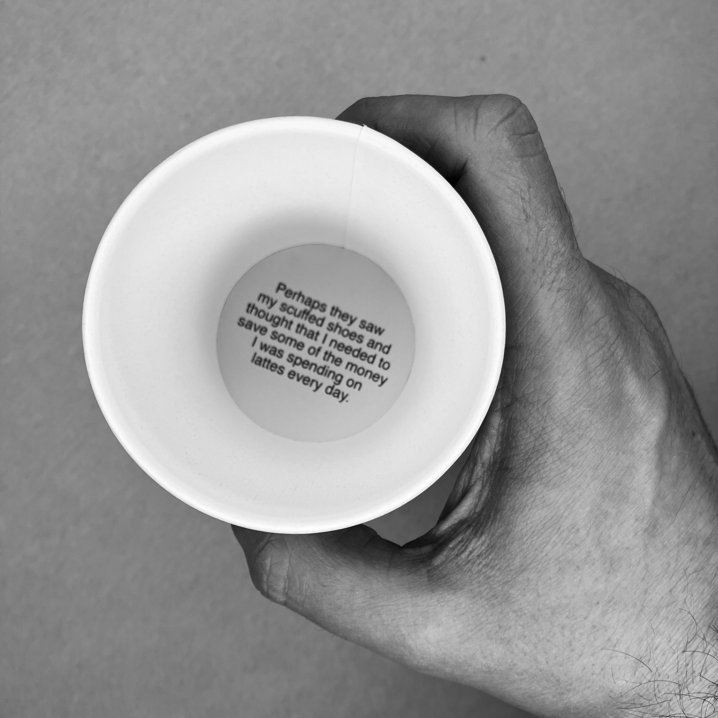

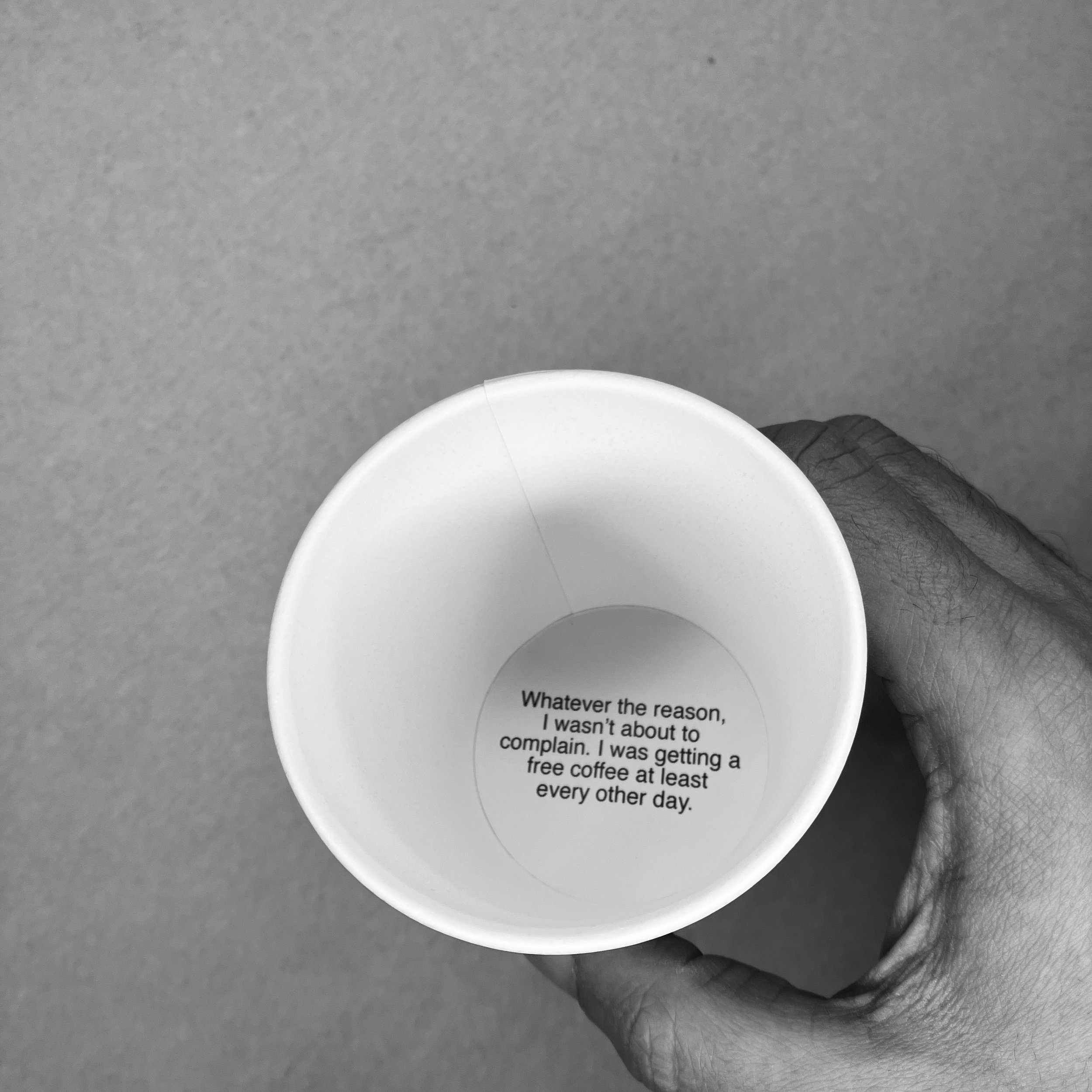
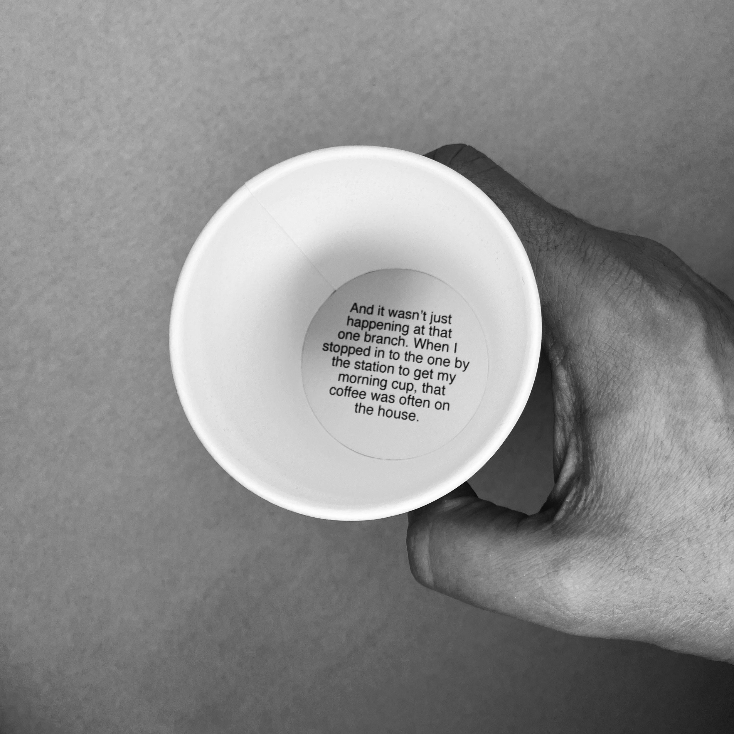

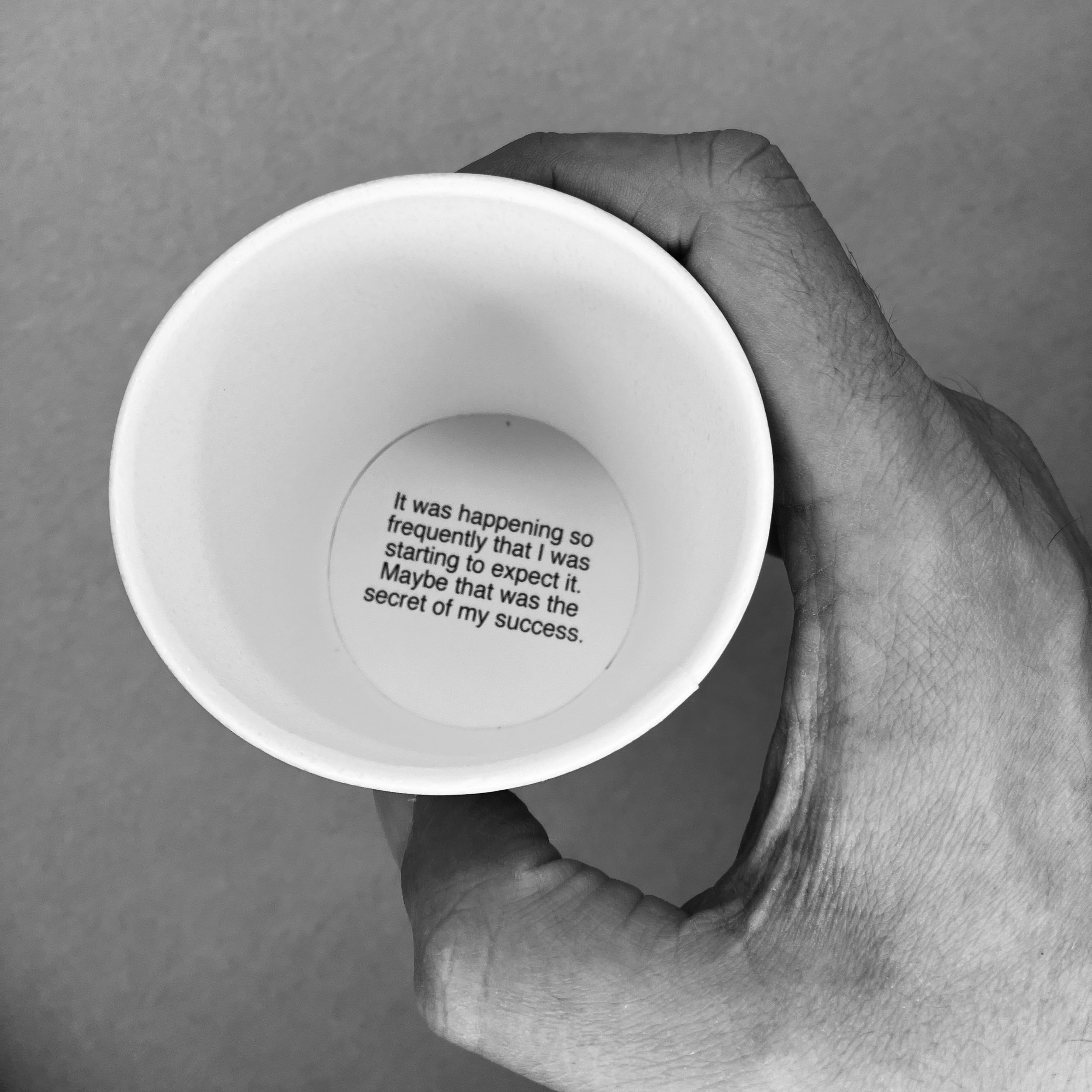


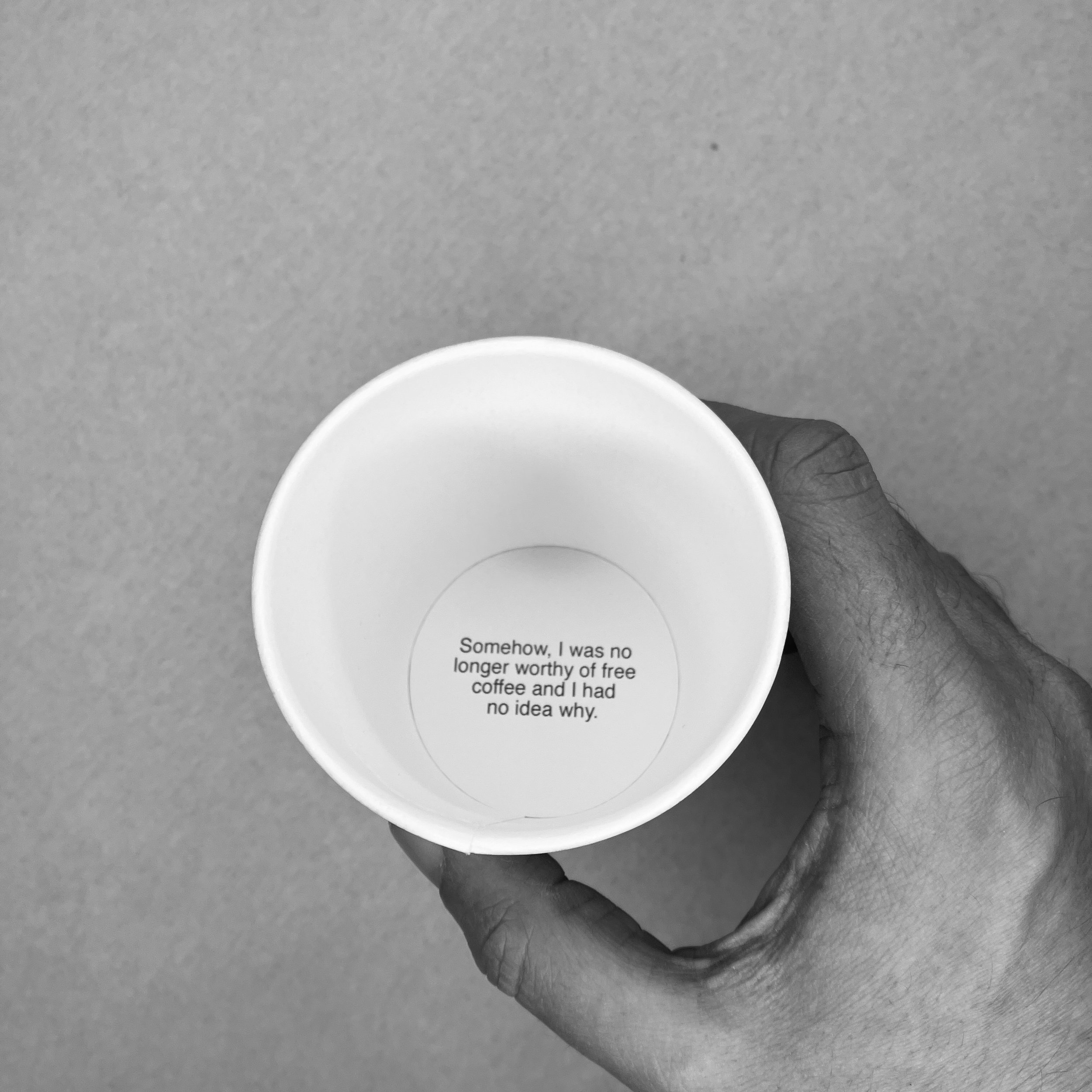
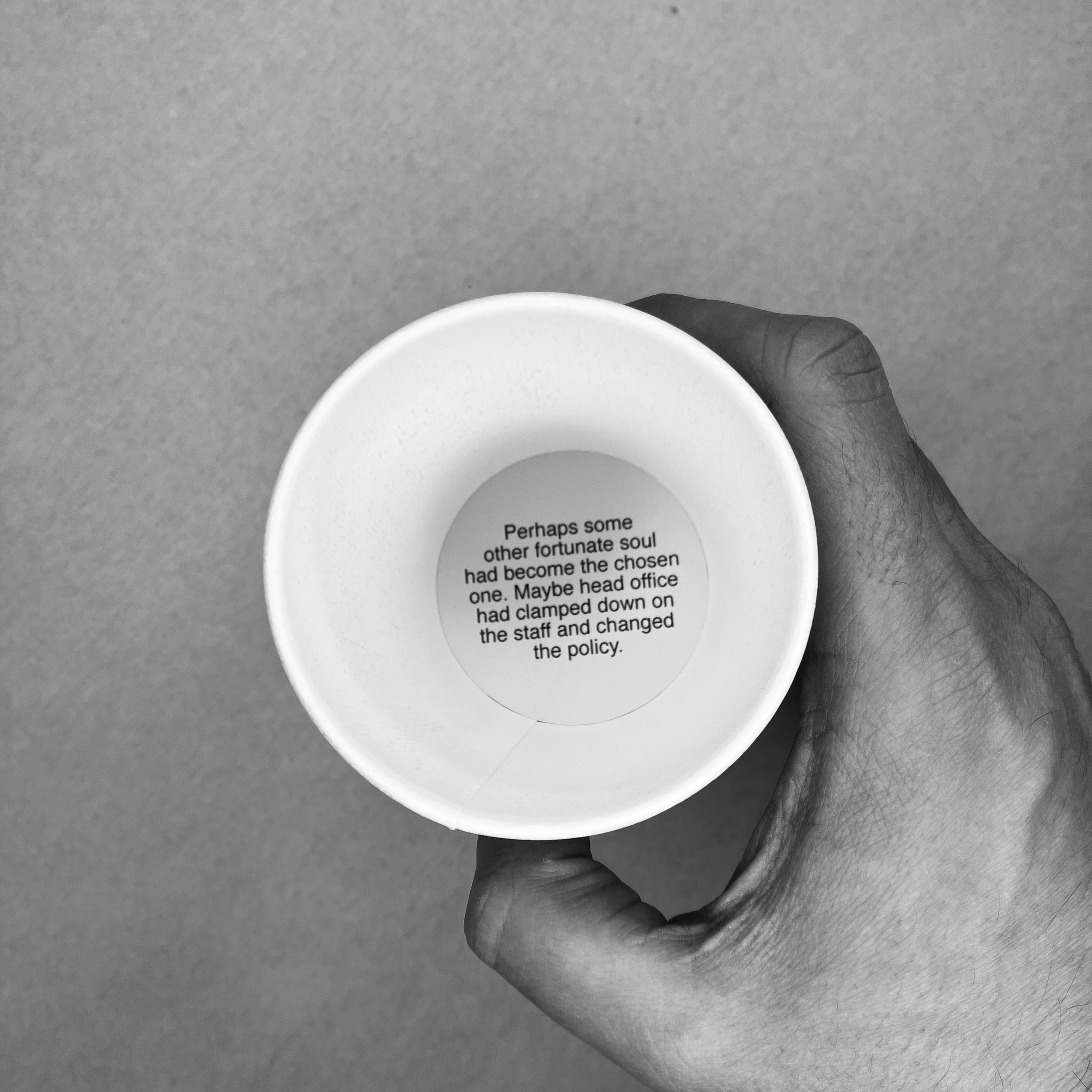
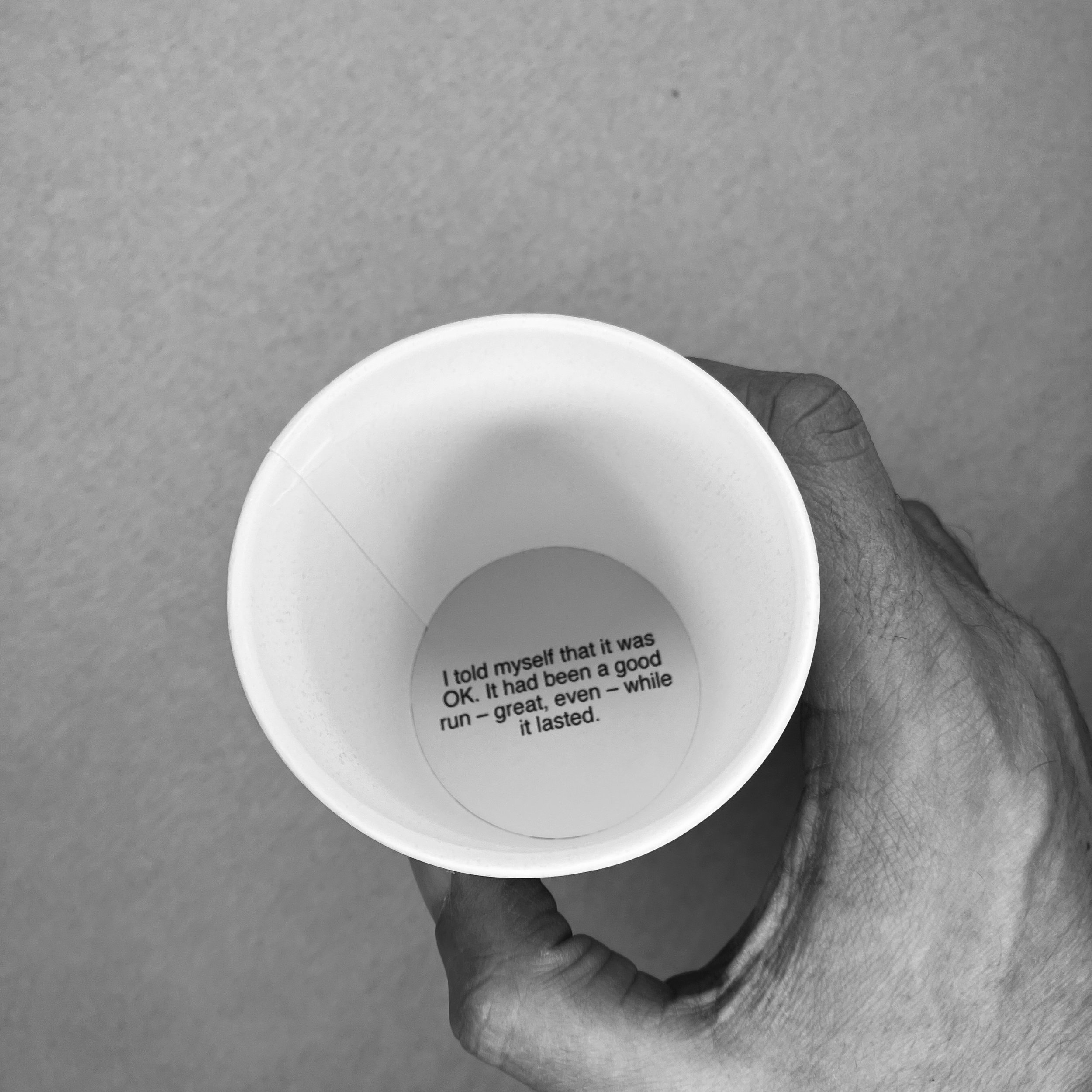

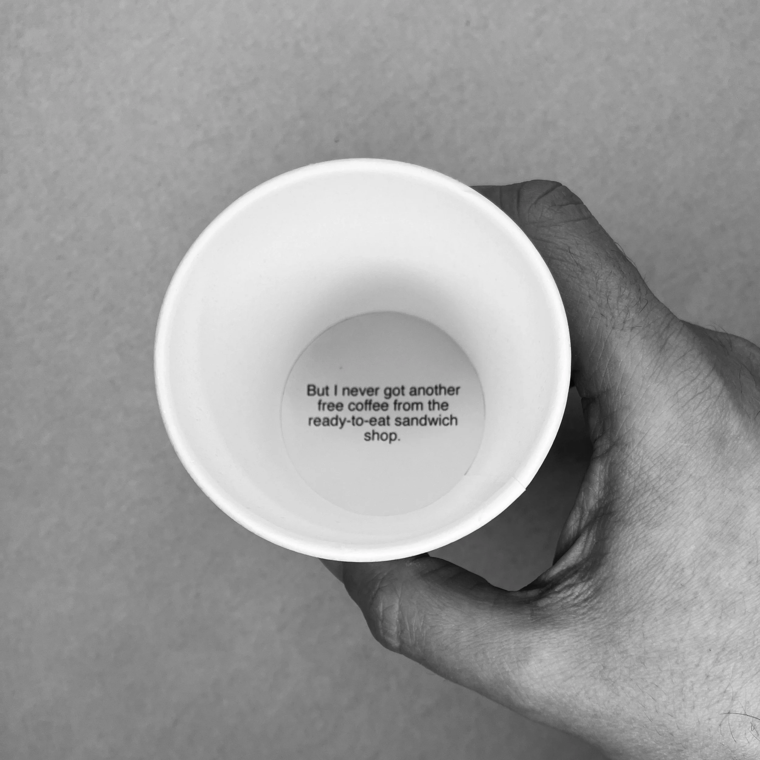
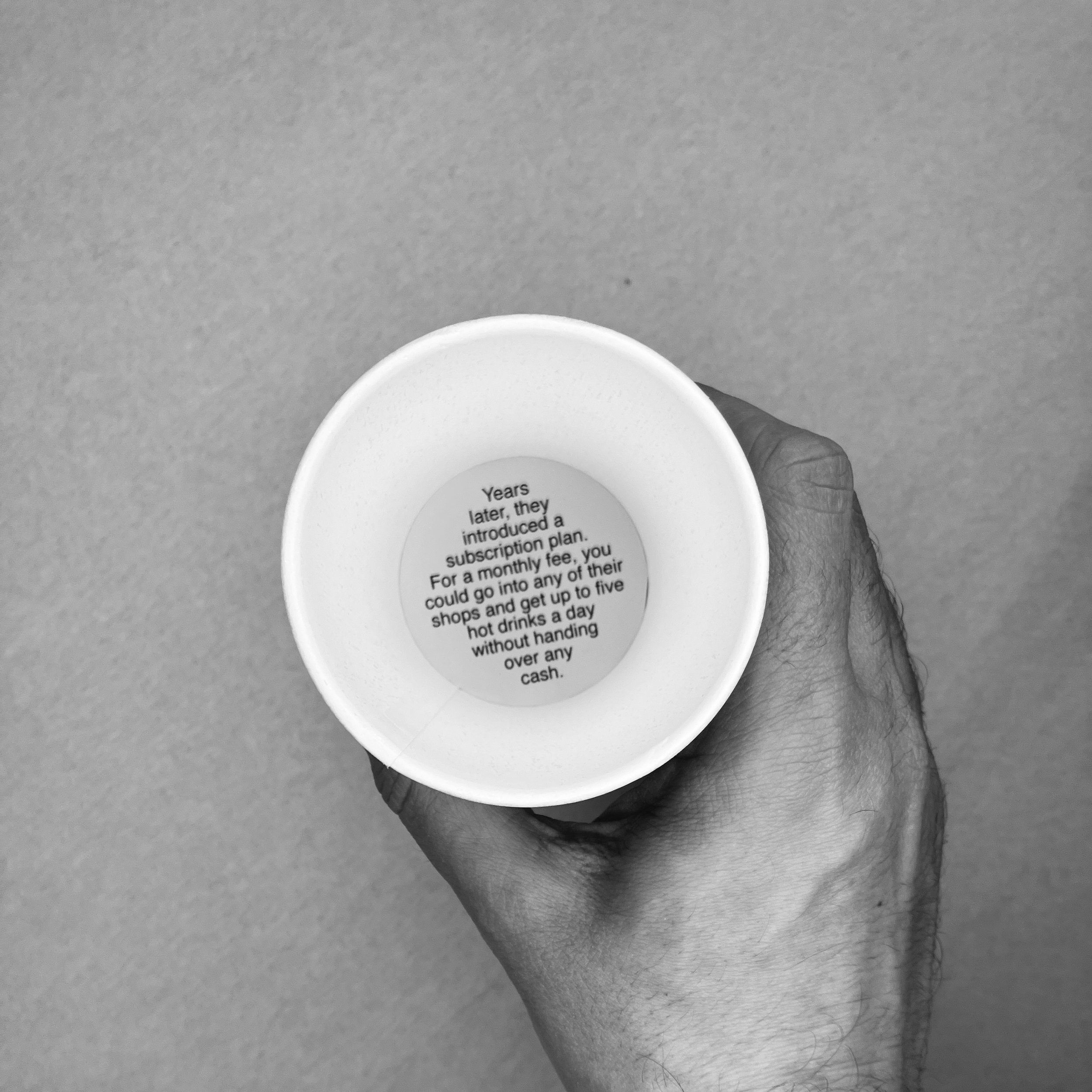
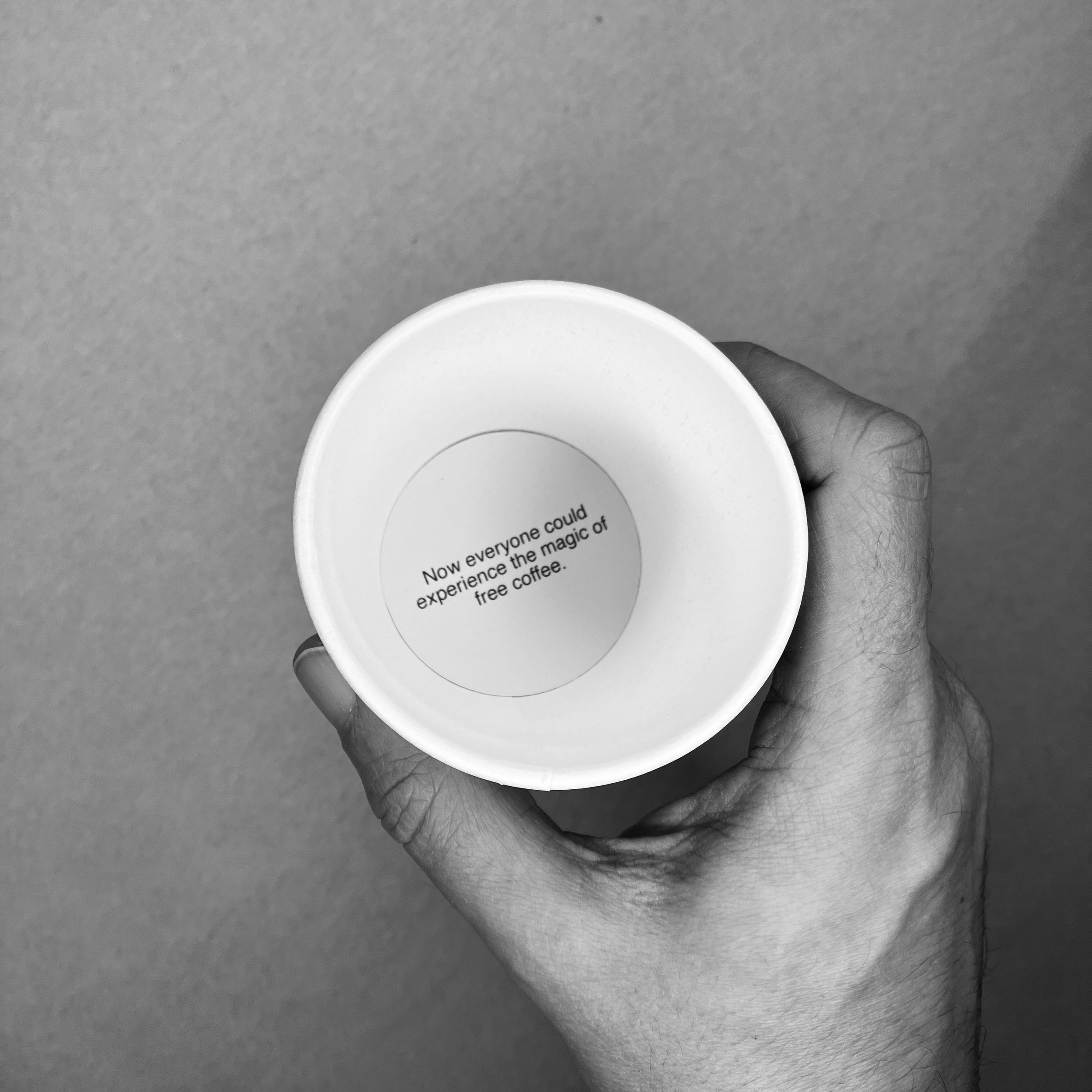

30 paper coffee cups, 60 x 600mm approx + A4 card base
Overview
A story about good fortune and self-belief, told through coffee cups.
Background
This is the story of my amazing run of free coffees from a particular chain of sandwich shops. It’s another step in the process of trying to find a way for form and content to not just coexist, but support each other in a mutually dependent way. It’s sometimes said that every object tells a story and I take that very literally by slapping a load of text over anything I might find in my immediate vicinity.
I had the idea for The Run while on a short break in Folkestone, which is a very nice seaside town in Kent with a lot of public art. I don’t know if it was this factor that inspired me to write a story on a stack of paper cups, but I don’t think it was coincidence. (There is also a very nice coffee shop there called Steep Street Coffee, which I can highly recommend.)
The amount of free coffees I used to get from Pret was a source of some annoyance to my partner, so creating a towering shrine to my good fortune seemed somehow appropriate. The reader takes a cup from the top of the left hand stack, reads the text printed inside the cup and then stacks it on the right hand side. (Instructions are printed on the base.)
Two sleeves of paper coffee cups were purchased from a local pound shop and I printed the sections of story on cardboard discs, which I then cut out using the Cameo Silhouette cutting machine. Those were then stuck down to the bottom of the cup using crafter’s tape. It’s not a perfect process. If I were to make it again, I think I would use edible ink and print them on the cup surface itself. The card stock doesn’t quite match the cups, which is why the pictures are presented in black and white. I did have plans for a fancy online version of The Run with animation and all kinds of bells and whistles, but I think a simple slideshow works just as well.
If anyone has any ideas of where I might be able to display The Run, I’d be interested to hear them. Coffee shops seem an obvious venue, but perhaps that would just lead to confusion.
Barry's Bottles
A lift-the-flaps board book about alcoholism.
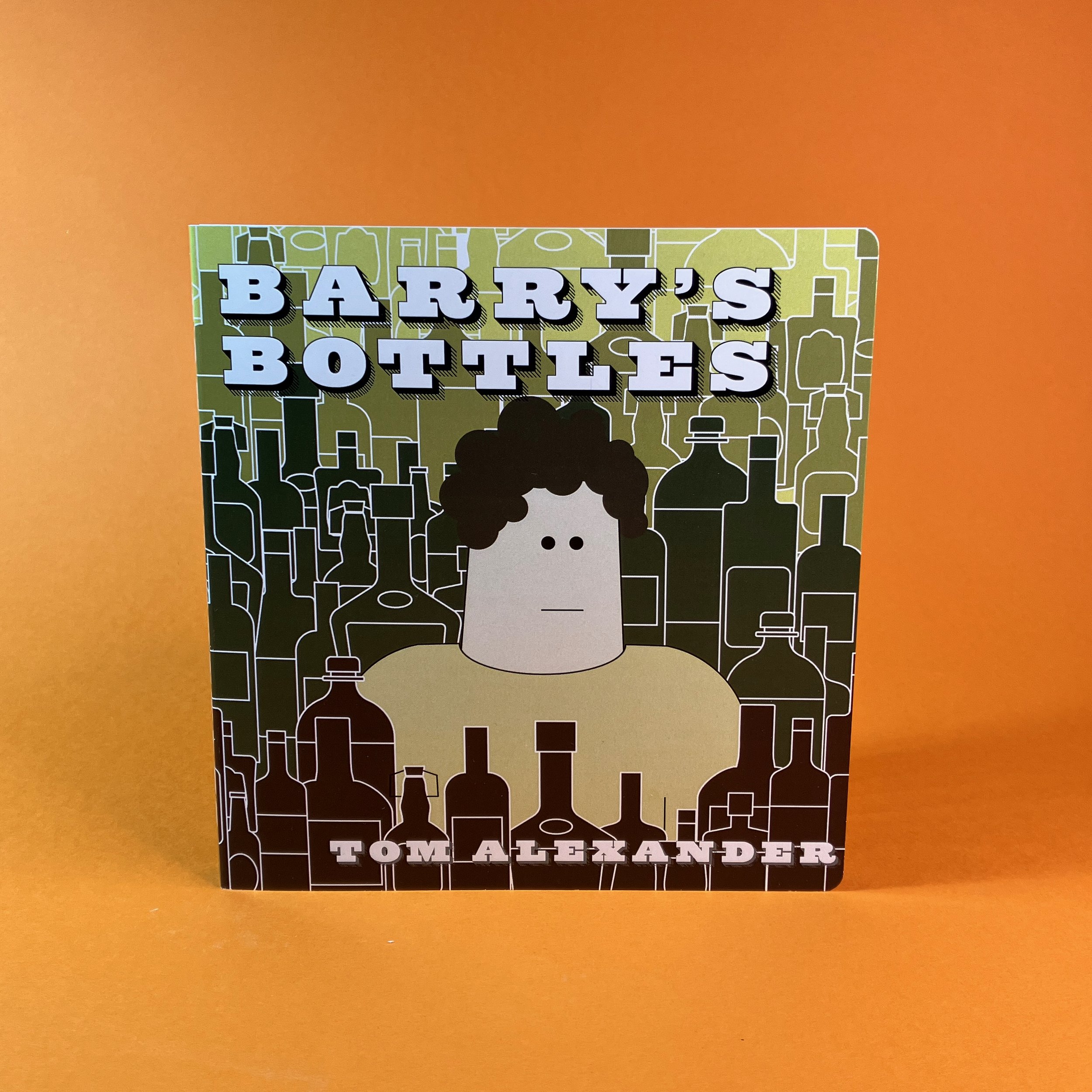

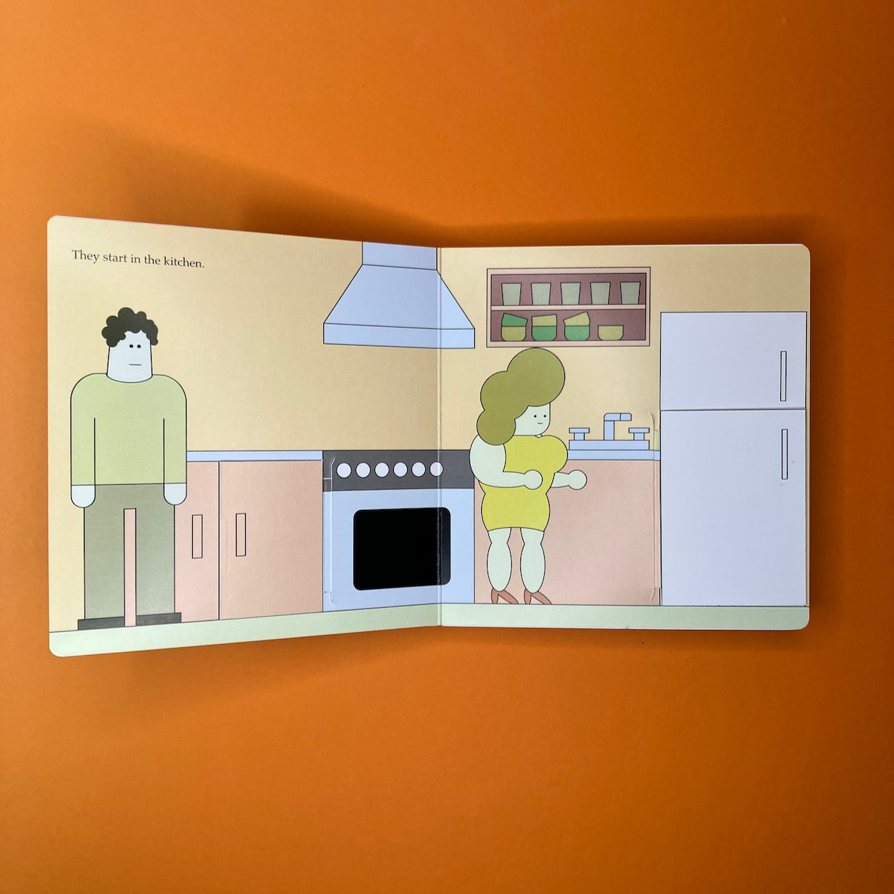

Board book, 140 x 140 x 12mm approx.
Overview
A lift-the-flaps board book about alcoholism.
Background
Barry’s Bottles is the story of a man and his partner, searching through their home to remove all the bottles of alcohol hidden there. It is an illustrated picture book with lift-up flaps, similar to books for very young children, such as Where’s Spot? Although it is illustrated in a similar fashion to My Secret Dog and Sometimes I Feel Sad, this isn’t a book for children. What I like about writing kid’s books, though, is the simplicity and directness you can use with them. That felt appropriate for this story about alcoholism, where all the attempts to control Barry’s drinking will be for naught if he can’t change the patterns of his thinking.
An early, black-and-white version of Barry’s Bottles was shown at the Work Show Grow group exhibition The Power of Play, in London in May 2023. There have been several changes since that version, most notably the addition of colour to the illustrations. The physical format of the book has also changed somewhat, with the heavy grey board removed from the volume to make it lighter and easier to work with.
Although I settled on the technique for constructing the book quite early on, this went through many, many iterations as I tried to get a result I was happy with. In the end, there are still a few kinks which I just couldn’t iron out. Board books are manufactured items, made with industrial die-cutting machines and mechanical folding and sticking processes. The precision required is a difficult thing to pull of by hand (at least for me). Had I realised earlier that there was no way to attain that absolute perfection, I might have leaned the other way and explored what imperfections and rough edges could bring to the story. As it stands, I’m quite happy with it, but also glad it’s over.
As the complexity of the making meant that Barry’s Bottles was going to be a very limited edition, I decided to make a digital version of the book which could be freely distributed. For this, I used an odd combination of software (Affinity Suite, Blender, Tumult Hype) to create something sort of like a Flash site of the early 2000s or a CD-ROM. Again, I settled on a process early on and made about 80% of the site before thinking it wasn’t perfect enough. After attempting a couple of times to remake it, I found the results were sterile and didn’t feel as good as the imperfect early version. I went back to the early version, finished it, and uploaded it to itch.io so it could have a permanent home. The online version of the book can be found at https://tomlxndr.itch.io/barrys-bottles.
Battlesecrets
A variation on the old pen-and-paper game Battleships, although potentially more harmful.
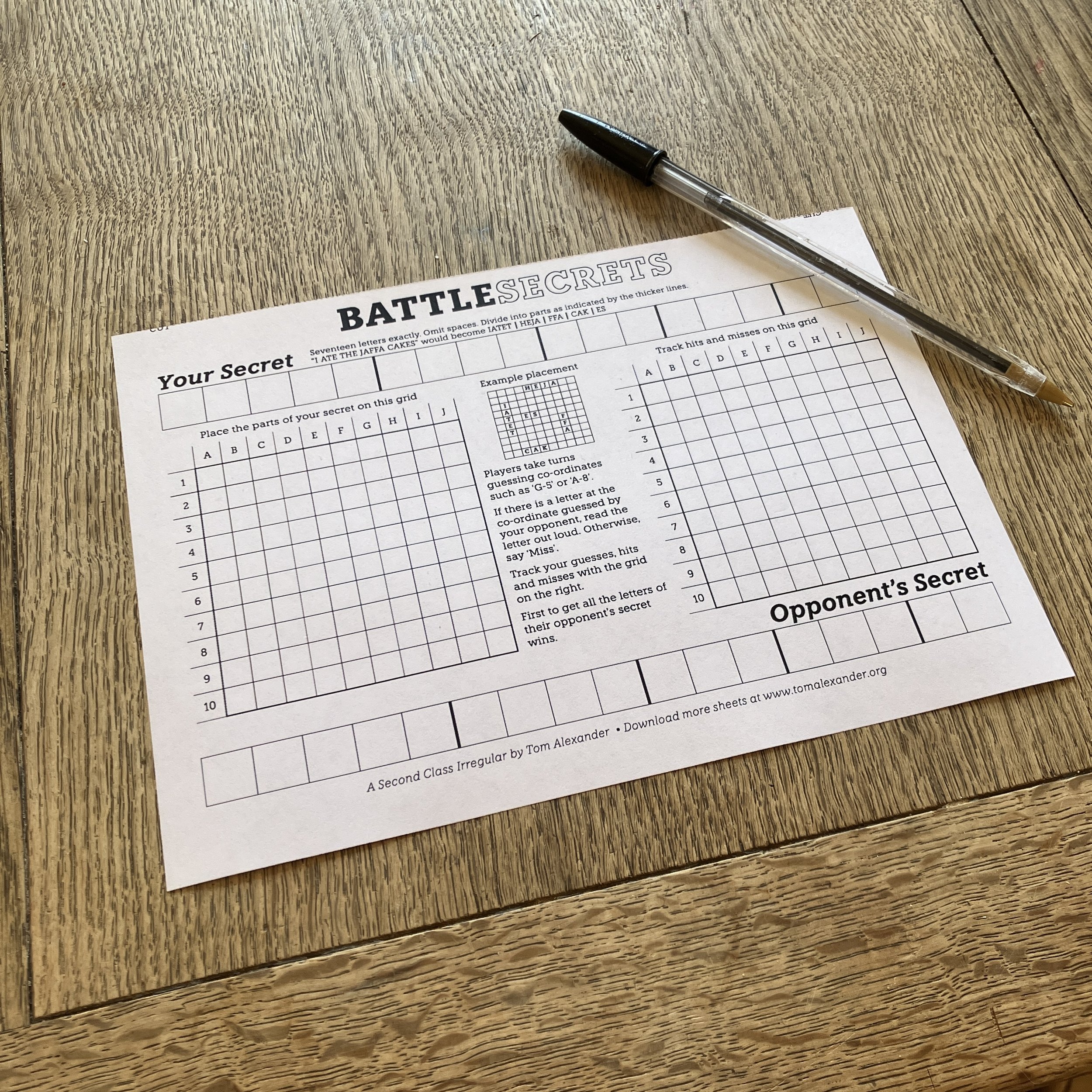


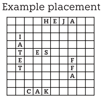
Pen & paper game, 210 x 148.5mm
Overview
A variation on the game Battleship, using secrets as the main objective.
Background
When I’ve spent a long time on a single project (or several projects that are taking a long time to complete), it’s nice to have an idea and execute it within a day or two. That’s what happened with Battlesecrets.
Obviously it’s the old game Battleship, but using secrets as the targets for your opponent to uncover. Hopefully that makes things a little spicier but perhaps it doesn’t make much difference.
This was sent out to subscribers on 5th January 2024. It’s interesting to think about how my (physical) mailing list has evolved and changed over time. Initially it was a welcome distraction from my serious writing. Over time it became the main part of what I had to grudgingly concede was an artistic practice. Then, as I started to experiment more and make more complex work that I couldn’t justify giving away, it’s sort of achieved some focus. The idea now is to do as much as possible with a single sheet of paper. This doesn’t always happen. The Third Eye Test grew from the eye chart to a whole kit, but I think it’s benefitting from having defined parameters. Hopefully it means I can make more stuff.
Daniel's Dinner
A wooden cyanotype book about misunderstanding the people you live with.


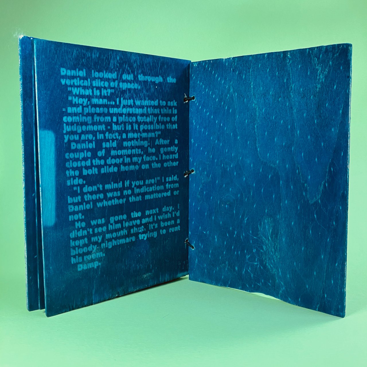
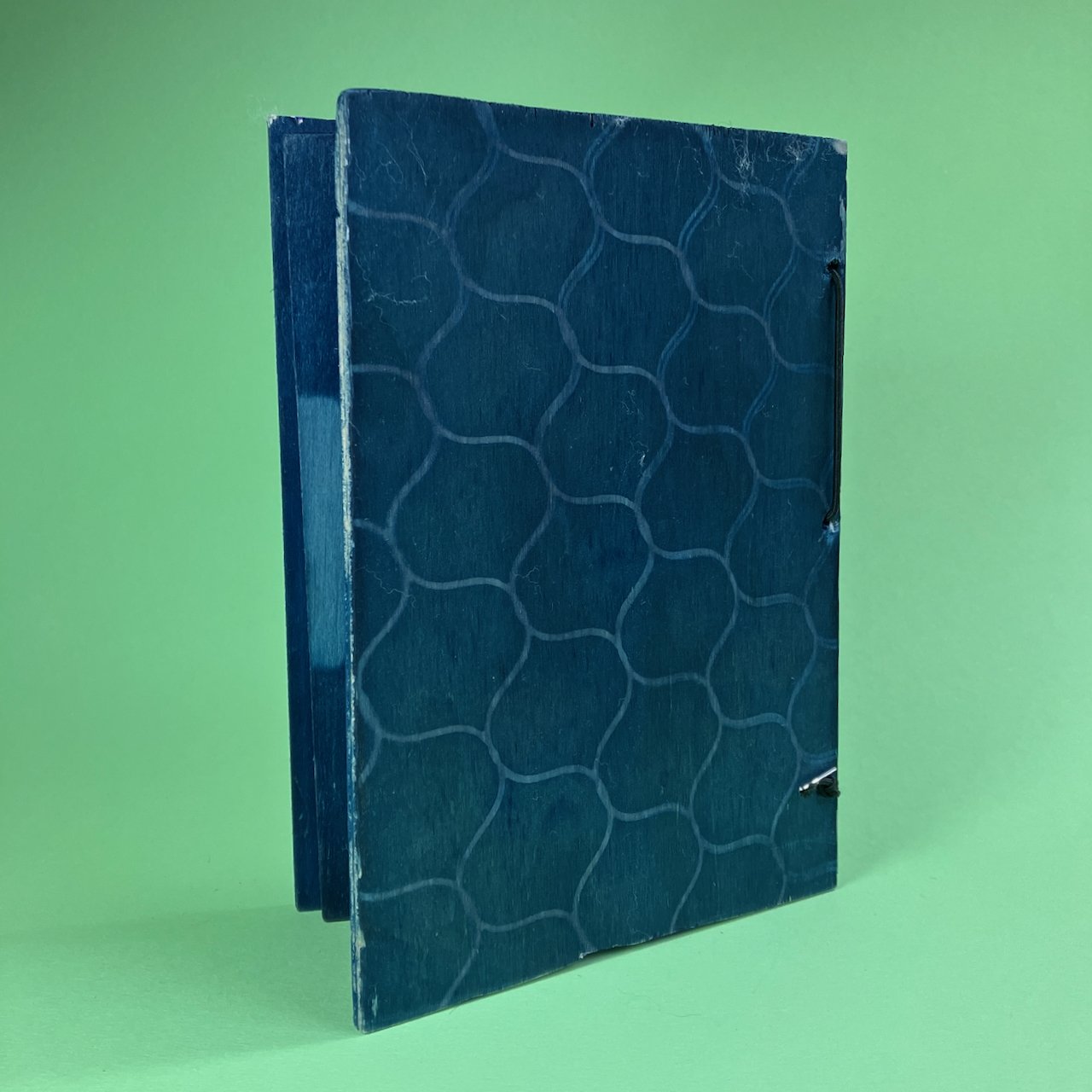
Wooden book, 220 x 150 x 20 mm
Overview
A story about misunderstanding the people you live with, presented as a wooden book with the text printed by cyanotype.
Background
Cyanotypes are quite a cool process - treat a surface with the chemicals, put some kind of mask over them and then expose it to sunlight. Where light is blocked, you get a pure white tone and where the sunlight reasches you get a rich blue. It’s an old process, used to reproduce drawings when accuracy and fidelity to the original was more important than the aesthetic. It’s where the term ‘blueprint’ comes from. I had made some cyanotypes before using the sun paper kits you can get, but had always wanted to try the chemicals on wood. When Upright Gallery posted an open call for artists books on the theme of water, it seemed like a good reason to implement some of those ideas.
I was on a short timeframe, so used a short story I had written as a basis for a simple book. The story was very short - less than a thousand words - and I typeset it on the computer before printing the layouts onto acetate. I then cut some pieces of plywood I had knocking around to the right size, treated them with the chemicals and exposed each of the sides to sunlight while covering them with the transparent masks I had made. Each side needs to be fixed with water, otherwise it’ll carry on reacting to light and eventually turn completely blue. Having to wait for each piece of wood to dry before applying the chemicals and exposing the other side is what made this such a tight race to deadline. That all worked out reasonably well and the exposures were OK. What turned out to be more difficult was applying my limited carpentry skills to cutting and sanding the boards to the right side. For some reason I got it in my head that the covers had to be thicker than the pages and, let me tell you, that thicker plywood was a bugger to cut. Also, I was using the wrong saw, so it was quite a wonky line. Also, I hadn’t drilled the holes for the binding before exposure, so everything was a bit off. Once I put it together, I could see that things were a bit wrong and did what I could to fix it, but my attempted fixes were just making things worse and I had to walk away and accept it as done, imperfect though it was.
I was glad to have finished it within a deadline and pleasantly surprised when it was accepted by Upright Gallery into their exhibition, which runs 2-23rd December 2023.
Making Waves at Upright Gallery, 3 Barclay Terrace, Edinburgh, EH10 4HP.
Ten Regrets
A collection of ten regretful incidents for you to reflect upon and then burn.

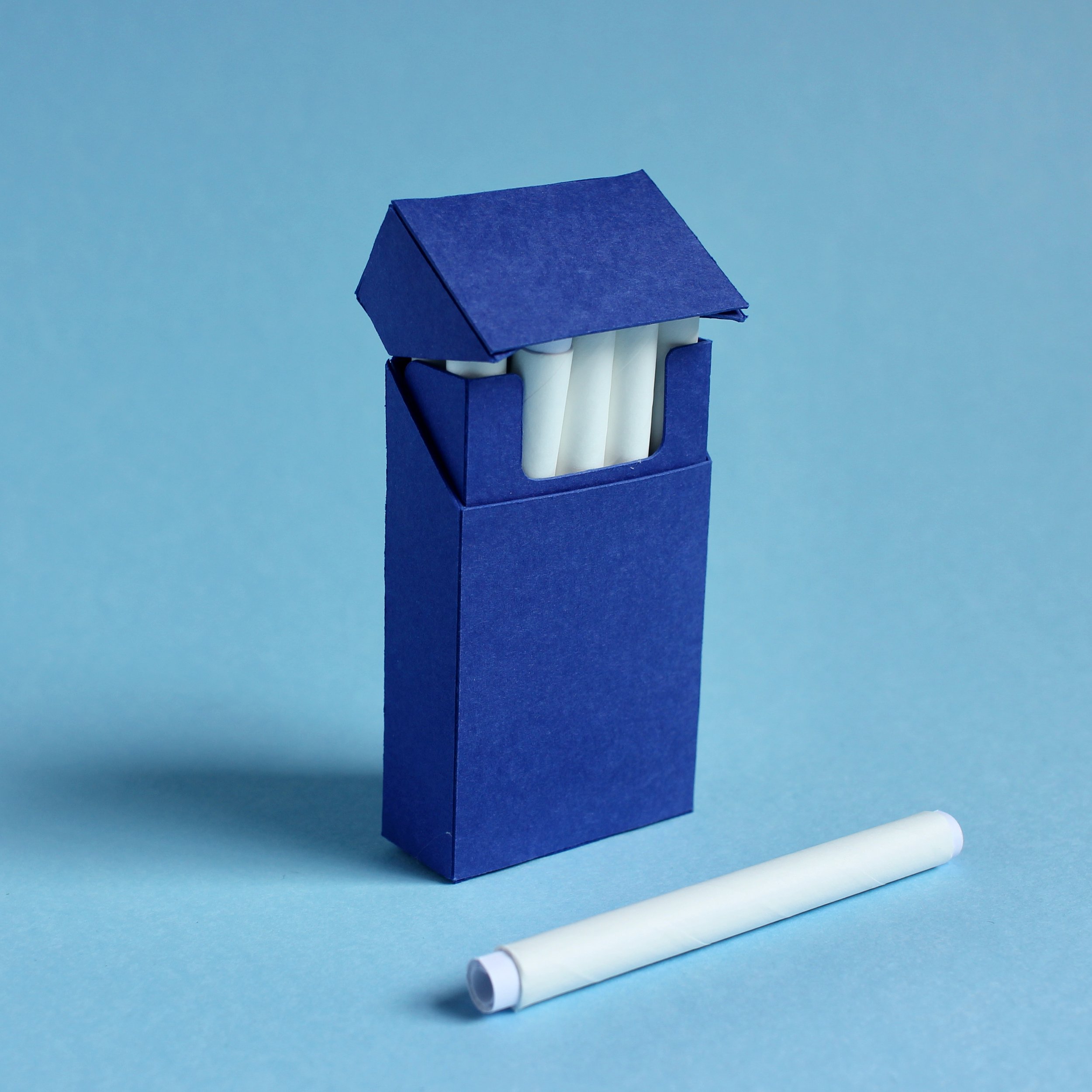


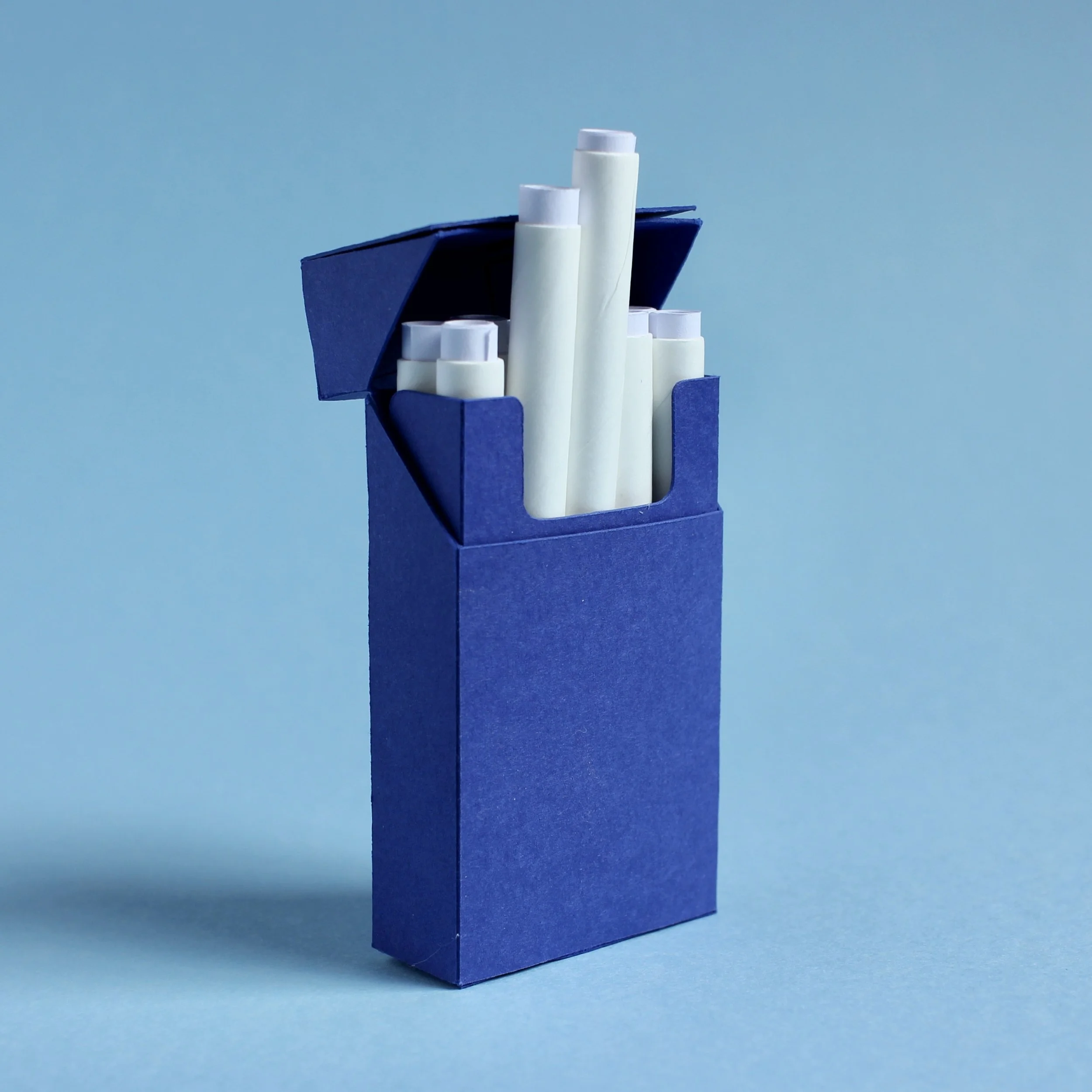
Ten Regrets is a collection of short texts which invite the reader to reflect on past mistakes. Each regret is rolled into a tube and collected in a box shaped like a cigarette packet. Each paper has blank spaces for the reader to write on and personalise it to their own specific regret. When this is done, the reader is encouraged to roll the paper back up and burn it in order to break the hold this past event has over them.
Paper and card, 20 x 90 x 46mm
Overview
A collection of ten regretful incidents for you to reflect upon and then burn.
Background
Ten Regrets is a collection of short texts which invite the reader to reflect on past mistakes. Each regret is rolled into a tube and collected in a box shaped like a cigarette packet. Each paper has blank spaces for the reader to write on and personalise it to their own specific regret. When this is done, the reader is encouraged to roll the paper back up and burn it in order to break the hold this past event has over them.
I also think it’s interesting that the reader is asked to burn the pages of this book. Although they are not bound in the same way as a regular volume, I’m interested in whether people will actually go through with the burning part. Obviously, book burning is an emotive issue. While I don’t want it to seem like I endorse it on a macro level, there’s also the fact that once you’ve bought it, you can do what you want with it.
There’s a specificity about the shape of a ten-box that puts my mind in a specific period of my life. The fact that the packet of ten is no longer available for sale also places it in a particular place in history, a pre-modern era that no longer exists and therefore adds an element of nostalgia. Nostalgia’s a tricky thing. It’s not accurate recall and in that way it’s similar to the process of looking back with a rueful eye about the things one should or should not have done in the past.
The regrets are taken from incidents in my own life, but hopefully are relatable to most people’s experiences to a greater or lesser extent. This kind of writing always feels like treading a fine line and I hope I’ve managed to make an emotional connection without it feeling mawkish or manipulative.
Third Eye Test
A kit for opening up your inner vision.
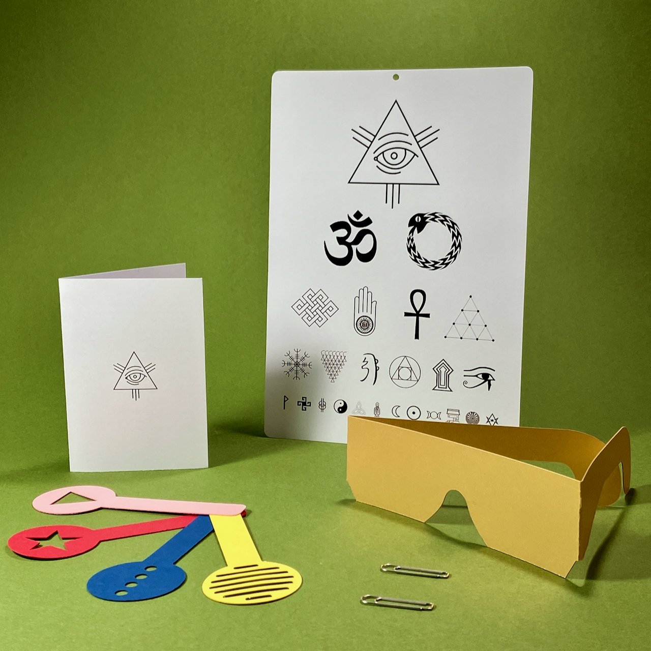
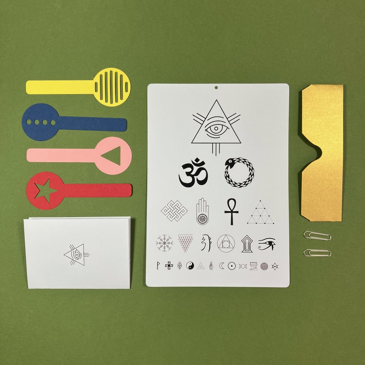
An at-home kit for testing your inner vision. Comprised of a Third Eye Chart, a covering for your First and Second Eyes, four corrective lenses, two lens clips and a short set of instructions.
Multi-part, assorted colour card, 2023
Overview
A kit for opening up your inner vision.
Contents
1 x Third eye chart
1 x Covering for first and second eyes
4 x Corrective lens paddles
2 x Lens clips
1 x Instruction leaflet
Background
I’ve been trying to buy new glasses for at least two years now. My current ones have the unfortunate habit of falling apart at inconvenient times. Apart from that, I like them. They’re light and they help me see.
That said, sometimes it’s difficult for me to read the train indicators on the Victoria Line and this told me that I should get my eyes checked. I went to the opticians and they told me that my eyes were exactly the same as when I last had them checked. When I asked about the problems seeing train times, they told me that was just being old and I shouldn’t worry too much about it. Huh.
Anyway, that led to this - an at-home testing kit for measuring the visual acuity of your third eye. It takes its cues from the equipment used to measure your other eyes and was originally going to be just an eye chart. Obviously, people would be able to see the symbols unless they were blocked out, so some sort of blindfold would be needed. Originally this was going to be a strip of cloth, but then I remembered the Peril-Sensitive Glasses that were packaged in with the text adventure adaptation of Hitchhiker’s Guide To The Galaxy (see here for a gallery of all the ‘feelies’ bundled with that and other Infocom games). I made my own version, but used some jazzy metallic card I had in the drawer. That would have been enough, but I always find an eye test isn’t an eye test without an optician holding lenses in front of my eyes and asking if it’s better “with…? or without…? with…? or without…?” and me saying things like “I’m not sure… maybe… with? …a bit?”. I really wanted people to be able to replicate that experience in their at-home tests, so created the little paddles that they could hold up in front of their foreheads.
But once they were done, I remembered that another great part about going to the opticians was wearing those incredible Frankenglasses with the lenses dropped in. Again, I wanted people to have some part of that with their Third Eye Tests, so set about fashioning some customised connectors that would allow people to attach the lens paddles to the coverings for their regular, ordinary eyes. I did not just buy a box of paperclips. No.
Anyway, the small idea ended up being 8 separate pieces (including the little explanatory leaflet that I was really in two minds about making and a little fold of card to stop the lens clips digging in to the main chart). Five of these elements required the use of the cutting machine, which is a slow process, meaning the simple little idea to knock out in an afternoon took a bit longer to put together. Still, once you embark on these things, you have to see them through.
Classifying stuff like this is kind of weird. Although it does have printed pages, it’s not a book. It’s not a wearable, although an element of it is worn. I guess it’s just a thing.
Babies – Invaders From The Future
A warning about the menace that lurks among us.
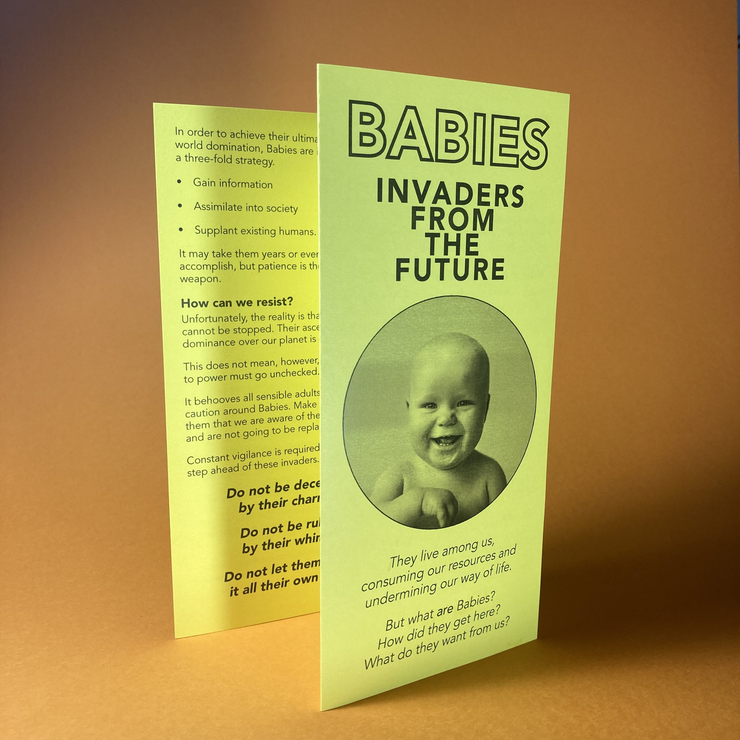
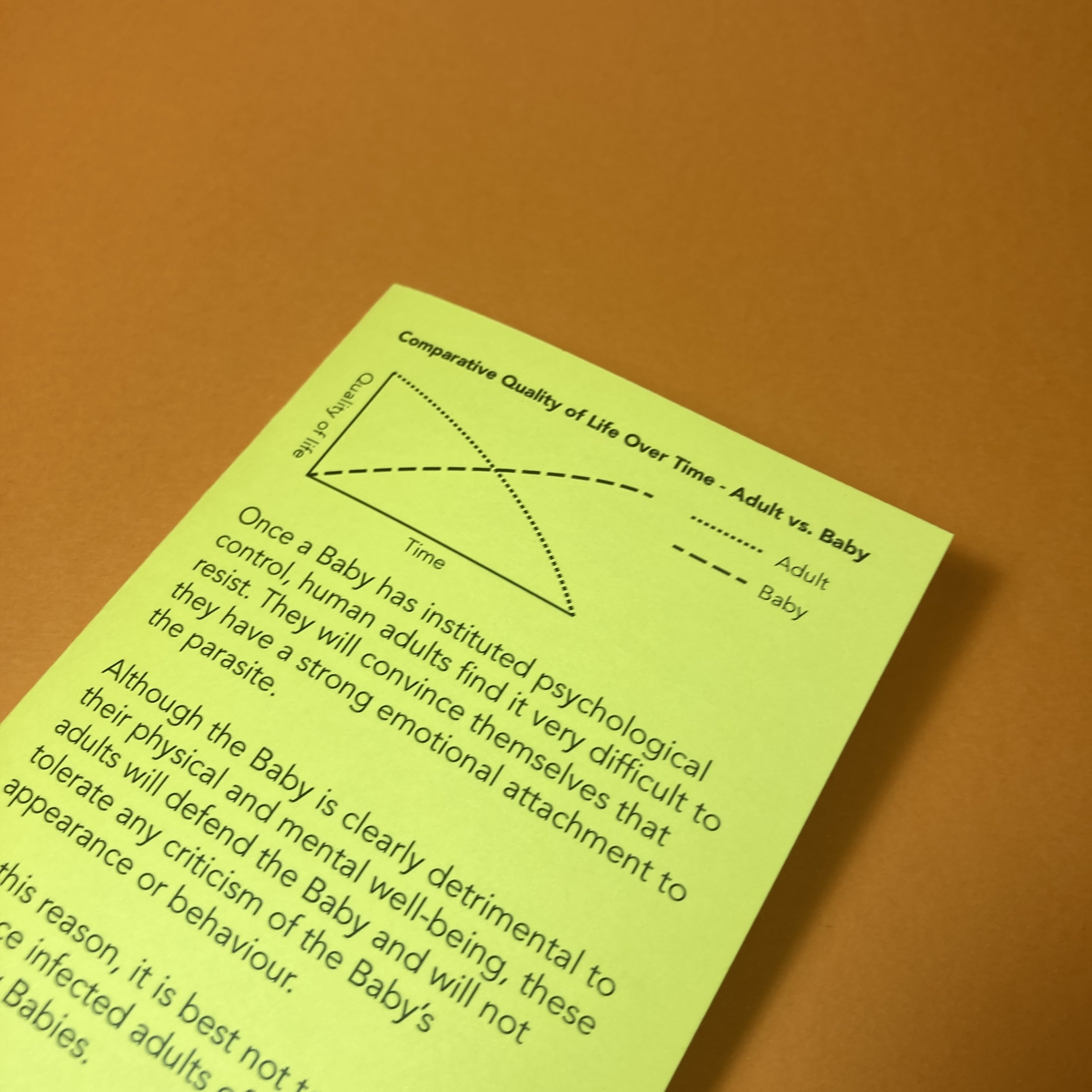
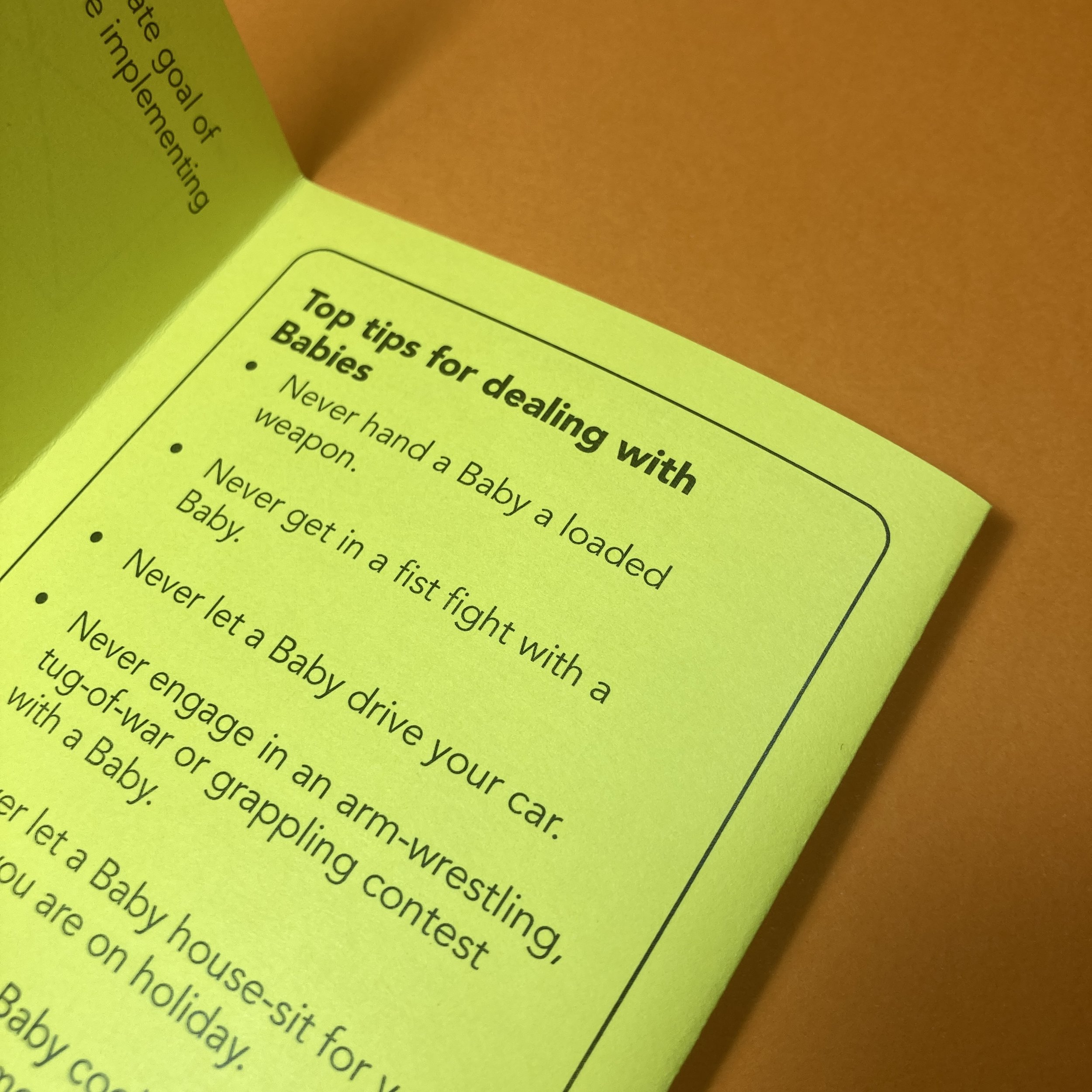
Tri-fold pamphlet, 99x210mm
Overview
A warning about the menace that lurks among us.
Background
The original concept for this - that babies are trying to take over the world - was originally expressed in another form. I wrote a 4000 word short story about the efforts of a difficult conception leading a man down a path of paranoia and suspicion. It was ok, but honestly the details of conception weren’t really that interesting me and I didn’t particularly want to publish a story about masturbating into plastic cups.
The core concept of babies as secret agents plotting to overthrow us stuck with me though. After a few false starts, made its way into this tri-fold leaflet, printed on high-vis yellow card.
This was sent to subscribers in April 2023 and copies were left in some locations in London.
Intern
A short story about a hapless member of the marketing department.
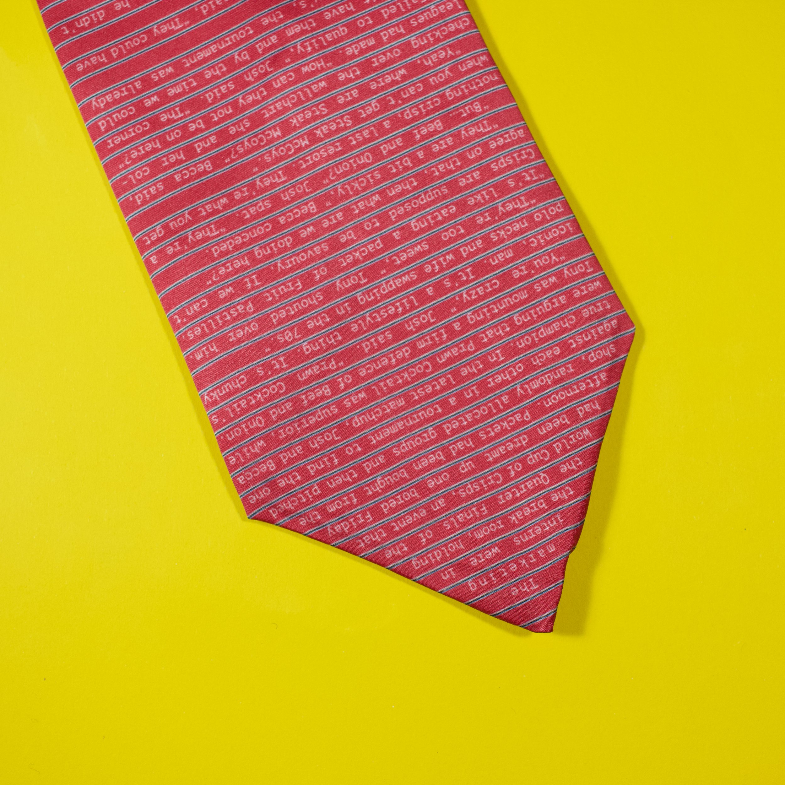
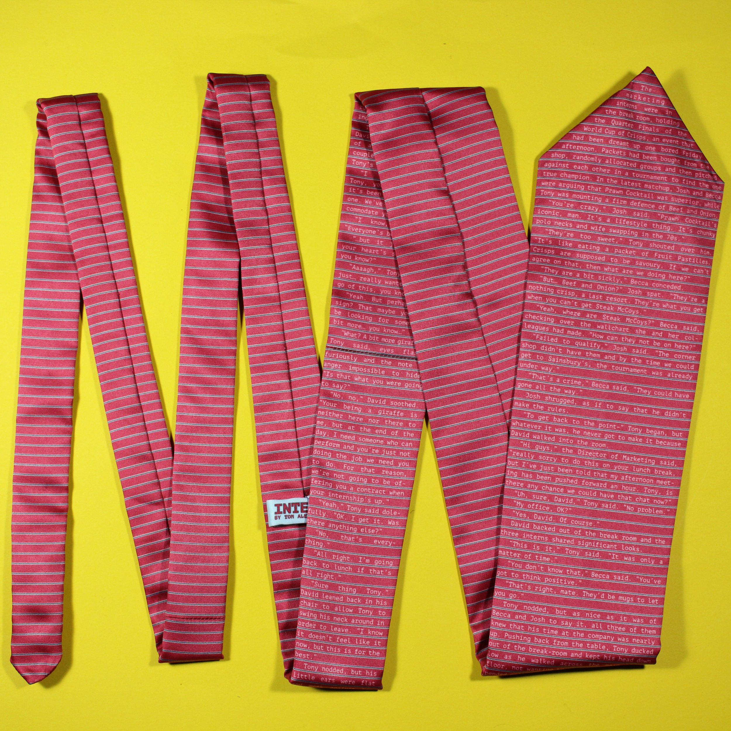
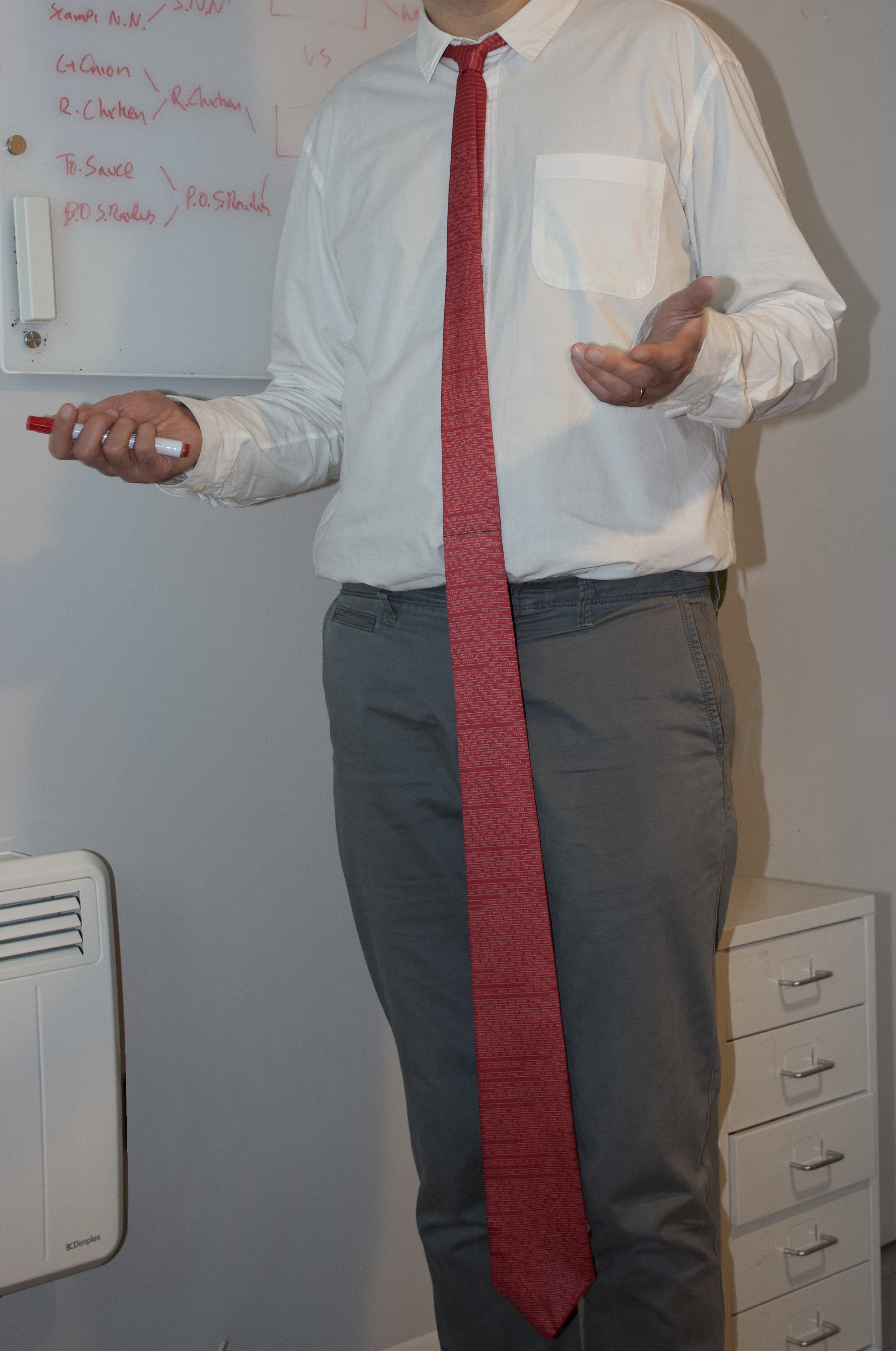
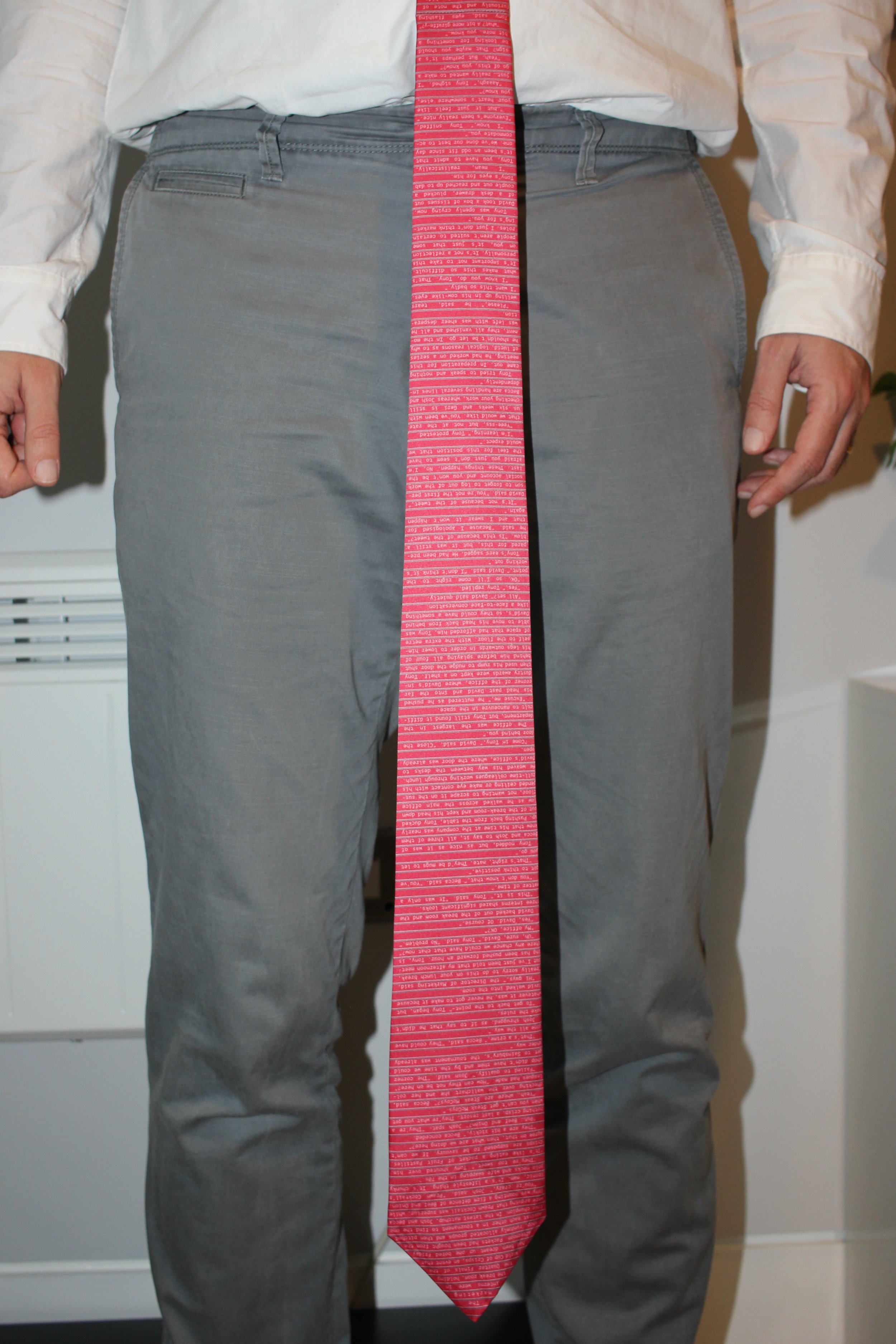
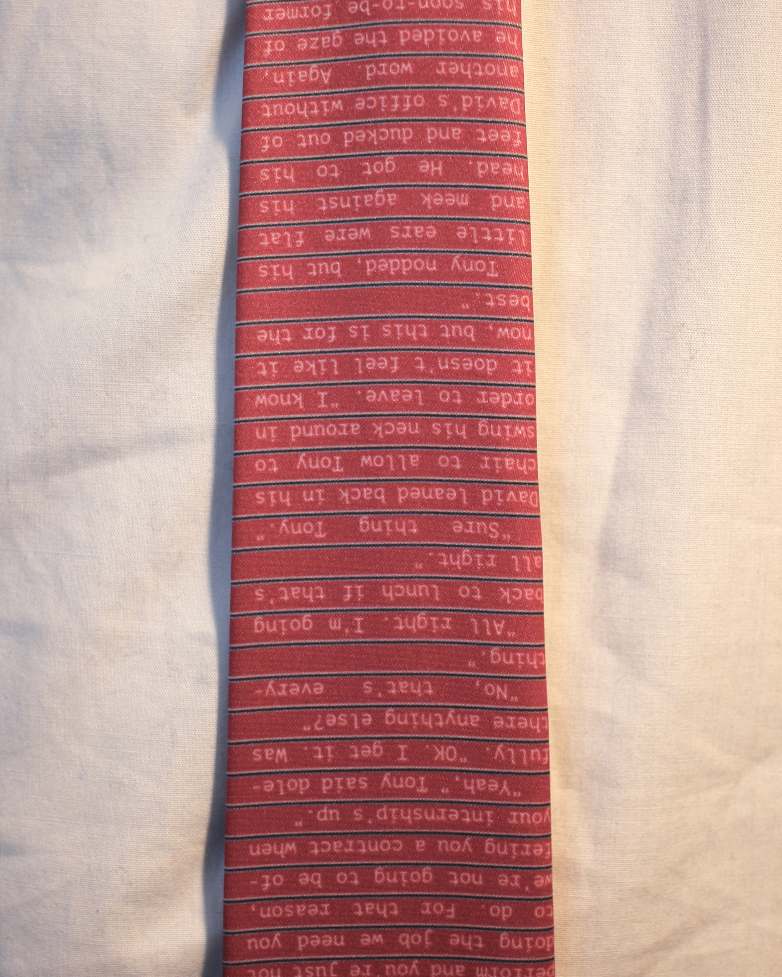
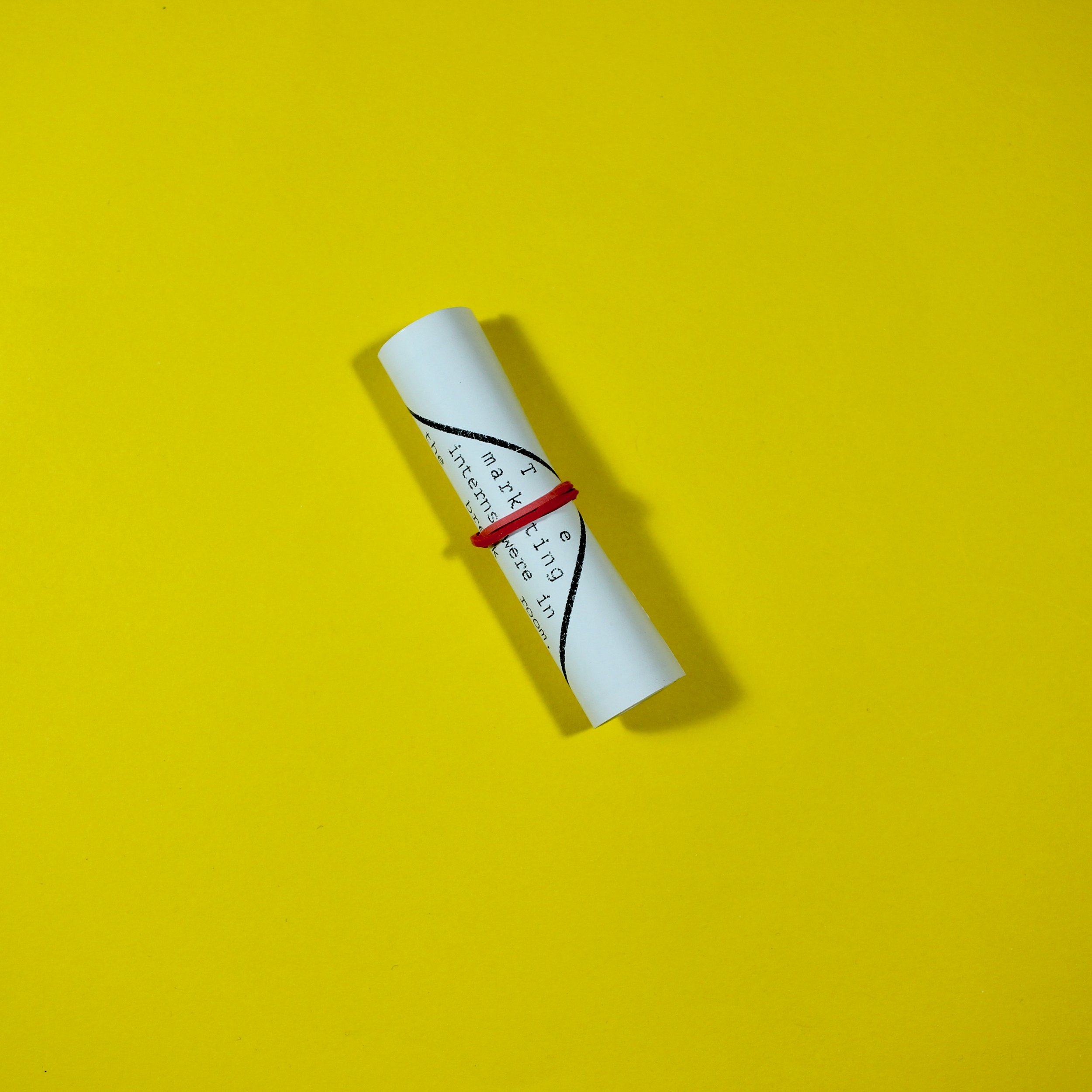
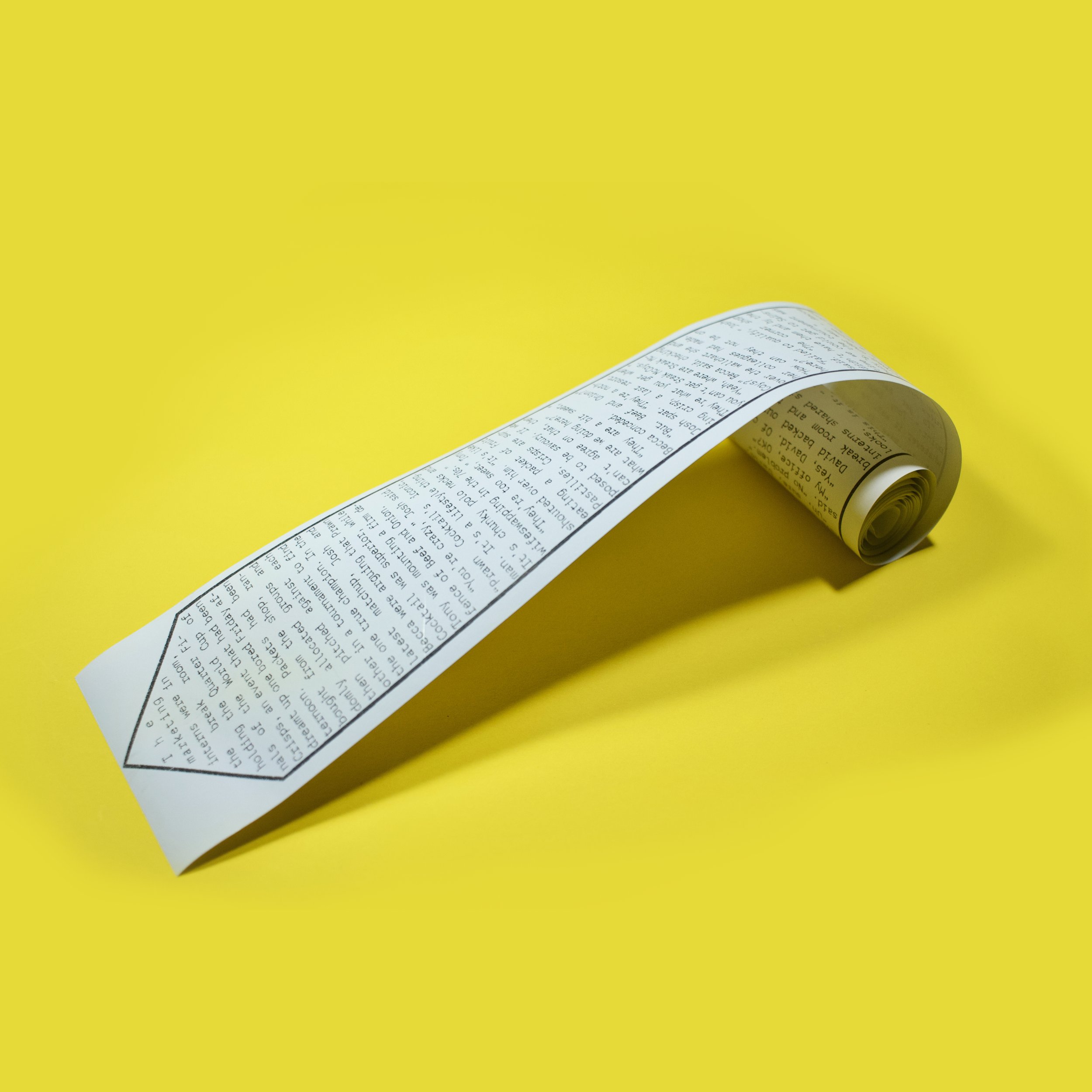
A short story printed on a tie. The text has been digitally printed on silk-like polyester and assembled by hand. It is approximately 2.5 metres long in total and is designed to be read by the wearer.
2023, multiple editions
Hand-sewn necktie, unique edition
Thermal paper, multiples.
Overview
Intern is a short story about a hapless member of the marketing department who is about to be let go. It was published by Idle Ink on 4th March 2023 and two physical editions were made to coincide with the story’s release on their website.
Background
So, it’s probably best to read the story on Idle Ink before continuing here. You’ll understand the rest of this a bit better and I’d like you to not know about the text before you read it.
Done? OK, let’s proceed.
This was one of several stories I wrote at the end of last year, when I really wasn’t feeling enthused about making books and instead was just concentrating of writing. This happens. I swing between those two modes - the simplicity of writing against the potential complexities of designing and constructing narrative vessels - quite frequently. Each time I do, I convince myself that I’ve stopped oscillating and that this is what I’m truly about. Then, inevitably, I go back the other way. Perhaps one day I’ll realise that they are, in fact, not two polar opposites, but in fact two complementary parts of the same thing. Anyway, I was loving the simplicity of writing by hand on lined paper and one of the stories that came out of that period was this short thing about Tony the intern and his crushing failure to make an impact on the Director of Marketing, who - and let’s be categorical about this - was not letting Tony go because he was a giraffe. It was short, silly and also kind of sad. That’s exactly where I like my stories to land, so I sent it out for submission.
It’s a weird thing, sending stories out. The wheels of literature turn slowly. I’m sure even the smallest publications are inundated with stories so the process is a slow one. Sometimes you sort of forget what you’ve done with a story. Or you pretend to, because you’re always hoping that it’ll find the right home.
While Intern was out, it occurred to me that I could use the digital fabric printing at Contrado to make a really long necktie with the story printed on it. I had previously used their services for Primates and found them to be quick and of good quality. Instead of a fuzzy fur, I was looking for a silky feel. I decided on a fabric (Silk Sensation poly 90gsm ID 2924, if you’re interested) and laid out the text. Trying to get my head around cloth patterns was a bit of a challenge. Luckily, I’m married to an expert, who took me through the things I needed to know, like seam allowances and the importance of the bias. Some of this I understood.
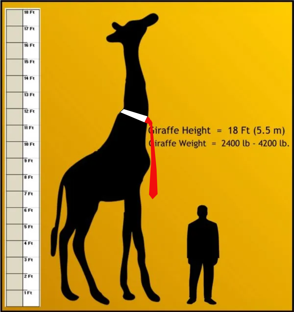
(In case it’s not clear - I added the tie.)
The question then presented itself - just how long would a giraffe’s tie be? This graphic helped me figure it out:
By my estimation, that put the tie at around 2 metres long, at least for the story part. I’m not going to lie, it wasn’t as long as I initially hoped. A six foot long tie didn’t seem as ridiculous as I’d wanted. One could imagine Donald Trump wearing one as a power move. But I told myself that this wasn’t some big joke - this was Tony’s tie and I had to remain true to that. Also, y’know, the story’s only about 1200 words long.
Working with a two-metre long document presents some challenges. The Affinity suite1 did… ok in this regard. Large documents are quite a lot of for my now-quite-old Mac and I think pasting the pattern inside a text box caused more problems than it should. Anyway, I laid out the long skinny tie and then, because I was ordering a sample print at A1 size, placed cropped copies of this document on a standard sized page. Then it went off to Contrado and within a few days I had a red silky pattern ready to be assembled.
This part of the process I had nothing to do with. I get the impression, though, that it was quite annoying to make. We had failed to account for the fact that a 2.5 metre piece of cloth is just plain unwieldy. Added to that, I had placed the pieces a little too close together, making the construction tolerances a bit tight. I thought it came out pretty nice, though.
With that done, I started to think about taking a couple of photos and posting it online for the fleeting glory of a dozen or so likes. What I wasn’t expecting was for someone to actually want to publish the story. Idle Ink, a nice website of weird stories, accepted it and I had a bit of a chat with the editor there and they agreed to mention the tie version of the story.
The process of photographing the tie was frustrating. It felt like the tie needed to be seen in an office environment. That’s fine when you have a job, but you can’t just stroll into a random office wearing a six foot long tie and start taking pictures. (Maybe you can, but I don’t have the front for it.) In the end, we went round to the in-laws home office, which is much tidier and efficient-looking than either of our workspaces. We took some pictures there, but they didn’t come out quite how I would have liked. There was a combination of daylight and tungsten lightbulbs which gave everything a mixed pallor. Although the shots with the flash going off were accidents, they ended up being the ones used. Flash photography isn’t really a look I like, but it is at least a look. If I’d had more time, I might have done them again, but it was all thrown together quite quickly on a Sunday afternoon. So, thanks to Jemima and Sarah for putting up with an impromptu photoshoot taking place while they were still working. If you want a website made, get in touch with them at www.websitedepartment.co.uk.
Anyway, it was while doing the photoshoot that it occurred to me that it would be pretty easy to make a cheap paper version of intern using the Epson TM-88V thermal printer I acquired a while ago. It would be pretty straightforward to do, as I had all the files and so long as I got the print settings right, I could have a long, narrow strip of paper with the story on. These went out to mailing list subscribers on publication date.
Some might say that three separate editions of one short and admittedly quite silly story is perhaps overkill. To them I would say… yeah… well… you just don’t get it.
I switched from Adobe a few years ago. For the most part Affinity has been a pretty good substitute. Sometimes I miss the more esoteric parts of Creative Suite, but I never really did enough with them to justify the cost. ↩︎
Butterfly Mask
A short story printed on a mask which must be read in a mirror.
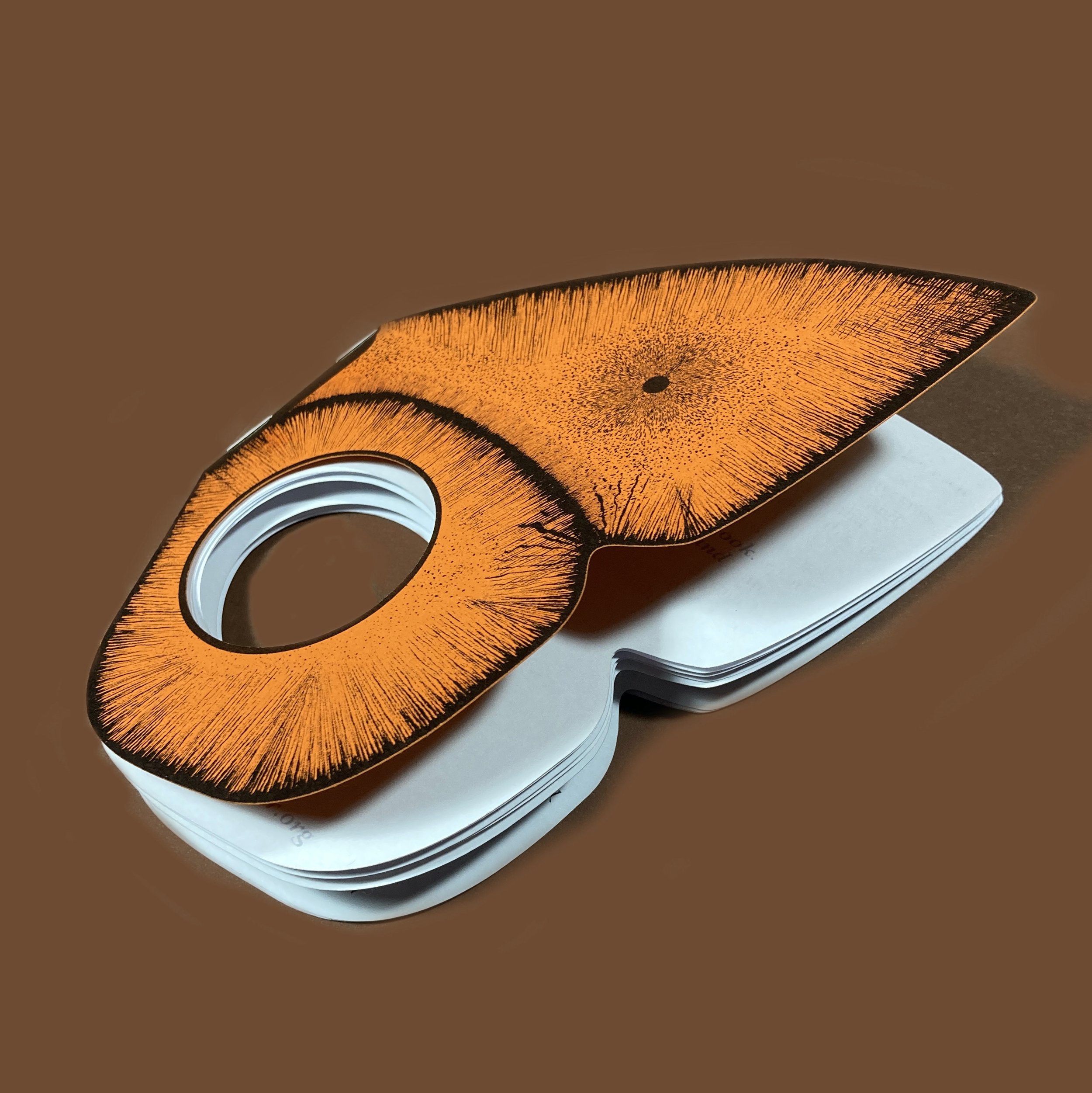
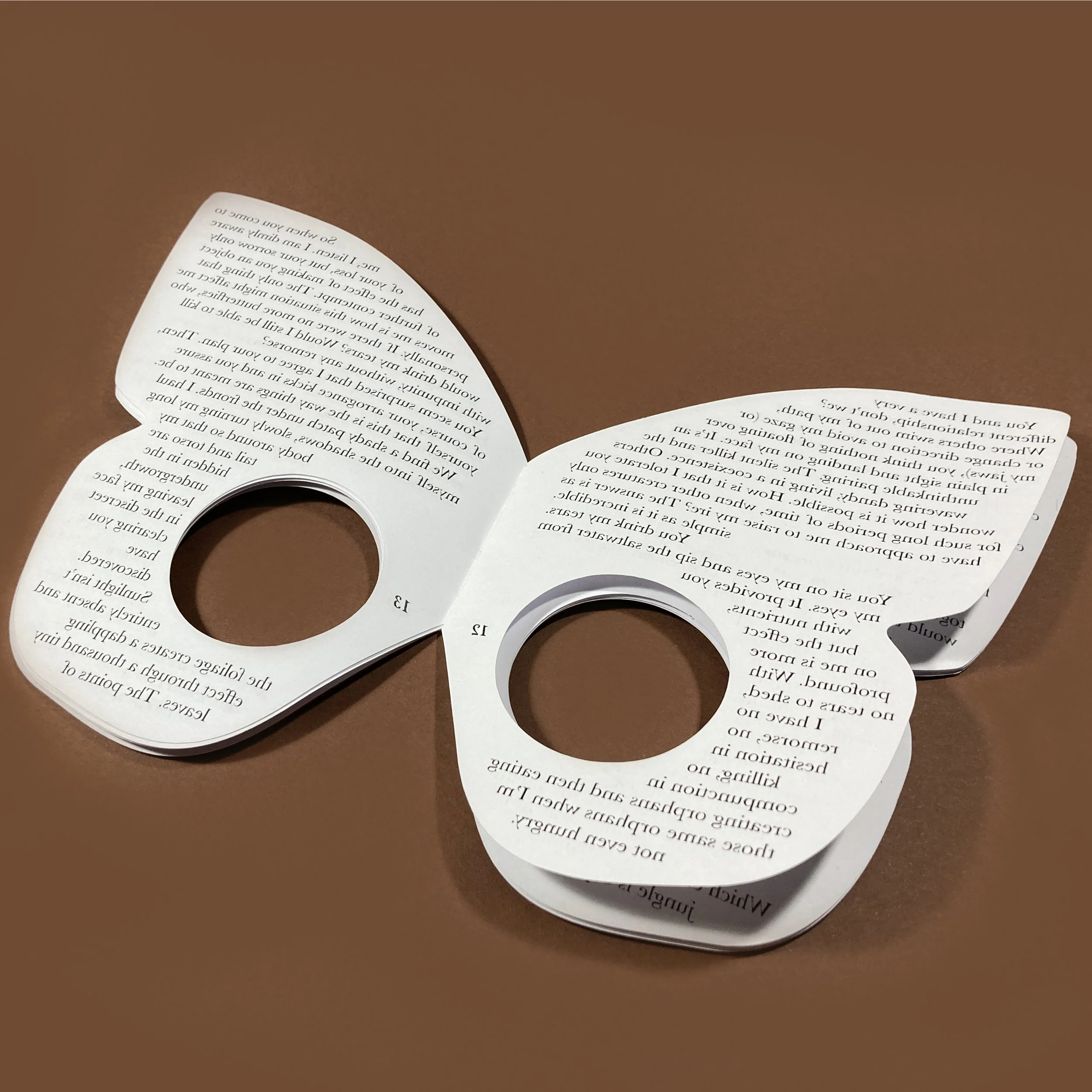
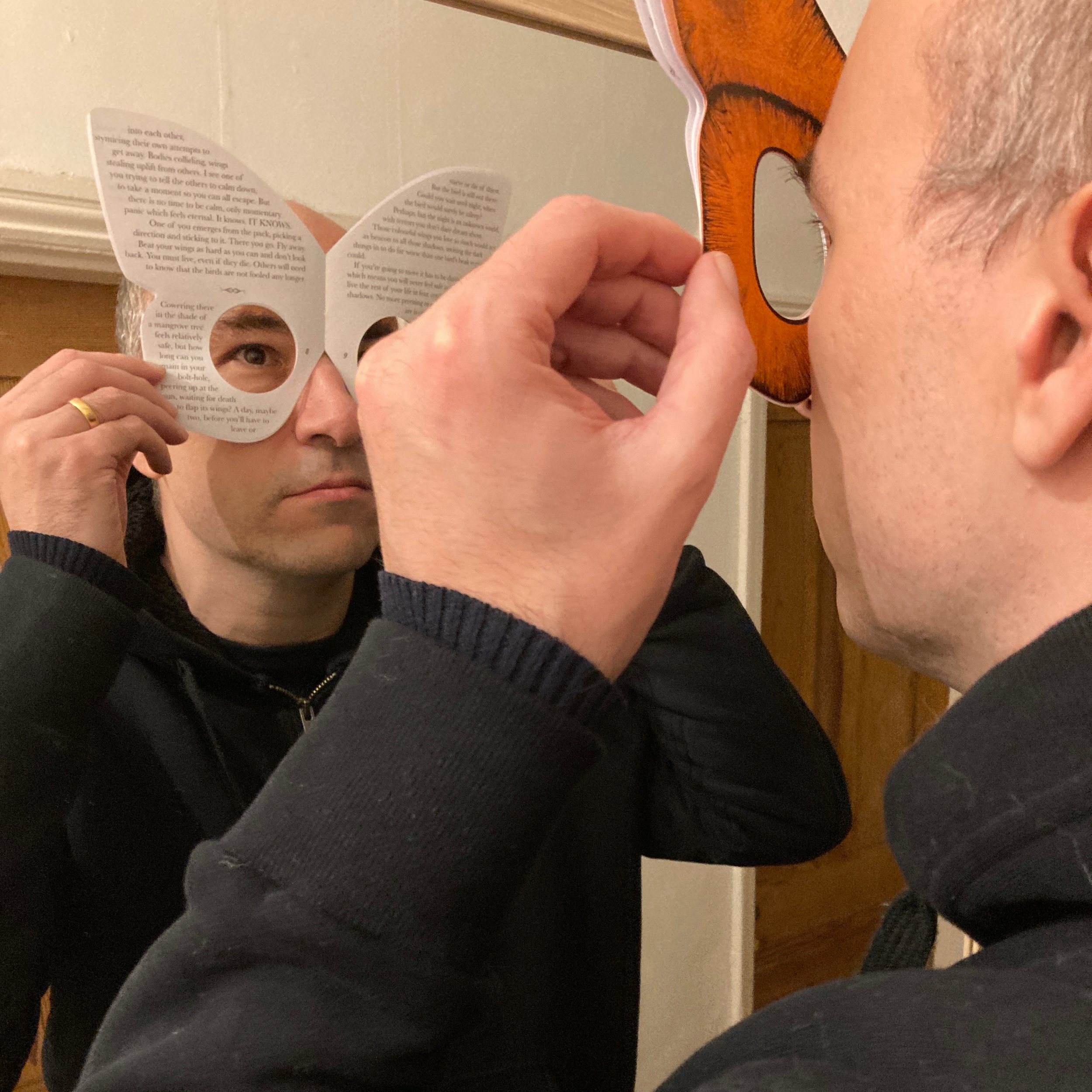
Paper / card
2023, 20pp, paperback
Overview
A short story printed on a mask which must be read in a mirror.
Background
Butterfly Mask started as an expansion on some of the ideas presented in Oubliette, namely that of mirrored text and an uncomfortable physical process to read the story. Rather than using an implement like a dental mirror, I thought it would be interesting to have the story on the reader’s face. Obviously, you can’t see through the pages so cutting holes out would be necessary.
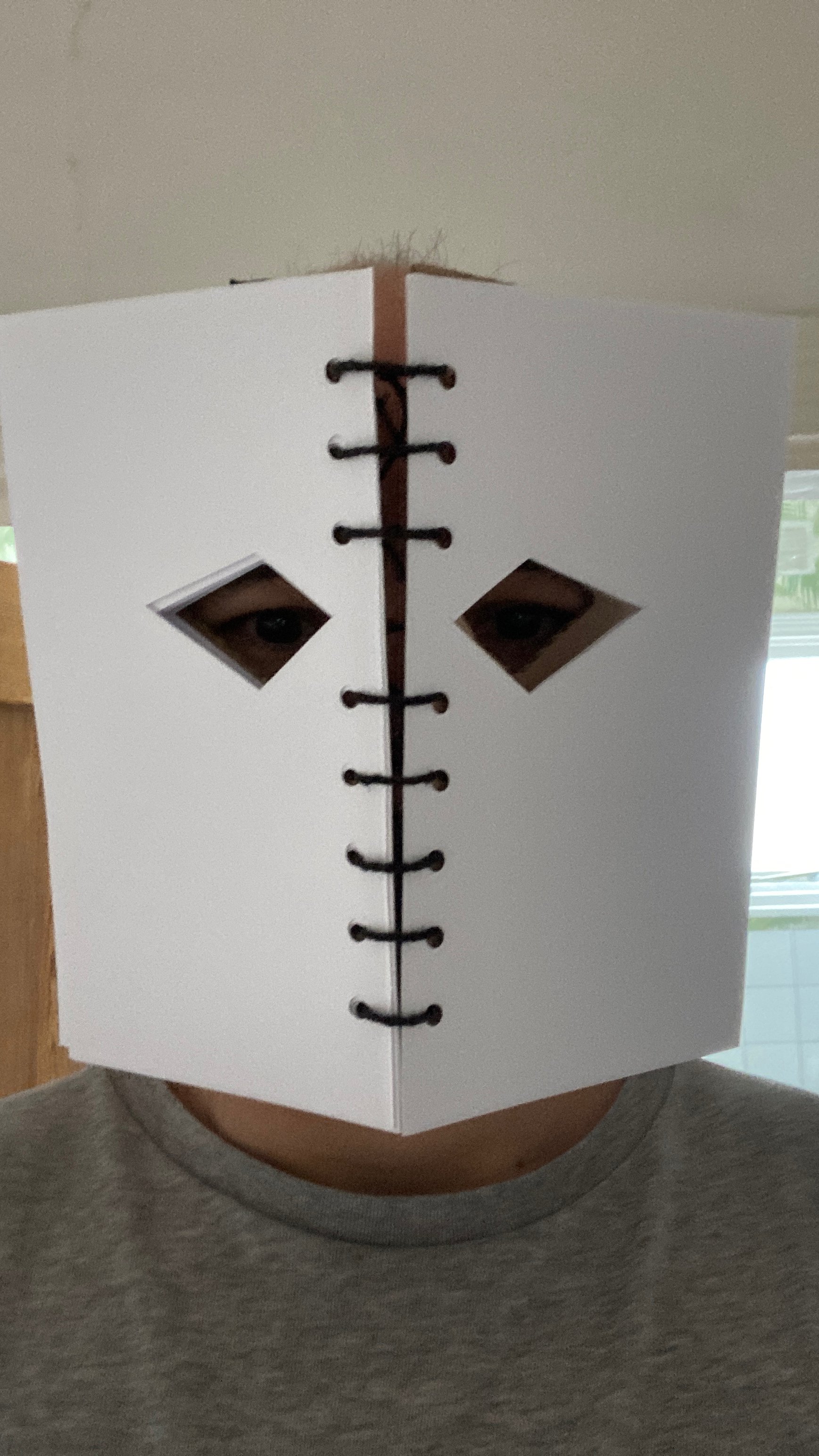
A rough prototype was made out of scrap paper and something about the blank face that I saw put me in mind of classical horror film bogeymen like Michael Myers and Jason Vorhees. I didn’t really want to write a horror story, though - at least, not one like that. Further experiments pulled me towards the ideas of camouflage and I found myself thinking about the deceptive wings of butterflies, which represent themselves as the faces of big, scary creatures to scare away predators. I thought the process of looking at oneself in order to read this story could have an interesting side-effect on the text. Rather than the text being out there, on a separate plane, it would be one’s own reflection, the face that you’re wearing to the outside world. Furthermore, there was the opportunity to do some playful stuff with the narrator - the ‘you’ of second person perspective giving way to the ‘I’ of first person as the story progresses.
Although the prototype was a plain book, I got it in my head to form it in a form more like that of a butterfly. This proved to be a pretty stupid idea. At first I wanted the text to flow on non-straight lines and spent a loooooong time setting text on various different arcs which were supposed to look like butterfly wings. They didn’t, and just looked crap. I then allowed myself the benefit of straight typesetting, albeit in a butterfly-shaped text frame, with the words flowing around the eye holes. The first versions had these towards the top of the page, but moving them to the bottom allowed for the curve of the wing to form a more natural shape for the reader’s nose.

Although the basic principles had been set out in the early prototype, finding the right sort of binding was a time-consuming process. I really wanted an elasticated strap that would keep the book secured on the reader’s face, but this proved too difficult to work out. I just couldn’t get the right combination of materials that would stay in position, but also allow the pages to fall open and allow the reader to see them properly. The strap had to be abandoned, much to my annoyance. It is for the best. Masks can be hand-held and so are books. I tell myself this in order to keep the loathing at bay.
There was no way I was going to be able to cut this consistently by hand, so I used the Cameo 3 cutter for both the pages and the cover. I’m getting a little tired of this process, particularly as Affinity Publisher doesn’t allow for addressing the cutter directly, meaning lots of exported PDFs, which are then placed into another application, then sent to the cutter. It’s a bit of a convoluted method and I miss the Illustrator plugin I used to use. There’s also the broader issue of everything being quite computer-based. My attempts at hand-making things tend to be quite shoddy, though, so I think that’s going to continue for a while.
The end product is a lot simpler than I had in mind, although it does maintain the fundamental principle of the idea from first conception – that of reading through the book and relying on external perception for an understanding of self. The whole process took a lot longer than I would have liked, although this was partly due to personal factors in the second half of 2022. Had I known it would end up as a stapled pamphlet, I could have knocked it out a lot earlier. Possibly. It’s more likely that I had to go through all those iterations in order to get to the simple version. I’ve really got to learn how to start simple and stay there.
The Real Writers' Handbook
A small guide to all the things writers use as justification for not writing - notebooks, pens, sexual infidelity, that sort of thing.
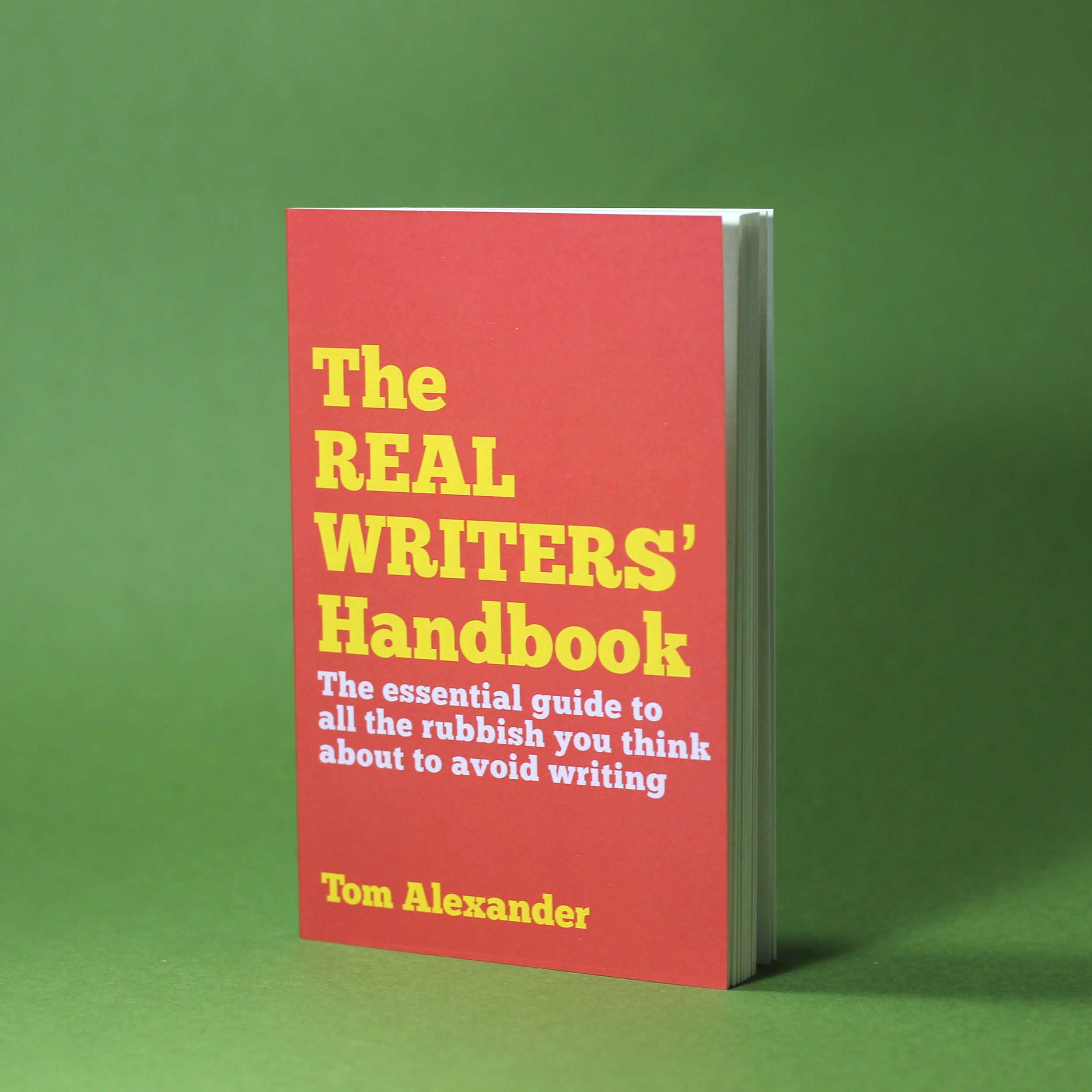
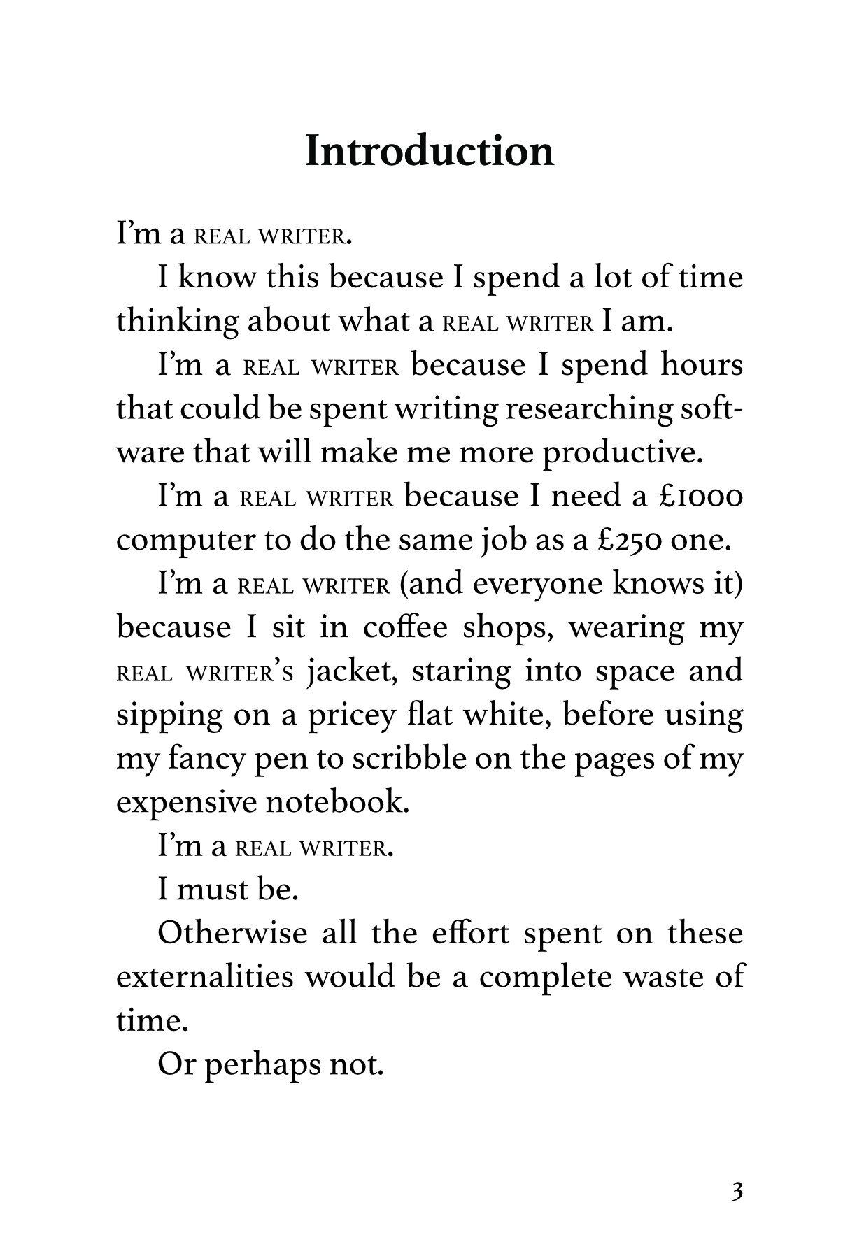
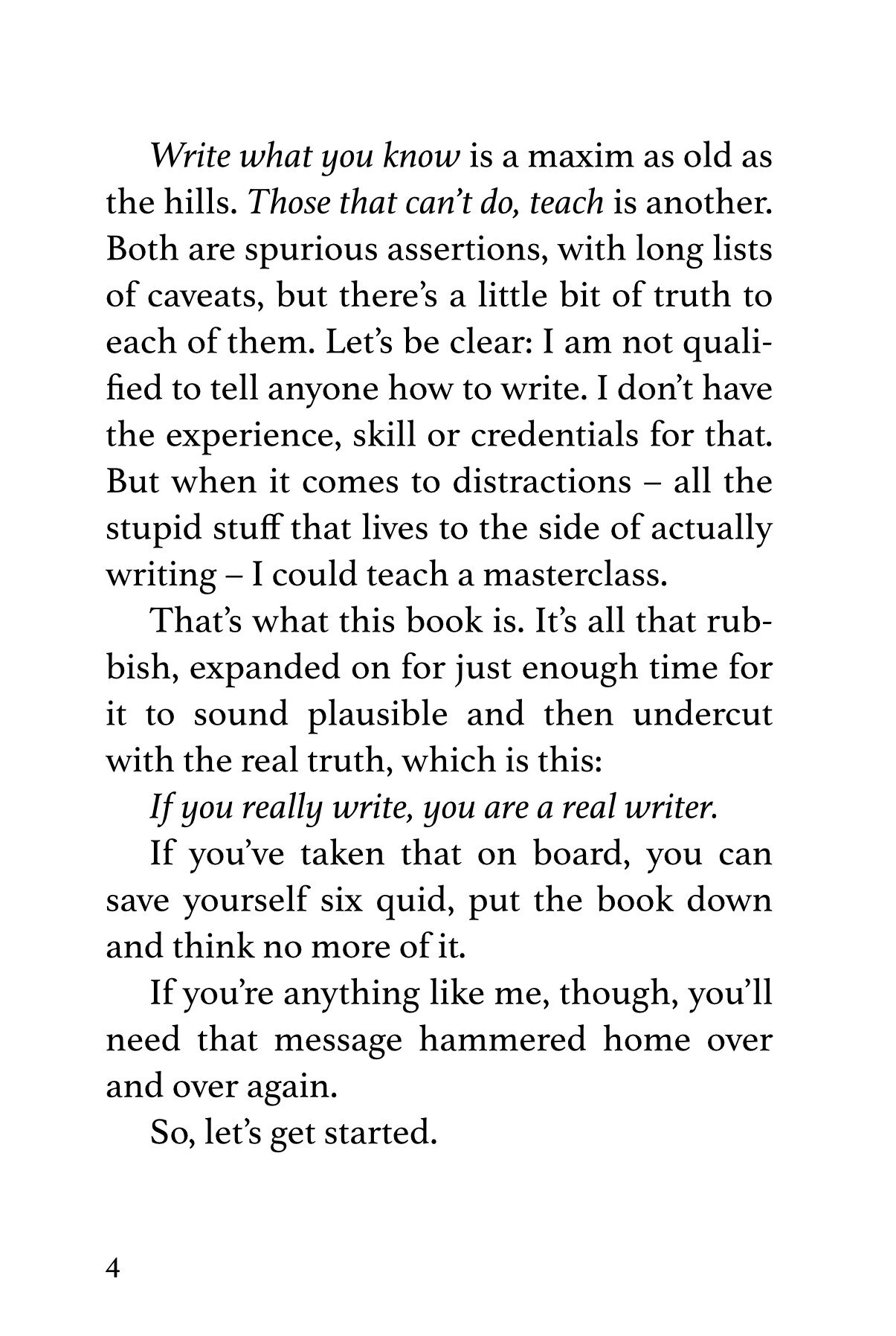
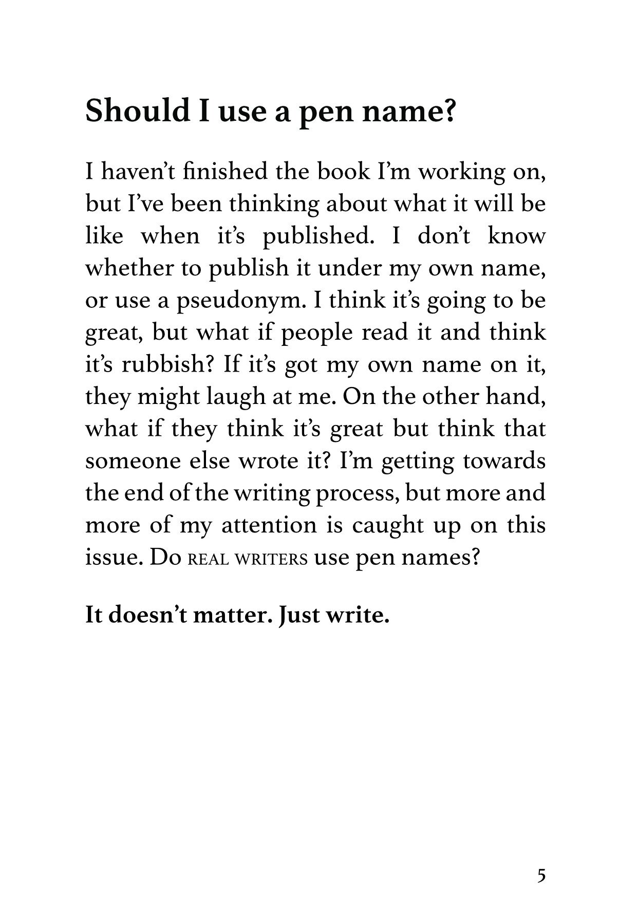
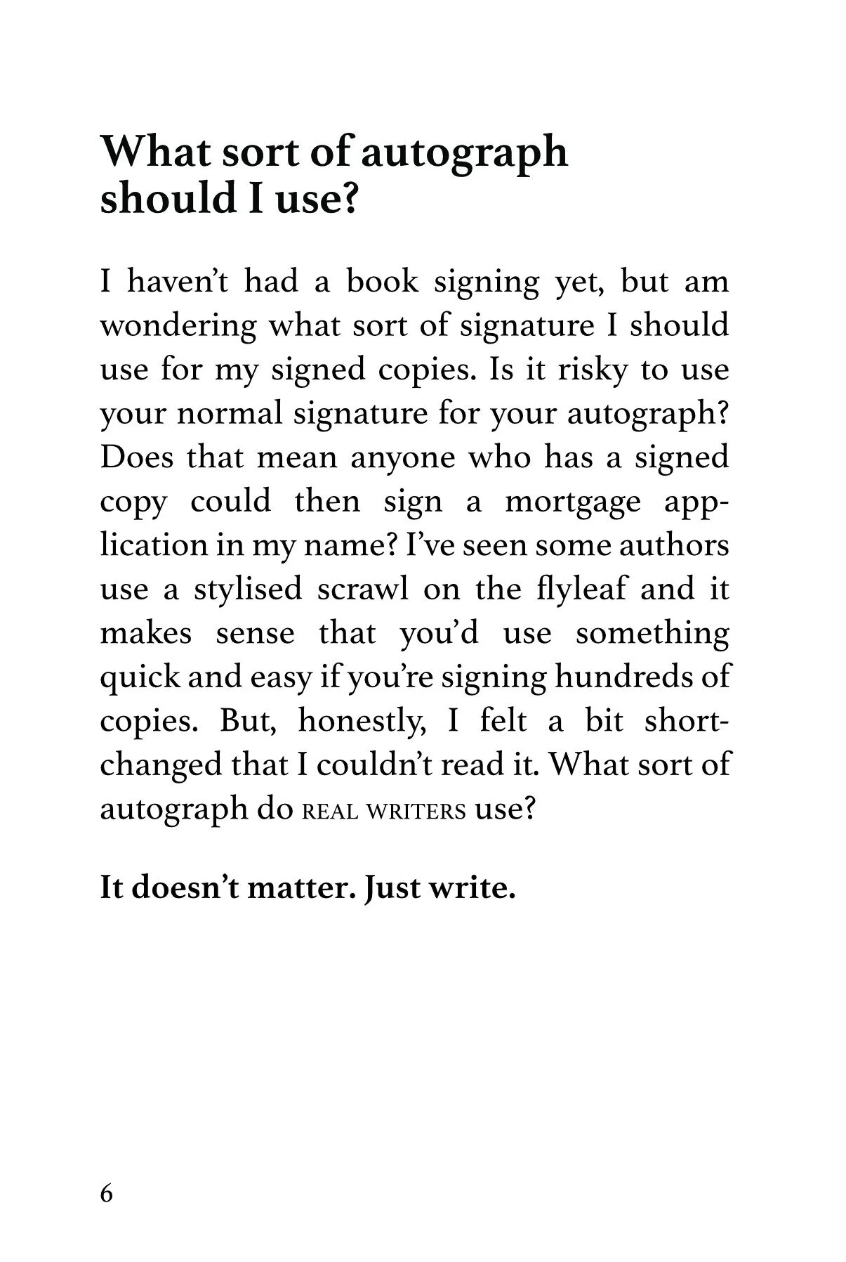
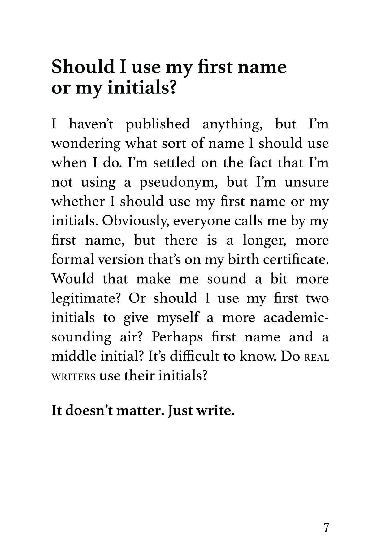
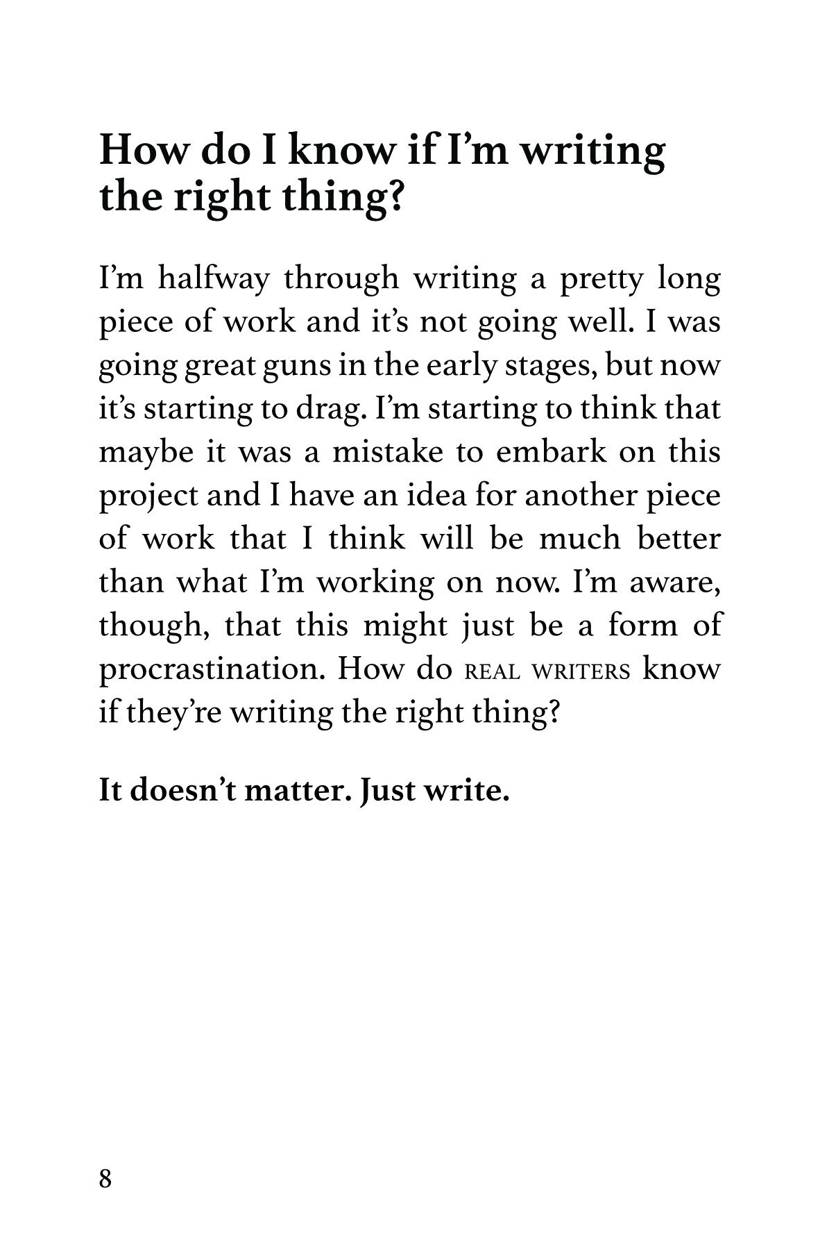
The essential guide to all the rubbish you think about to avoid writing, this pocket guide will transform you from idle dreamer to productivity powerhouse. (Not a guarantee).
Paperback, b&w, 2022, 101x152mm, 56pp
Overview
A small guide to all the things writers use as justification for not writing - notebooks, pens, sexual infidelity, that sort of thing.
Background
I’ve had a lot of long-running projects that, while not stalling exactly, have felt sometimes like they will never reach anything like an endpoint. Wanting to just get something finished, I blurted out this short How-To book, aimed at people like me who call themselves writers but often do anything but.
It’s basically a series of stupid questions, all of which have the same answer (It doesn’t matter. Just write.). Most of them are drawn from my own personal experience, when I’ve used all manner of excuses for not knuckling down and doing the work.
As the idea had been brewing for a while, I was able to put everything together quite quickly. It’s very short, so I did the first draft on Monday and had everything typeset and proofed by Friday evening. I used Ingram Spark (as I had previously on Forms) and the whole process reminded me of working in the production department at JKP. It’s the first time in a while that I’ve made an ebook and I had forgotten what a finickiy process that is.
Anyway, I think it’s a nice little book. If you know someone who writes (or claims they do) then it might make a good gift.
Writing.IE asked me to write an article about the book’s genesis. It’s almost all true. You can read it here.
Swiss Army Book
A small practical volume for the roving reader.
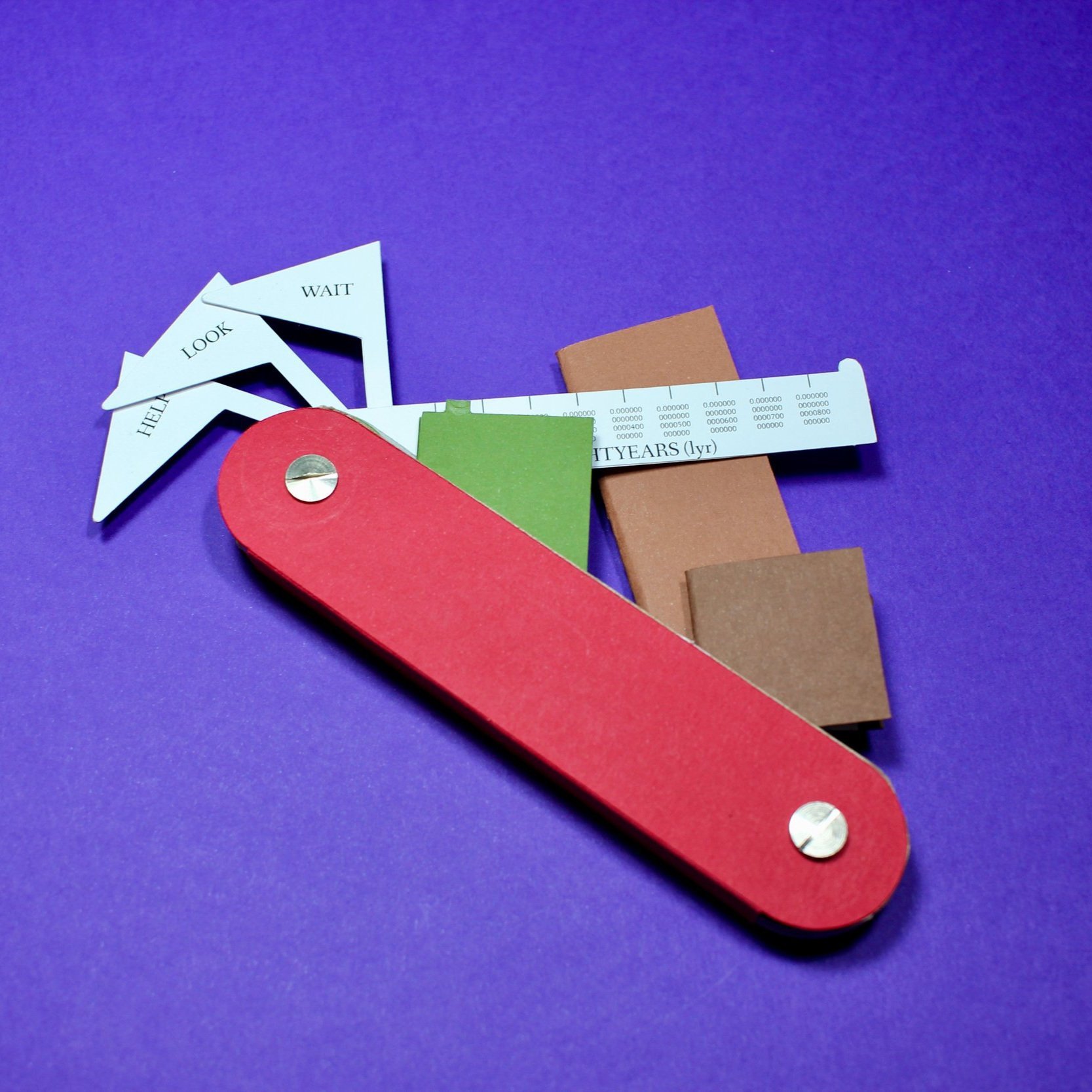
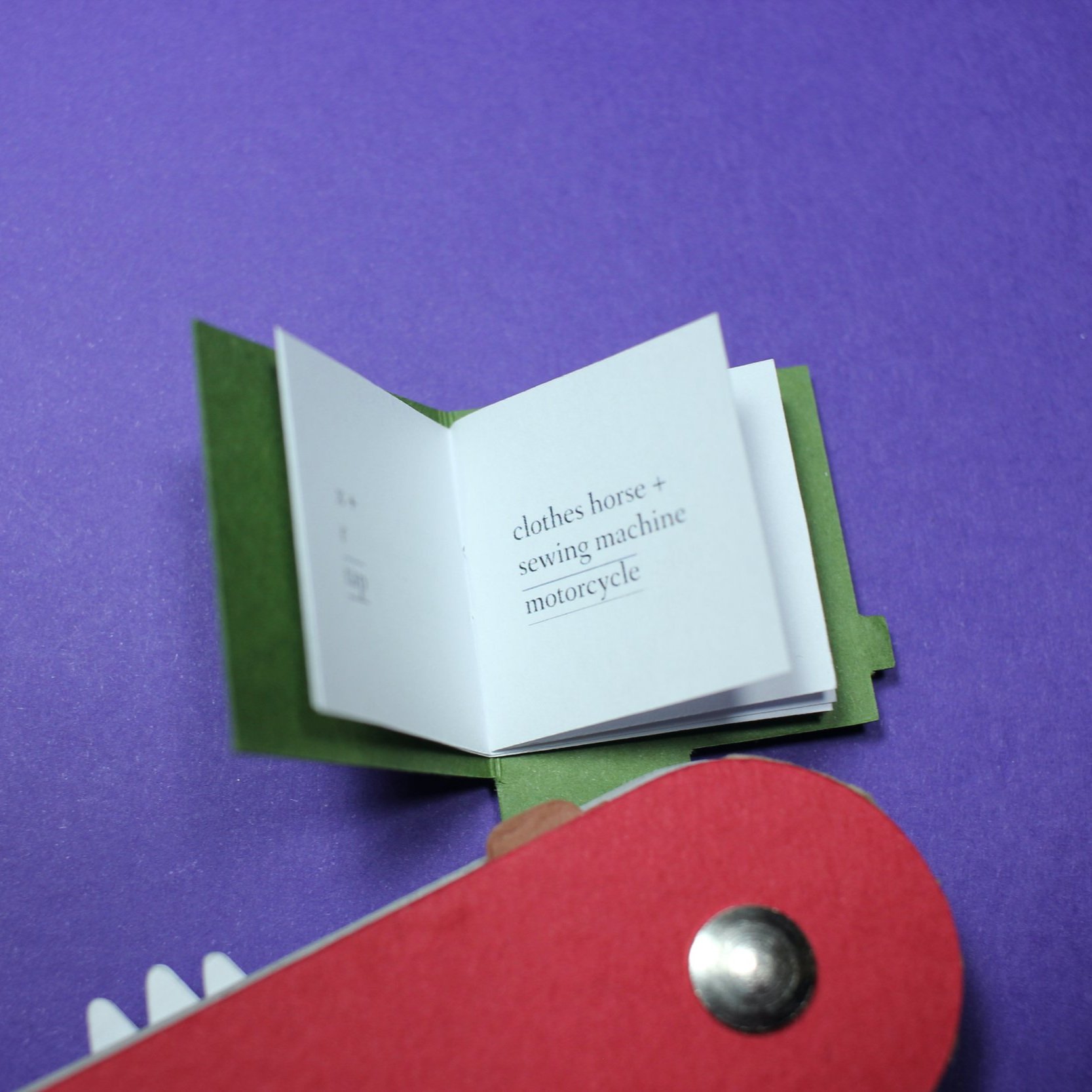
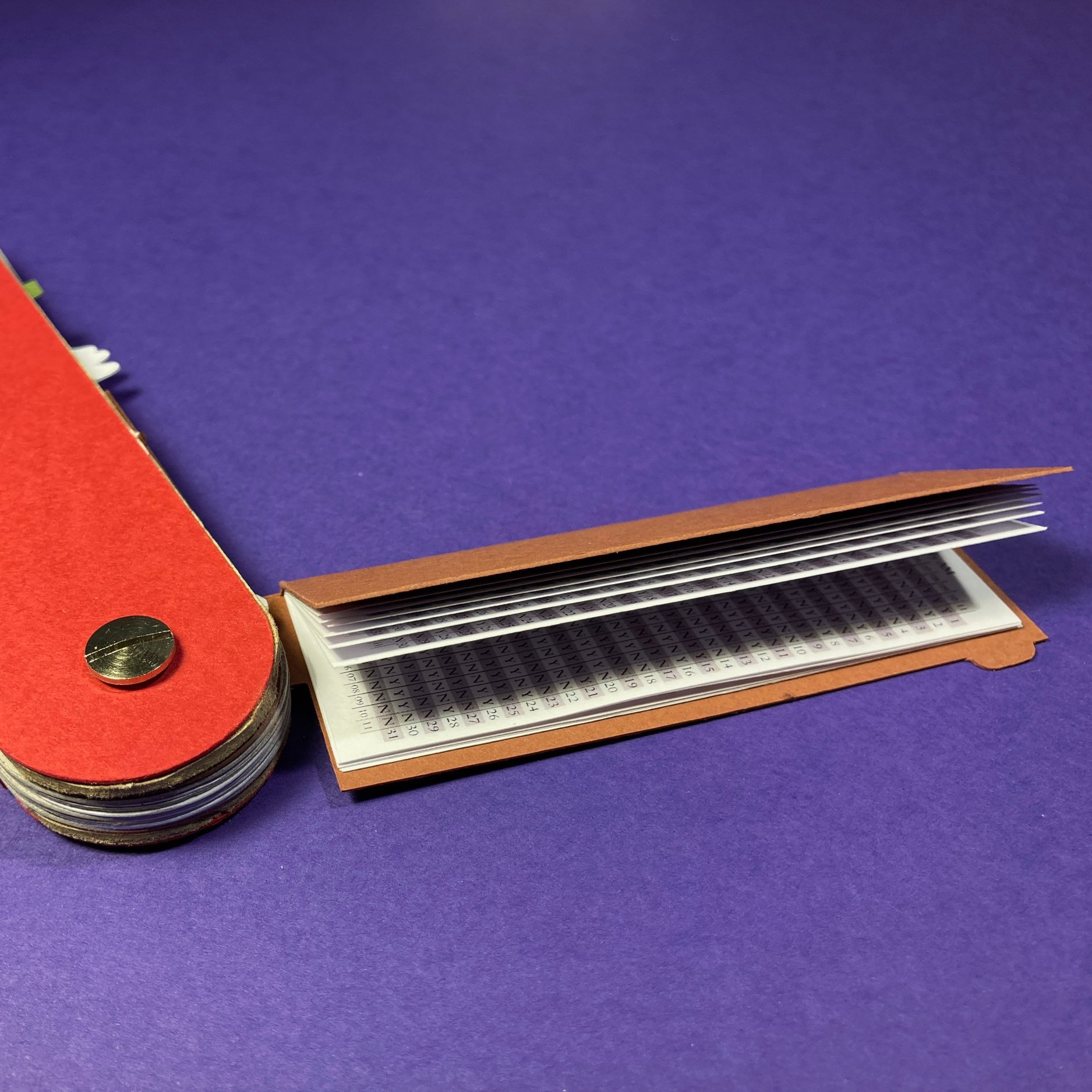
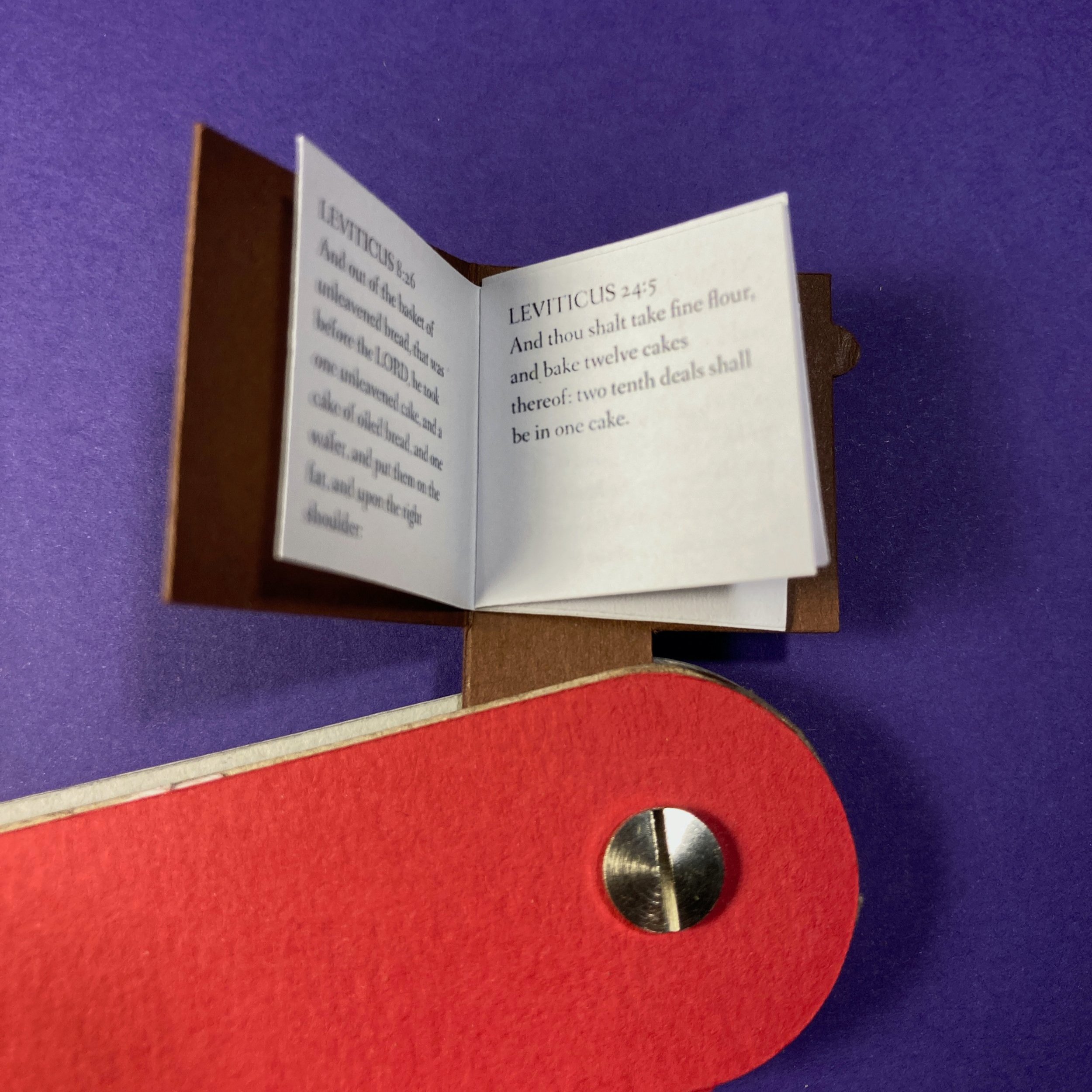
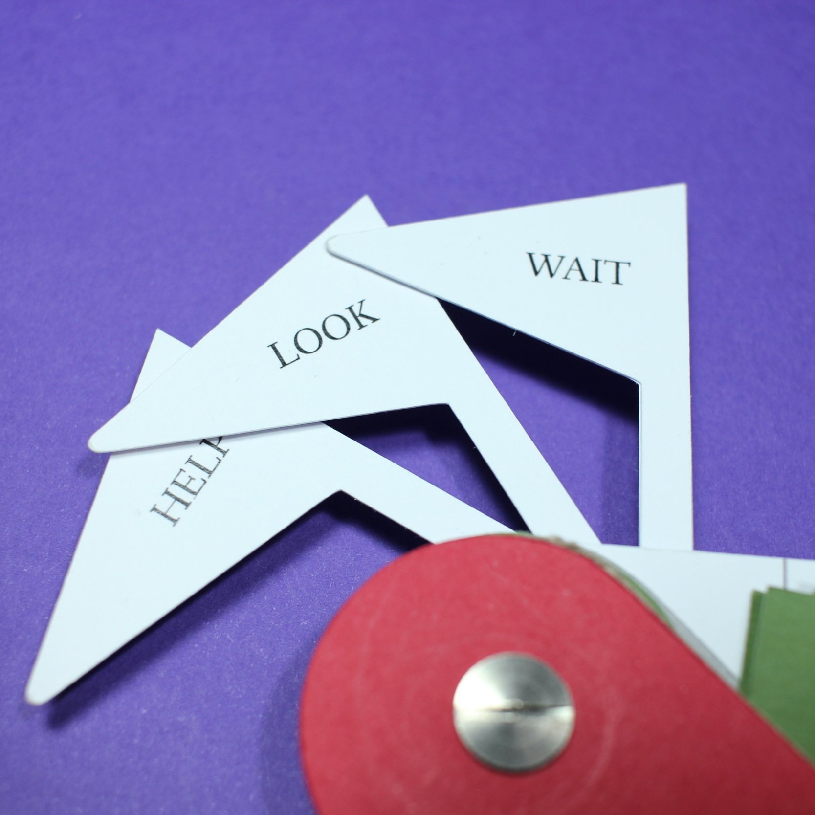
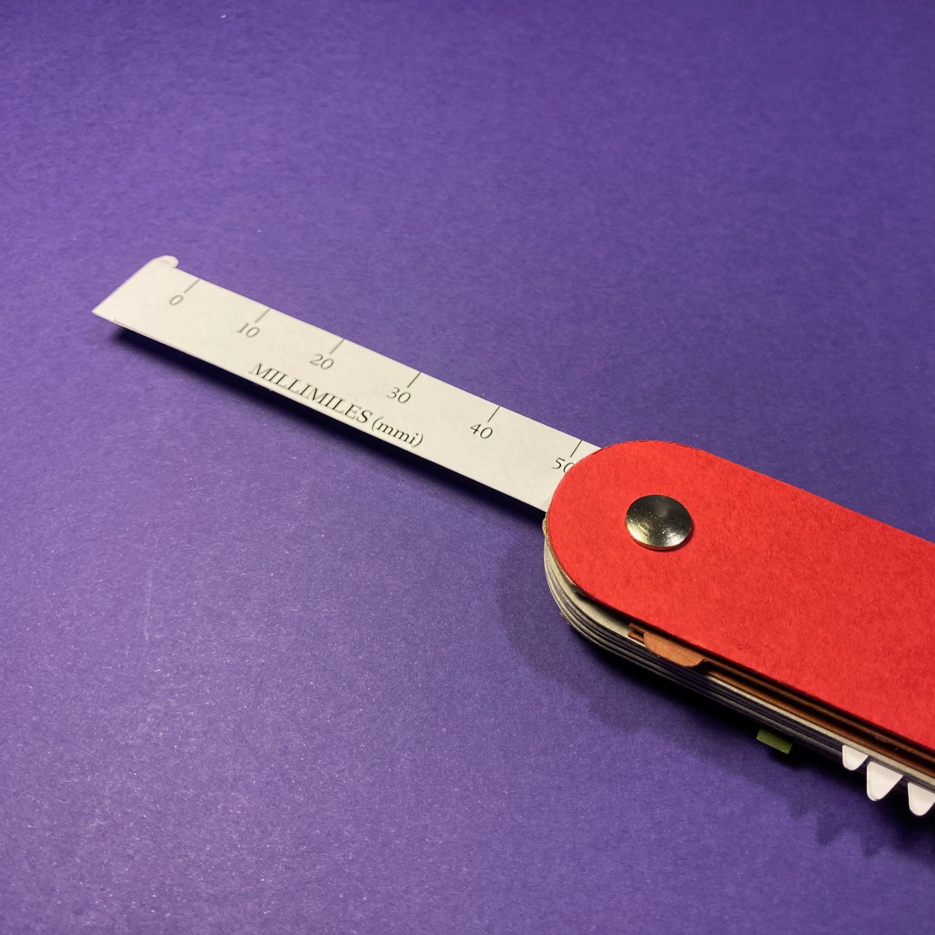
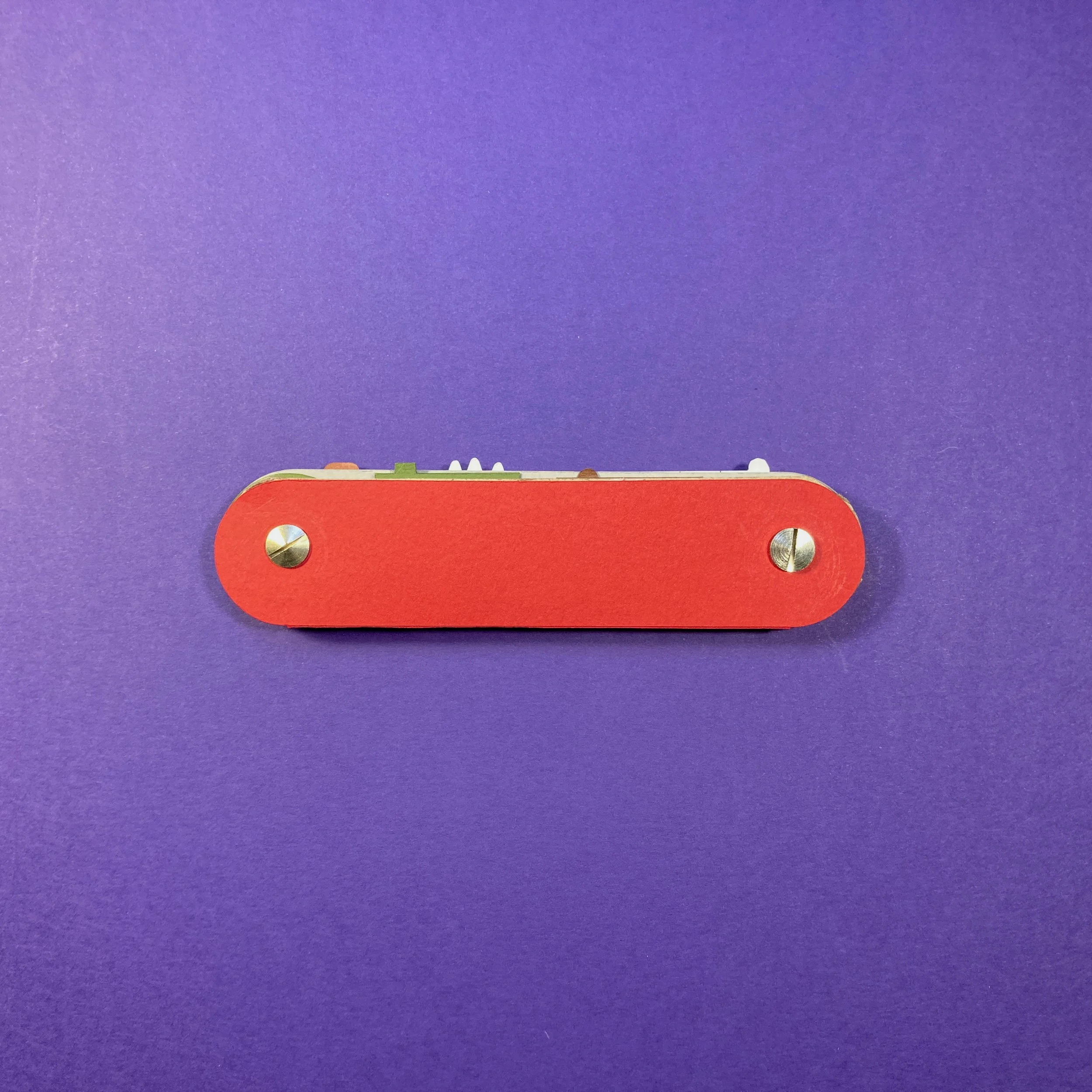
Paper/Card, 2022, 35 x 140 x 20 mm
Overview
A small practical volume for the roving reader, containing several useful texts and tools that fold out from the main body.
Contents
Yes / No Guide
Cakes of the Bible
Aggregate Objects
2-sided Ruler
Millimiles
Lightyears
Tiny Flags
Help
Look
Wait
Background
It’s rare that I remember how or when I have an idea - they just sort of appear. In the case of Swiss Army Book, however, I remember exactly how it came about. I had a period of quite intense anxiety at the end of 2021 and attempted all sorts of methods to try and ease the symptoms while working on the cause. As well as massage, shiatsu and acupuncture, I had a couple of sessions in an floatation tank. Bobbing around in salt water in the dark is… all right. I didn’t find it to be a life-changing experience, but it was quite nice. And while I was floating around in Epsom salts, I had a vision. Not of God, the future, or the interconnectedness of all living things, but a book shaped like a Swiss Army Knife. I emerged determined to make that dream a reality.
Having just made several pieces that were small and fiddly to construct, I wasn’t that keen on doing so again. Wanting to get a grasp on how the pieces would interact, I made a large version of what I had in mind, thinking that the ‘blades’ of the book would be around A6 size. It was immediately clear that this was stupidly big and, despite my misgivings, it would have to be much smaller. Not as small as a real Swiss Army Knife, but certainly of a more compact size. That first humungous version wasn’t a waste of time, as there are some things that you can only know when you have an object in your hands. As an example, that first version had the books spine-out, which made putting them away a problem as the pages would get caught up in the next compartment. Flipping it around so that the spines went into the body first made the pages close as well, making it a more pleasing motion.
(At this point I’ll be honest and admit that I did entertain the notion of a beautifully made hardback version of this book made of wood, leather and brass. After a few abortive attempts to casebind a 30x30mm book, I had to admit that such a thing was beyond my capabilities and conceded that paper and card would be the best materials for me to use.)
As I went about shrinking the size of the book, I also had to think about what would be in it. It was clear that a narrative story didn’t really fit in with the concept, so I thought about non-fiction ideas that could be implemented in a very small space. Just as the swiss army knife has an assortment of tools within its body, the swiss army book should cover a number of potential situations.
There were a false starts here, which were largely to do with issues of tone. I thought about Swiss mythology and entertained creating a history of the great gnomes of Europe, but it was a bit twee and not quite right. Thinking of books that a person might turn to when up a mountain, I thought about the bible. But, as I didn’t really want to make something that was either religious or actually practical, I tried to use it in a way that wasn’t actually useful, even to the most devout theologian. I searched the bible for passages that mention cake. (Originally it was bread, but there were too many of them.)
I also wanted something that would be a practical survival guide, but obviously not that practical. I also put together a set of ‘aggregate objects’ based around a simple 1+1=2 method, which I thought was adjacent to a survival, but not actually useful. After prototyping these, my partner suggested adding in the Yes/No Guide I had previously made as a small item for my mailing list. I also created rulers using impractical measurements and three very tiny flags. In time, I’d like to print these on rigid plastic, but I suspect I won’t get to it.
Construction was both simple and fiddly. I used the Cameo cutter to create the various pieces, but a few stupid errors here and there led to some wrongly-sized pieces, which was exasperating and led to a massive crisis of confidence until I saw where I’d gone wrong.
The final piece consists of 39 pieces, 8 different paper stocks and 7 separate volumes. The binding is two screw-and-post binders There’s a little bit of glue to make some things sit flush and nice, but for the most part it just relies on things being aligned. I think it came out all right.
Writers Write
A series of stories about writer’s block, contained in a recursively bound booklet.
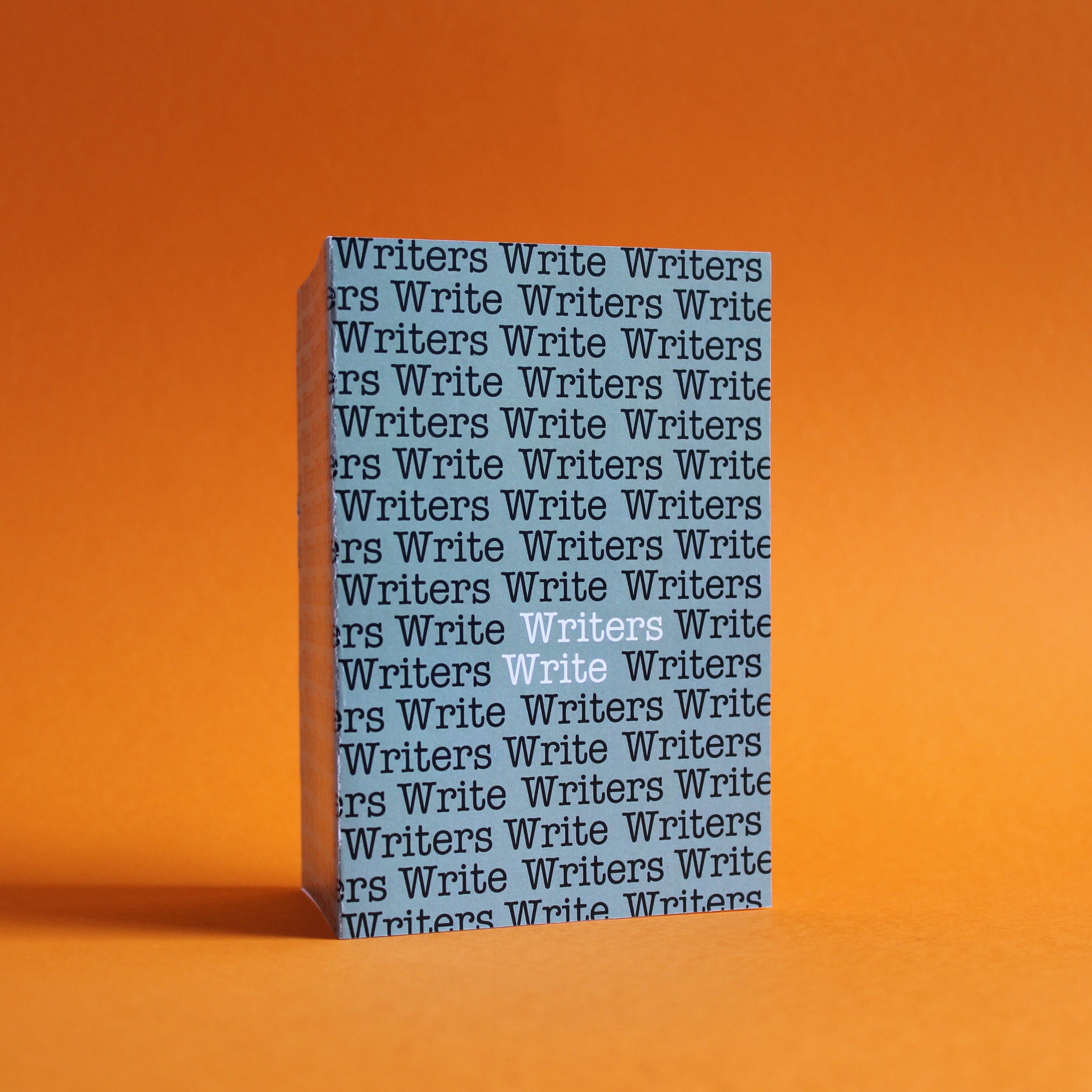
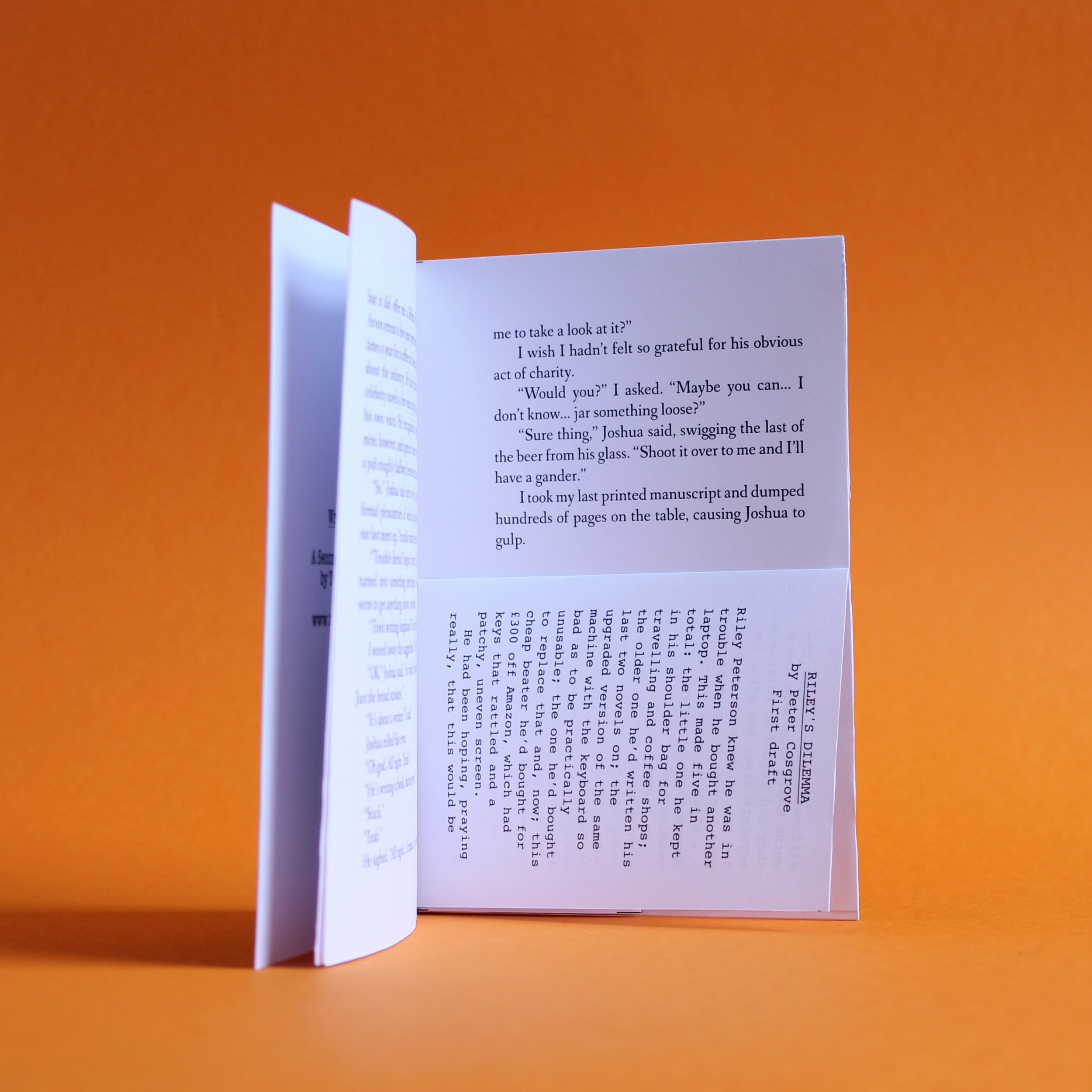
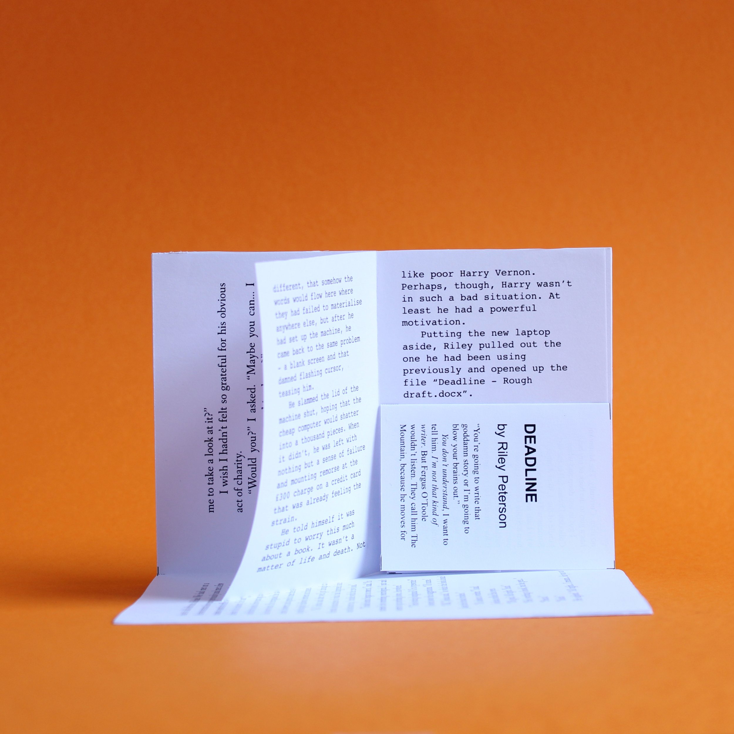
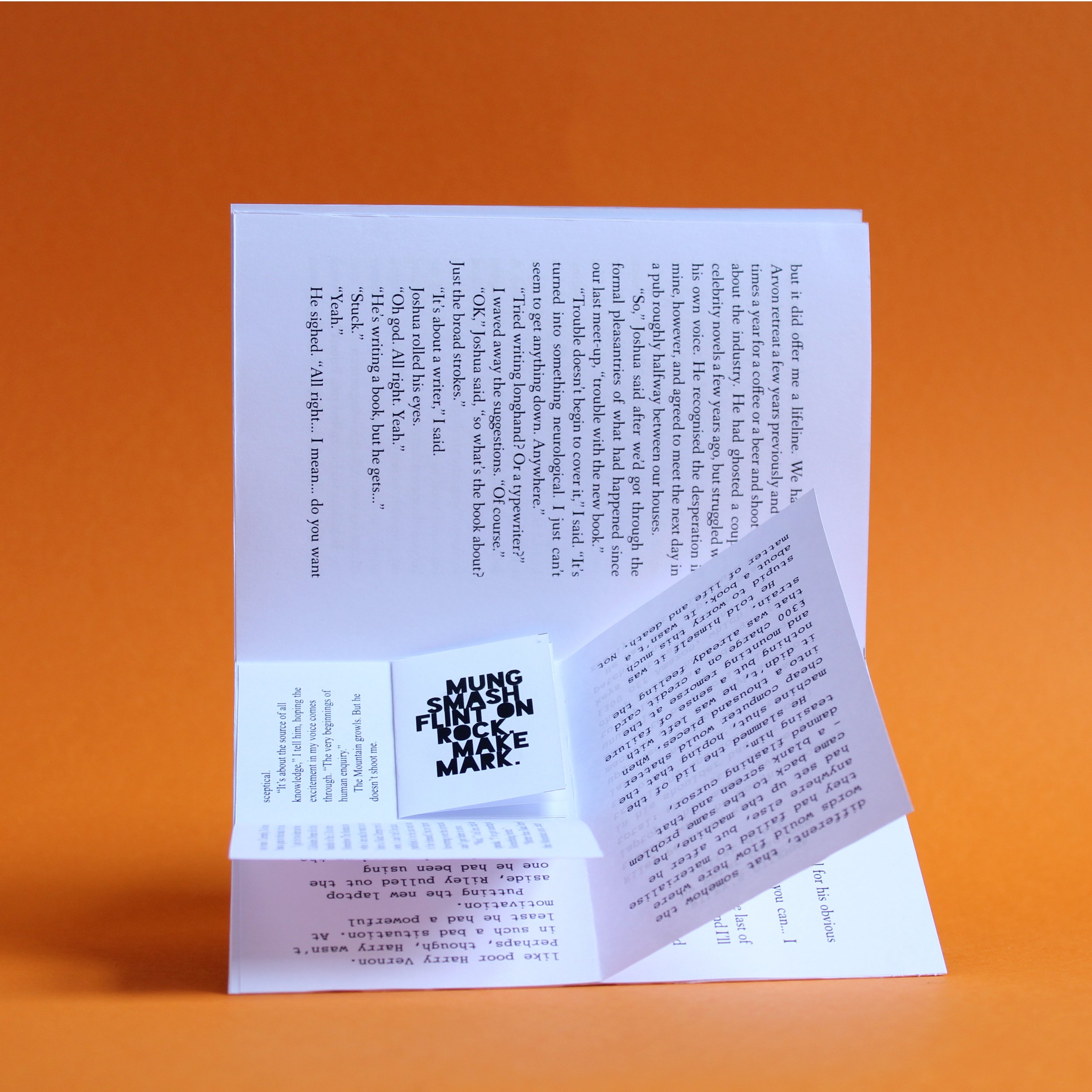
Recursive booklet, 105 x 148mm, 2022
Overview
Writers Write is a series of stories about writer’s block, contained in a recursively bound booklet.
Background
I had this idea a while ago and dismissed it because I thought it was disgustingly self-indulgent. Then I read Billy Summers and realised that some people had made entire careers basing stories on barely-disguised proxies of themselves, so figured I was joining a rich tradition. Furthermore, the edition I had in mind was just a few pages long, rather than several hundred, so I went ahead and made it.
The story is pretty much what it sounds like. One author struggling to write about another, who is, in turn, having their own difficulties writing their own story because that author is having difficulty… and so on and so on.
Praise be to the ISO paper sizing scheme, which makes this all possible. The booklet is bound by glueing the back page of the smaller booklet to bottom half of the recto in the centre spread. For someone who doesn’t like glue, I seem to be using a lot of it.
52 Murders
A collection of crime stories that was supposed to take a year to complete, but lasted for a decade.

In December 2011, I began a writing exercise. The plan was to write a new murder story every week and post them online for one year. I made this very clear when I named the project “52 Murders”.
I got just over halfway (to murder 27, to be exact), when I felt a bit burned out from the whole thing and took a break. I figured it would just be a week or two and then I would pick up where I left off.
It didn’t exactly go that way. It was nearly five years later when I posted a new story, only to drop the habit a couple of weeks later.
Then, finally, I got sick of this being an unfinished project and I told myself that I was going to finish them all off, even if they were the worst stories ever written.
They might be. I don’t know. I really can’t judge it objectively. But they’re done.
They are posted at https://52murders.wordpress.com if you want to read them. Below are some notes on the writing of the stories and the course of the project. I don’t recommend reading them without having read the acual stories first.
1. The First Time
Ugh. I don’t like this at all. It took me a surprisingly long time to realise that I shouldn’t try and write like I went to public school.
2. ’Til Death Do Us Part
Have no real feelings about this one. Meh.
3. Bitter Tang
Seem to remember this was the first one I quite liked, and not just for the mention of Tang in the title. I like ornery characters who don’t give a fig what anyone thinks of them and Captain Powell is definitely that. Suffers a bit from last-lineitis, where it’s clear the author is really pleased with the writing at the very end that they don’t want to go back and actually fix the story. (There’s quite a few of these in this collection.) Anyway. It was OK.
4. Last Christmas
My sister liked this one, perhaps because she was a nurse and appreciates what it’s like working on-call. As for me, I think it hinges on a pretty weak pun.
5. One In, One Out
Yeah, I can see what I was trying to do here. It’s the sort of experiment in form that I wanted to try, but I’m not sure it comes off. Again, it feels like someone who has never spent New Year’s in a club imagining what it’s like. Don’t get me wrong, I’ve been to clubs. I just don’t go out on New Year’s Eve. In my mind, the club is the Paradise Factory in Manchester, where my university flatmate Jamie used to be a manager. Why I didn’t just set it there, I don’t know.
6. Dr. Kenner’s Journal
John Carpenter’s ‘The Thing’ is one of my favourite films. The underlying tension and paranoia that builds throughout was probably what I was hoping for by setting this story in the antarctic research base. That and killing the huskies. In the original tumblr version I had a very subtle typographic difference in the two sections of the story, indicating that something had shifted somewhere. I don’t think the Wordpress version has that and it doesn’t matter, either.
7. All Of You Are Going To Get It
Violent flight of fantasy. Surprisingly well received.
8. Salt in the Wound
In the early stages of the project, I thought I would have recurrent characters coming back throughout the stories. I pretty much abandoned that when the project broke down. This means there’s a couple of threads that don’t go anywhere, which is either annoying, or just life. There’s something about the way DS John Durban actively seeks the mantle of unconventional copper who gets results that I sort of like, though. Rooibos tea. Honestly.
9. Safety
I don’t know. I guess it’s OK. The suburban swingers thing seems a bit overdone, but whatever floats your boat.
10. Full Disclosure
Feel OK about this one. A little uneasy about the parallels between it and other, real-life, ‘murder houses’, but that’s just how things are. The area mentioned is where my Dad used to live. I like the interplay between Perskine and Freddy Jenkins.
11. Hinged
This one’s bollocks. Trying to be too clever.
12. Post-its From The Fridge
Simple idea, which means I’m more inclined to like it. Maybe a few too many notes, but still. That’s my psychopathic handwriting on the notes. I seem to remember it was done digitally with a Wacom tablet for some reason. ‘I know what you did to my Onken’ is the line that sticks with me more than maybe any other in the whole project.
13. Programming Your Killbot
Two in a row that I quite liked. I know the language syntax doesn’t quite add up, but I am not a programmer, as has been demonstrated time and time again by my inability to grasp the necessary skills. The fact that MurderScript requires an explicit declaration not to slay the programmer seems like an oversight. Maybe it’s a feature, not a bug?
14. Parts and Labour
Some weeks I just had to write a story. This is one of those weeks. It’s probably quite clear from this that I know little to nothing about cars.
15. I Killed Moonbeam
Not great, but murder among the hippies is a good setting, I think. Probably didn’t do it justice, but that’s what happens when you only have a week to do it.
16. XP
Different kind of murder and perhaps it’s questionable whether deleting a digital avatar counts. I think I did just enough here to make the protagonist’s loss feel real.
17. Chicken
Nope. Didn’t like this when I wrote it. Don’t like it now. Annoyed with myself that I used the same accidental asphyxiation method in two stories without realising. I think the later one is better, but I might be wrong.
18. Blood Donor
This is fine, I think, right up until the end. The last line is hoary bollocks and I’ve a good mind to cut it. I’m hoping that the use of the word ‘asylum’ might give it a slightly heightened reality that makes this a little less offensive. But I’m kidding myself. This is bollocks. I’ll probably alter it if it ever gets put in print.
19. Breakdown
Here’s a confession - I never actually liked Choose Your Own Adventure books that much. My dad was really into Ian Livingstone’s Fighting Fantasy series, but I never took to them. Too fiddly and whatever. Anyway, they came back in fashion a while ago and a software tool called Twine makes it very easy to create your own. I mean, technically easy. Actually creating a branching narrative that makes sense and is satisfying is no small thing. I did not accomplish that here. For some reason, I made the code more complicated that I needed it to be, with lots of conditions that altered the overall flow of the story. This makes it more difficult to transcribe it to a printed form, or even a simpler set of anchored links so I can host it here. I’ve been meaning to do that for ages, but I’m honestly not sure I ever will.
20. A Moment or Two
The central premise of this - that a few moments of conscious inaction is enough to make you guilty of murder - is quite an interesting one. The tone’s kind of weird here. I think I was thinking of the opening monologue from Paul Thomas Anderson’s Magnolia, which (apart from Aimee Mann’s soundtrack) was the only part I liked from that long-arsed film. I also had a weird, half-remembered image of a comedy series set in a sweetie factory made by some of the Pythons in my head as well.
21. Composite
Ugh. Hate this. Several reasons. Invoking Rashomon feels like such a hack move and I’m not clever enough to do anything interesting with it. The characters themselves seem pretty cliched to me. To cap it all off, there’s a recurring character who comes back at the end of the story, lengthening a thread I probably already know at this point that I’m never picking up again.
22. Local Man Gets Life
It’s short. You have to give it that. I was a big fan of The Onion’s ‘Local Man’ trope, so this is my version of that. Suicide into homicide gets used again, because I don’t have enough original ideas to see through a project like this.
23. Pathology
A counterpart to Dr Kenner’s Journal. Pretty much the same deal, if I’m being honest. If something’s worth doing, it’s worth doing twice, right?
24. A Brave Face
And this feels pretty similar to ’Til Death Do Us Part. I think you can see that the toll’s starting to show and I am really running out of fresh ideas. The recycling process isn’t so much trying to get things right the second time, but instead that I’m floundering and going back to things I’ve already done. Actually, this also feels like Safety as well. Oh dear.
25. In Conversation With Albert Bassom
This feels like the last good story of this first batch, after a bit of a dry spell that’s about to peter out. I like the conversational format and the idea of a professional Journal of Murder is quite nice. Probably goes on a bit too long, but these sorts of articles do, don’t they?
(I like the names in this one. De La Croix, Petit Ganache, Henri Larochelle. Gregory Hastings, Tibor Sienkiewicz. I thought there was a nice mix of realistic and ridiculous. What kind of horrors has Petit Ganache been up to?)
26. Digging A Hole (Again)
I don’t miss hangovers. At all. Particularly when you have to work. I never had a job digging graves and I know that filing isn’t anywhere near the same level of stress, but that feeling of trying to get through the morning without puking in your own lap was very familiar. The other thing that I don’t miss is not being able to remember chunks of the night before. I spent a long time thinking they were the fugue states of a psychopathic mind. Then I realised they were alcoholic blackouts. I empathise with Chas in this story. Honestly can’t remember if I thought he’d done it or not. Looking at it now, I’m giving him the benefit of the doubt.
27. Make Mine a 99
Named after a Fluke song, this story was the one that made me want to down tools and rethink the whole idea of writing these stories. I didn’t like the idea, didn’t like my story and hated every moment of writing and redrafting it. That should have inspired me to do something better next week, but instead I just stopped.
28. Written Out
I can’t remember what I decided to do instead of writing 52 Murders. I probably thought that writing a novel was a more sensible idea and perhaps I was right, but four and a half years later I didn’t have a novel and decided to go back to the project. This was supposed to be an acknowledgement of the delay and a way of kickstarting things on. I think it might also have been when I moved the project over to Wordpress, for reasons that now escape me, but probably had something to do with unified control panels. It marks another return appearance of John Durban, although he’s not named as such here, probably because I knew it wasn’t going anywhere. But it was him.
29. Inevitably, Crows
I like this one. As the title says, I felt a bit murgh about using ‘a murder of crows’, but I think it turned out OK. I like little Thaddeus and his kin.
30. Get Rich Slow
The podcast Serial was big at the time and I was playing off that. Written as a dialogue probably because I thought it was more like an audio drama. If I’d really wanted an authentic NPR, Vox Media feel to it, I would have cut them off and run narration over the top.
31. Three Windows
Mixed feelings here. In some ways it’s quite an earnest story and I like that aspect of it. What undercuts it is perhaps a lack of authenticity. The detail of American prisons and executions was gleaned from movies and I think it shows. This has some elements that work, but more that don’t. That’s kind of the hallmark of these stories.
This one was posted after another break, put on Tumblr over three years after the last one. I can’t remember why now. Perhaps I thought it was good. Anyway, the date on the Wordpress post is almost a year later.
32. Medici
This one is problematic. It’s really only when I look over the project as a whole that I can see some things clearly. The first thing that really struck me is that this collection as a whole is really white and pretty male. At the start of the process, I probably would have justified it with the fact that I’m a white male and that’s the perspective I’m writing from. That didn’t really cut it in 2011 and it really doesn’t cut it in 2022. The only stories in the collection that feature black characters in a central role are about hip-hop, prison and chicken. That’s just really, really, shitty and I’m embarrassed by it. None of the 52 Murders are deep - they’re designed to sketch a scene and then get it done - but the shallowness in this regard is a real problem. If I was starting now, I hope I’d come from a different place.
Medici was supposed to be a tribute to the magazines Hip-Hop Connection and The Source, which were a big part of how I came to learn about rap music as a teenager. As I got older, I felt hip-hop passing me by. The outright capitalism went to new extremes and, latterly, I found myself utterly disconnected from artists like XXXTentacion and Takeshi69, both sonically and in attitude. I found myself shaking my head and saying proper old person phrases like “that’s not music”. The story is again an attempt to tell a story through headlines and snippets, hoping that some subtext and narrative emerges through collation. But the world didn’t need another story about violent, money-hungry rappers. It conforms to the worse stereotypes about the culture as a whole. But, I wrote it and even though it’s not good, it remains in the collection — hopefully as an example to myself of how easy it is to fall into bullshit racial stereotypes.
It’s really disappointing that I didn’t see how bad this was, particularly as this was the start of the final push to finish the project. The fact that the murder count had stalled in the low thirties really bothered me. Although writing twenty-odd more stories seemed like a tall order (I used to have a lot more energy), I forgot the central principle of taking things one story at a time. Besides, it wasn’t really twenty stories from scratch, as I had a load of notes and drafts. I decided to finish twenty drafts, whatever they were, and just get it done. Medici was one of those, started earlier and decided to go forward with just in the name of momentum. Like I say, disappointing.
33. Apparitions
This didn’t quite come out right. I think we were watching that Nick Frost Ghosthunters series on Amazon and it reminded me of this old idea. I wanted something about a ghost being the image of violent death, but using it as a premonition rather than a past incident. Fudged it, but whatever.
34. Solo
In my defence, the lyrics are supposed to be terrible.
35. Picnic in the Park
Cold beers on a hot day with friend and music - it’s the stuff that Corona commercials are made of. I remember days in the park with plastic bags and a little speaker. The image of someone coming over and asking the group to please move on somewhere else came to me and then there was the twist at the end.
Of course, it’s not really a twist by this point. The thing about it being murder after murder is that they start being meaningless. This was part of what made me stop in the first place. People dying stopped being an abstract thing and the difficulty I had with bereavement made me imagine how much more difficult it would be to have violent crime wrapped around it. This was part of what made me stop the project for a while. I just felt guilty, like I was profiting off someone else’s misery. The thing is, I didn’t really know who and I wasn’t the only one in the crime genre. I don’t know. Maybe I sacrificed morals to gratify my own ego. In any case, the project rolled on.
36. He Killed Last Night
Some of these stories were cut down from longer drafts. This is one. I think maybe the longer version was better, as it mirrored Jim’s standup debut with that of Andrew (Specs). But it took a long time to go anywhere, so I hacked at it.
A surprising amount of my work is based on crap puns and wordplay. Perhaps it’s surprising to me and nobody else.
37. Classifieds
I probably had the famous London Review of Books personal ads in mind with this. Again, playing with the idea of a commercial infrastructure around what is usually a spur of the moment crime. It occurs to me that these could be in the back of the Journal of Murder referenced in 25 - In Conversation with Albert Bassom.
38. The Goon Sweepstakes
I had the rough idea for this based off Suicide Squad. When I was younger I thought the name sounded cool and dangerous and the idea of a group who knew they might well die on a mission lent itself to gallows humour. I didn’t flesh this out well at all and it’s basically a framework for two lists and an ending that comes out of nowhere.
39. Proposal for the Elimination of Rick Burgess
This had the working title Micromort, which is a measurement of the probability of death. I don’t think I managed to work it in anywhere, which was a bit of a shame. I quite like the format and the banal corporate notion of death, but think that I took the wrong tack. Instead of one lone nut, it would have been better to focus on the actual corporate decisionmaking that leads to a person being killed. I’m not sure I have the political acumen or the writing ability to do that, however, and I’d already done all the charts.
40. Serial Killer
Oh, the banality of evil. They live among us. It could be your next door neighbour. All that stuff.
41. Coach Trip
This quite-long story about a mother and daughter on a European coach trip has a few personal elements in it. My mum kept getting free holidays from companies, with the hope that if she was given travel and board free, she would pay for excursions along the way. She never did, as far as I could tell, and went to a lot of places for very little in her retirement. I went on one or two of them and my sisters did, too. There’s a weird dynamic that builds up on coach trips. Who’s noisy and who’s always late, that sort of thing. I tried to get some of that across in the story. The murder part is pretty tacked on to be honest, and it’s a regrettable case of ‘fridging’ a female character. Sorry Inga.
42. pith
I don’t write poetry, but appreciate the economy.
43. Trainer
Just a story to fill up a space. Again, had bigger expectations but in the end just had to write what came to mind.
44. Killer’s Tarot
I had a lot of big ideas about how all these disparate stories might tie together, none of which really came into being. One of them was that, just as there were 52 weeks in a year, so too were there 52 cards in a deck. The murders could be in suits and then you could make hands from them and… something. I don’t know. But the correlation of cards and crimes seemed a good one, so I bashed out this system of murderous divination, based on what I learned as a telephone tarot-card reader during my university years. There’s probably one too many example readings, but I quite like it and think the system makes as much sense as any of this stuff does.
45. Festa
This piece of catalogue copy originally had some artwork to go with it, but I didn’t have enough confidence to post it along with the text. Sort of Futurist, vaguely fascistic feeling artwork that I knocked up in Illustrator. Too many gradients for my liking, so I pulled it from the post at the last minute.
46. The Missing Piece
Second appearance of accidental asphyxiation as a means of death. Not a murder, per se, but certainly provoking feelings of guilt. I’d had the idea of murder-by-jigsaw right from the beginning, but couldn’t find the way to get it right. I wrote this when I was attempting a YA novella and was very much in a teenage frame of mind. It made me think of an old friend from school and what might have been on another timeline.
I don’t have a hole in my heart, although my first girlfriend did. Never date a writer. Or be friends with one. Or really associate with one at all.
I’m still thinking of maybe getting this printed onto a jigsaw puzzle. There’s places that do that. I’m just not sure it’s worth the effort.
47. Interview
Honestly, I think this is shit.
48. Union of Serial Killers Membership Form
This was an offcut from my book Forms, culled from the original set because it was a bit too murder-y for the funtime vibes of that collection of paperwork. But when I was grabbing anything I could to fill out the weeks, in it went.
49. Murder Myself
I think this was one of the stories that made me stop this project altogether. The idea of suicide as murder had been done before in Local Man Gets Life. This was just a more drawn out version of that. I think I lost my taste for it as a theme when someone close to me lost a sibling by suicide and I saw the absolute wreckage they went through. Not posting this story was probably the correct thing to do. But then time passed and I decided to use everything I had in the tank, whether I liked it or not, just to get the project finished.
50. Almost There
Another regrettable instance of a man killing a woman. Unfortunately, that’s the way it happens in the world most of the time. I’m not endorsing it, obviously, but I thought there was something deeply male about not wanting to live with the shame of attempted murder.
51. Last Dance
Believe it or not, this silly idea about a modern day necromancer with an iPhone was the basis of a novel and a screenplay that I worked on for a couple of years. I had an almost complete draft of each, but ran into plot problems after the introduction, so I just posted that as an extract that hopefully stands on its own. There was more in the beginning, but when I read the rough draft I realised that it was, essentially, the same as Watson at the crime scene in the Moffat/Gatiss version of Sherlock, so I binned it.
52. Just One More Thing
This was not meant to be the last story. There was an altogether more philosophical scene about how callous it is to write crime fiction when real people die all the time. But I chucked it when I found this stupid Columbo homage that I had completely forgotten about. I think I’m realising that I’ll go for silly over profound almost every single time.
So, that’s all of them. I’m glad it finally got finished, although I am somewhat embarrassed by quite a lot of the stories. I don’t think I’ll attempt a similar project again, although I probably would be better equipped to do it. I do wish I had been able to accomplish my original goal of one story a week for a year. I don’t think it’s impossible, but perhaps stories shouldn’t be rushed like this.
Anyway, better late than never, right?
Right?
Lazy Dog
A small text toy derived from the phrase “The quick brown fox jumps over the lazy dog”.
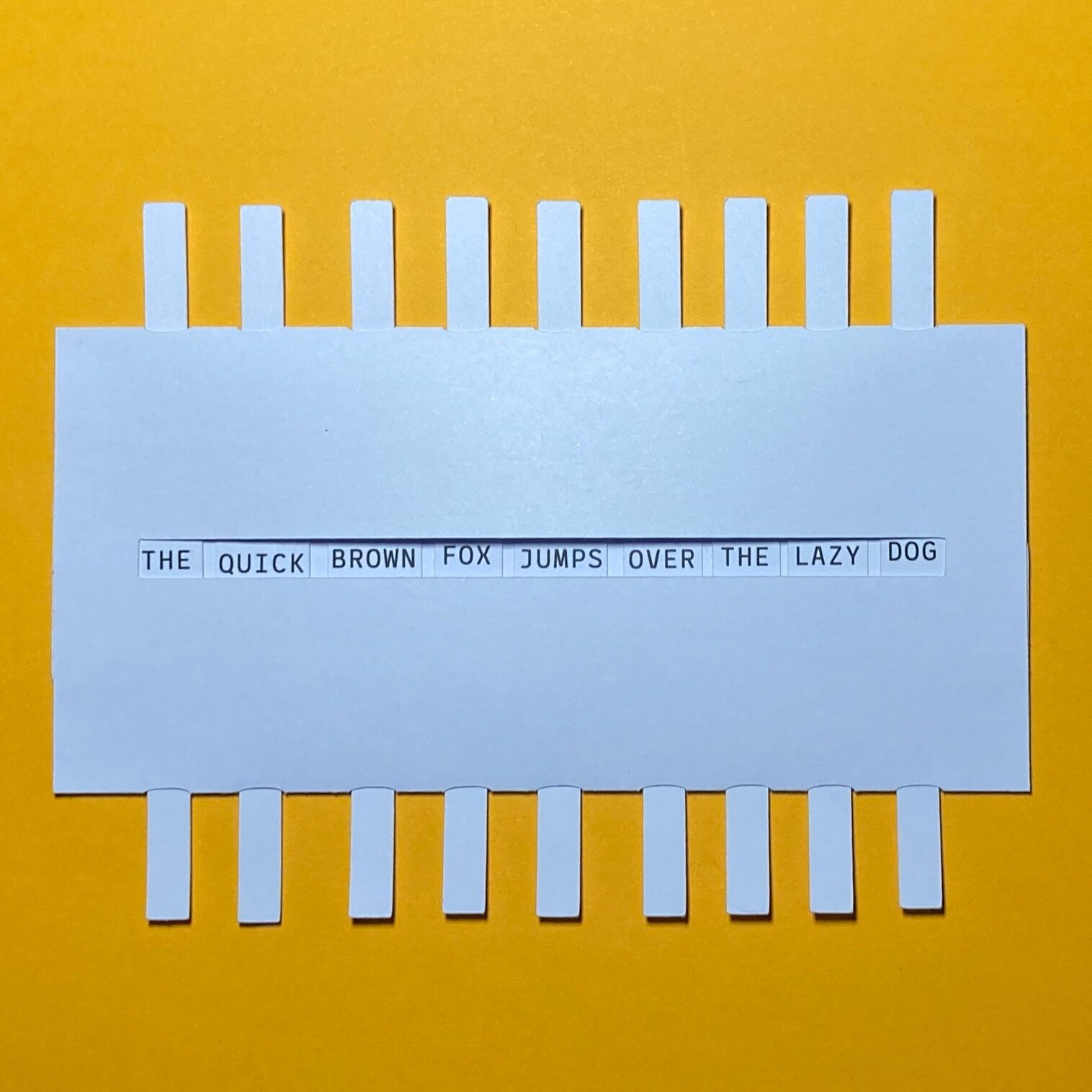
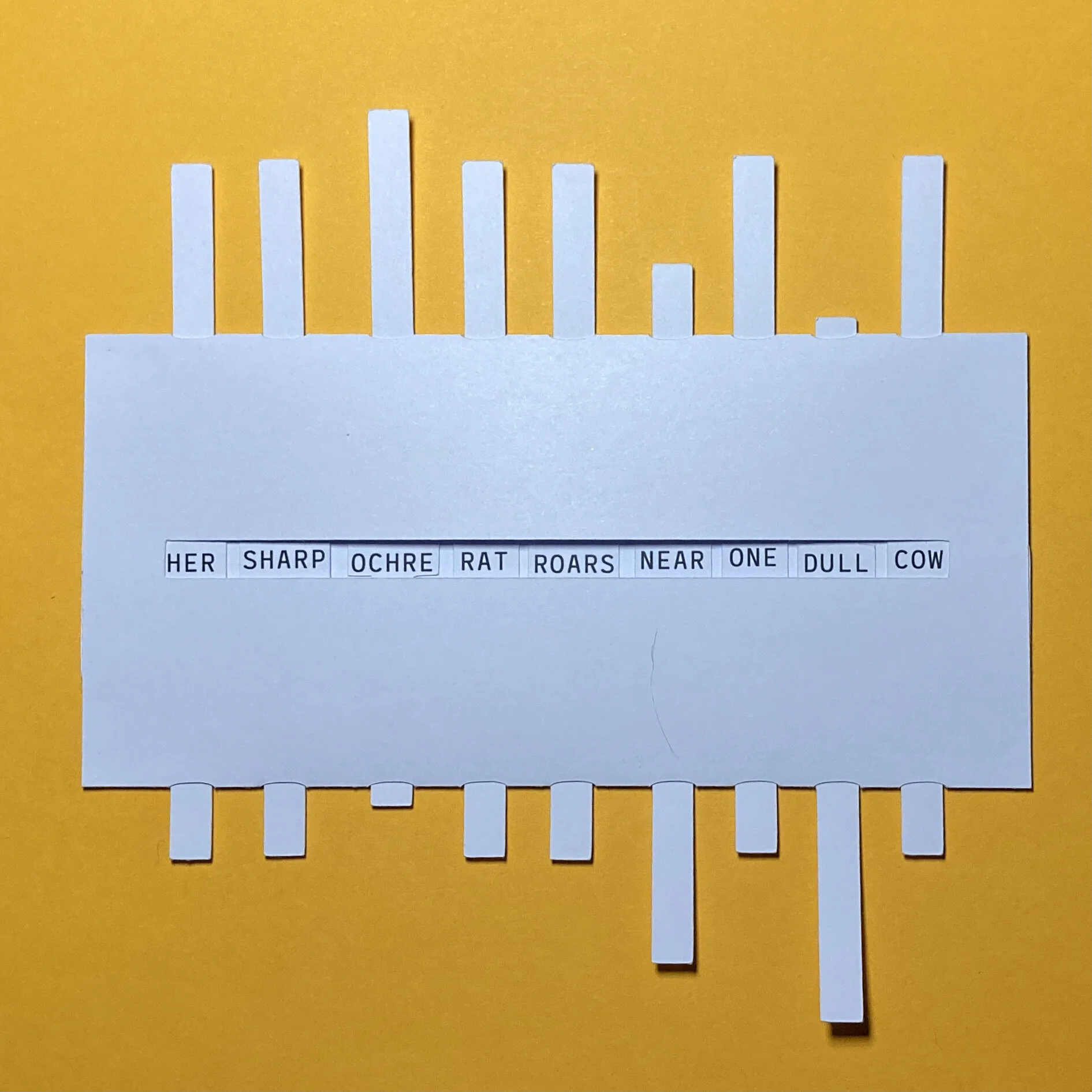
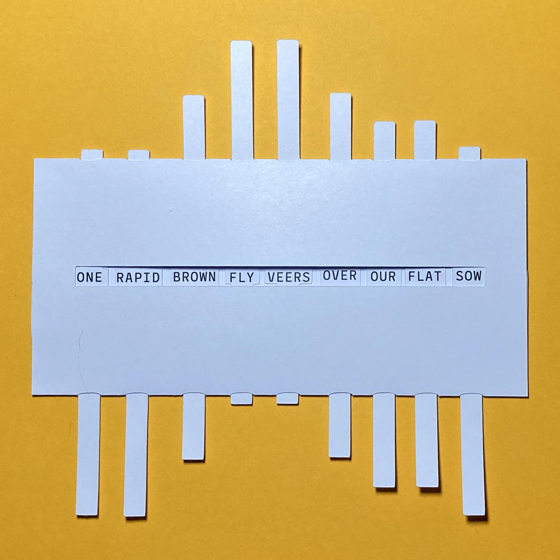
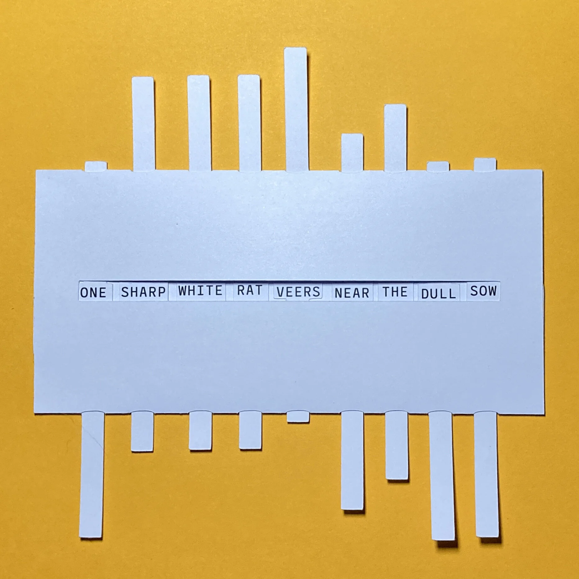
Card plaything, 115 x 150 mm, 2021
Overview
Lazy Dog is a small text toy derived from the phrase “The quick brown fox jumps over the lazy dog”. Readers push and pull the strips to create new variations.
Background
This started as a thought experiment, idly scribbling synonyms in my notebook for each words. Initially, I thought I could make it in to an interactive web thing, but then decided it would be more fun to make it out of card as physical object. Initially set in proportional type, I changed that to a monospace font so that each column could remain the same width.
Although nothing is taken from it directly, the book The Elements of Pop-Up sits on the bookshelf above my desk and probably got me thinking about push and pull strips.
Coarse
A ‘reverse Pygmalion’ on sandpaper.

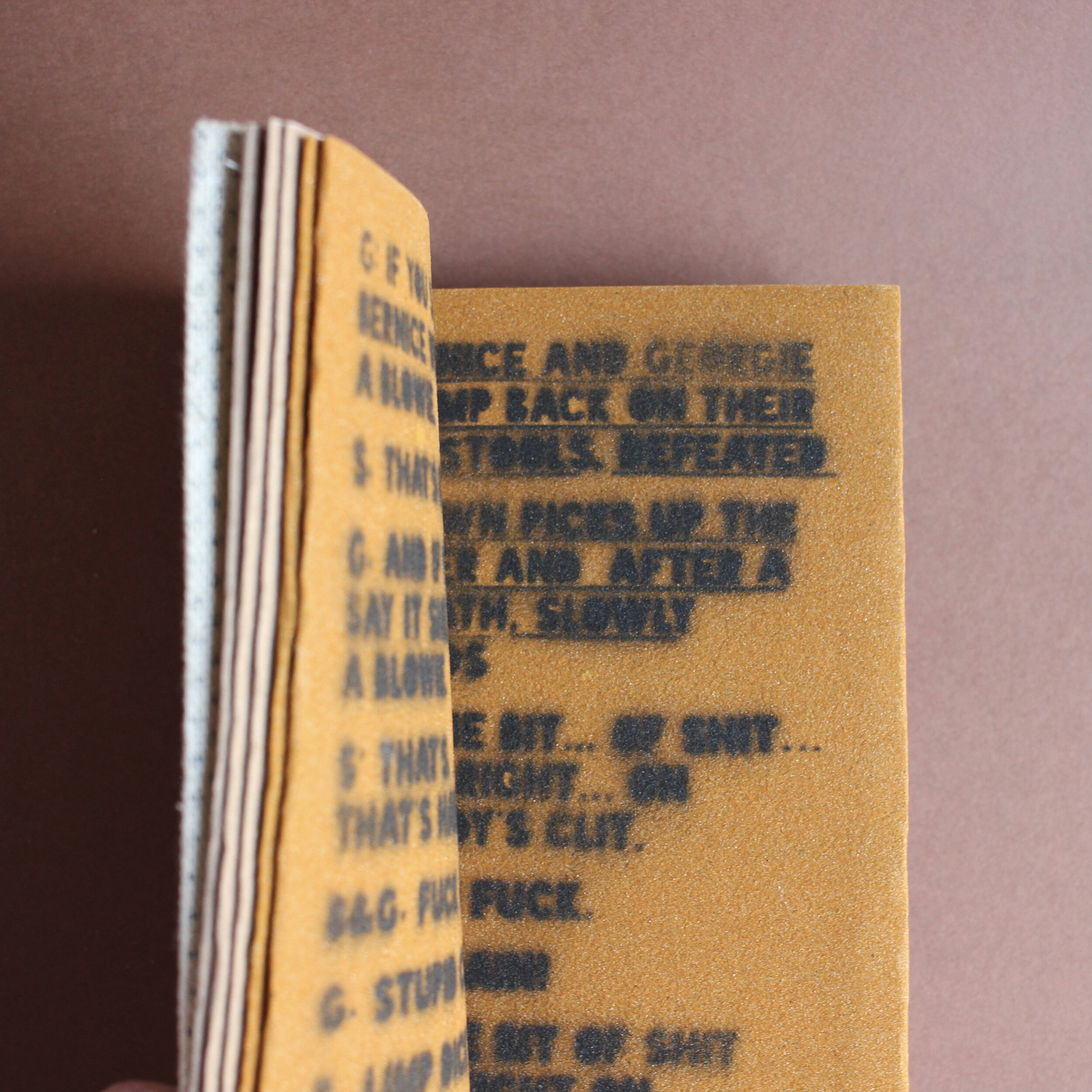
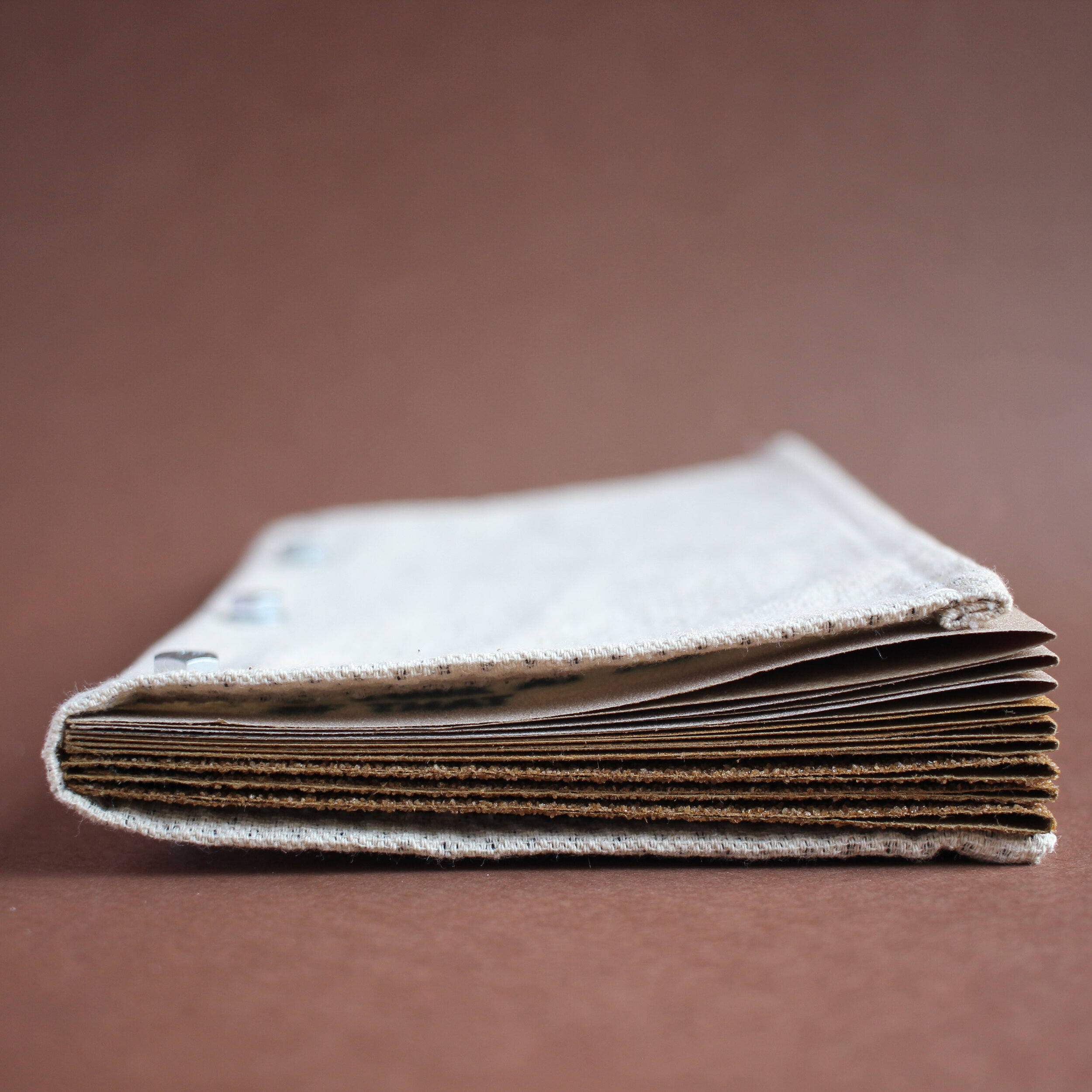
Playlet script, spraypaint on sandpaper, 18pp, one-off, 2021
Description
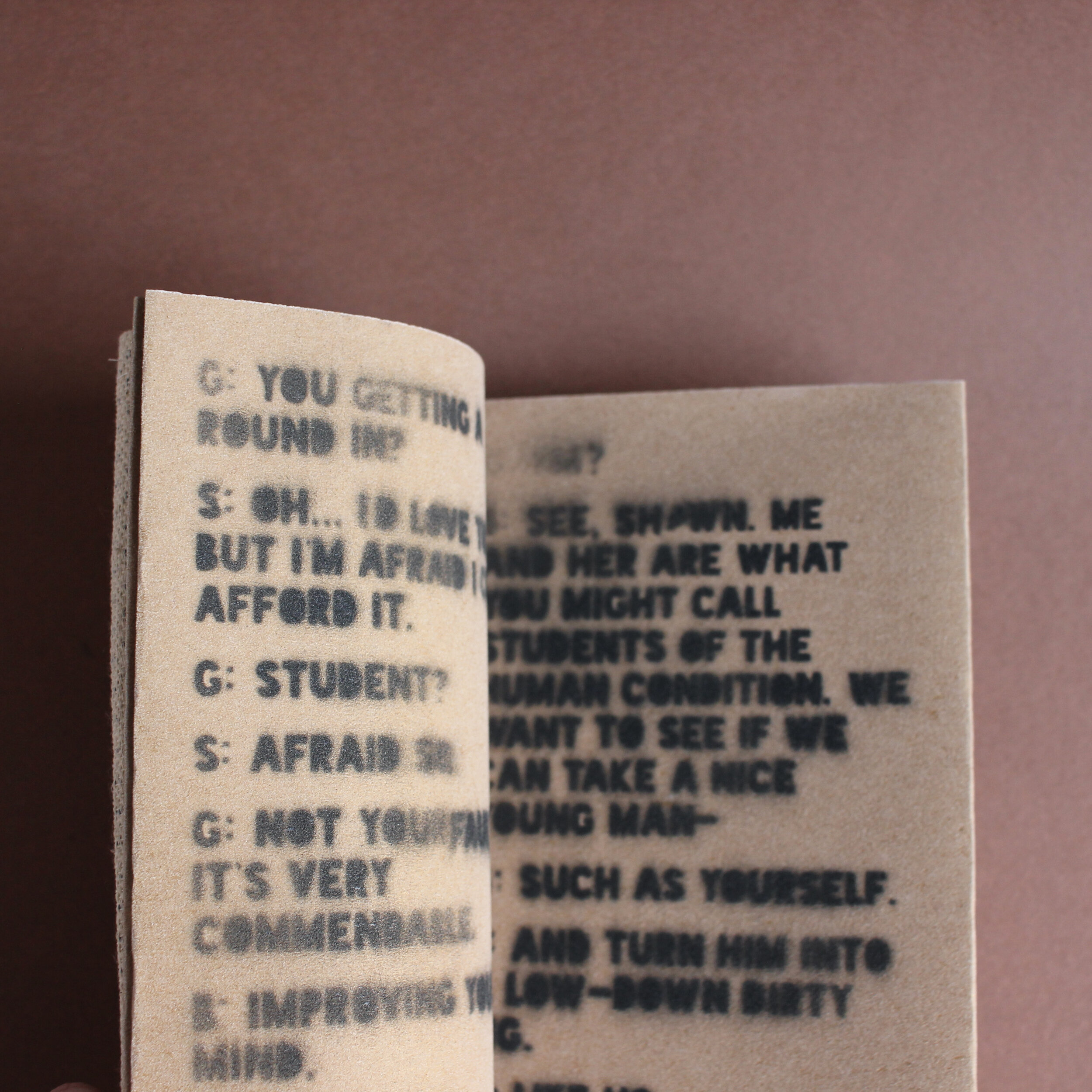
Coarse is a three-scene 'reverse Pygmalion' - a playlet about turning a nice person into a filthy animal. The pages are made of sandpaper and the text is printed via spraypaint and stencils. As the characters descend into squalour, the pages become coarser and the words are more difficult to read.
Background
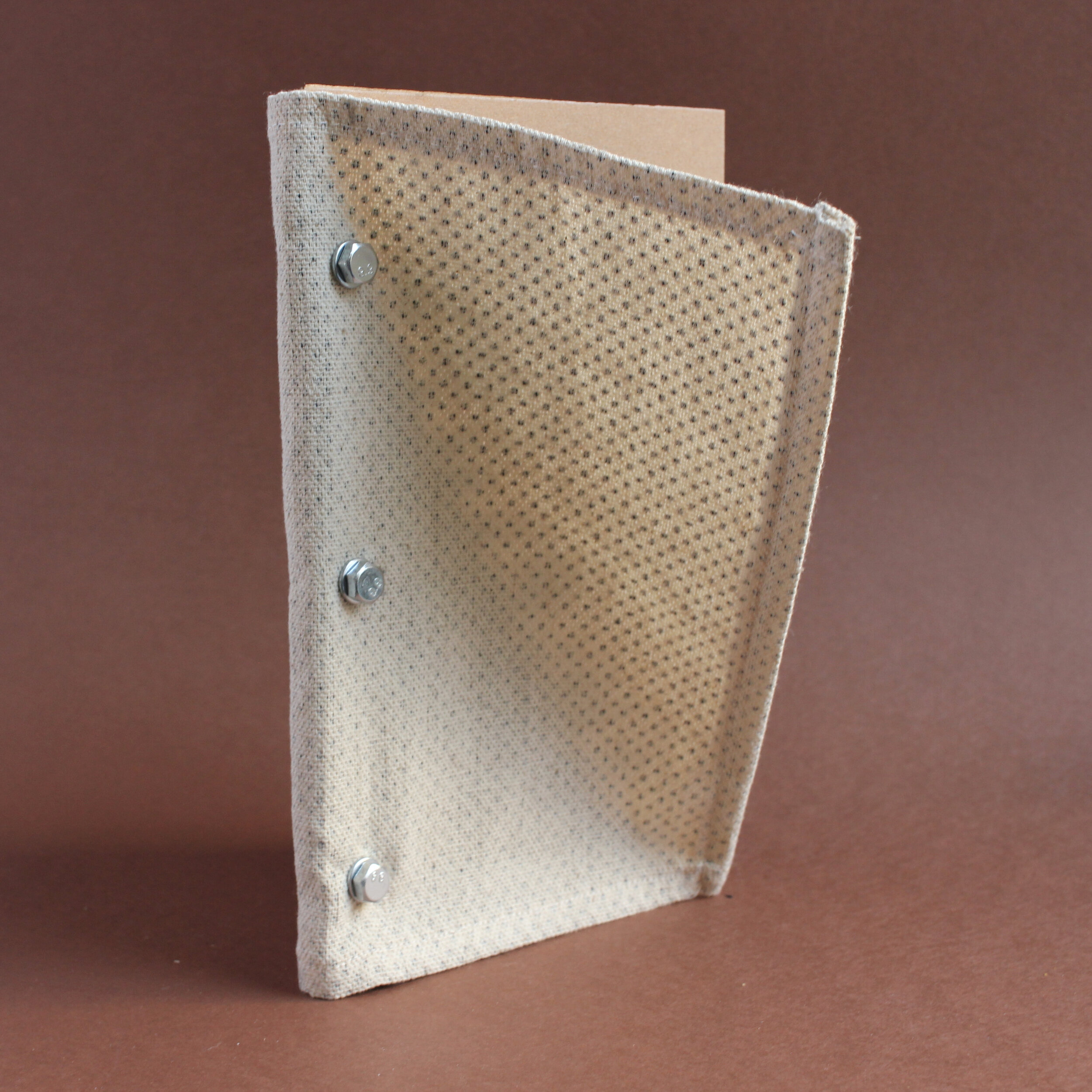
This book owes a debt to 'Mémoires' by Asger Jorn and Guy Debord, which has a sandpaper cover. I sort of flipped it around, as I wanted the interior to be abrasive and harsh, but for the outside to be sort-of normal.
Part of making experimental books is playing around with form and content. I didn't really have any great desire to explore George Bernard Shaw's social experiment (or the musical version with Rex Harrison and Audrey Hepburn, for that matter), but when the idea of increasingly rough pages came to mind, it seemed to fit well enough. By necessity, a lot of the text is exceedingly vulgar and I was fine with it being rendered illegible.
The text is set in Blackout, an open source font from the League of Moveable Type. I created stencils on the Cameo cutter for each two page spread and used black spray paint to render the text on the page. Honestly, this process was a little slapdash (the flat stank of aerosols for a couple of days) but, as previously mentioned, I wasn't too concerned about the typography being sharp.
Using a modification of a Japanese stab-bind technique, the book is bound using three 25mm stainless steel bolts. Having decided to use sandpaper, I wanted to use only items I could buy from a DIY store. The cover is a section of the dust sheet I used to protect my floor as I sprayed the pages. Honestly, it may be a little too slack to effectively protect the pages and the bolts are perhaps a little too long for the book to sit comfortable on a shelf alongside other volumes. This makes it closer to Mémoires than I consciously intended.
A Book for Spiders
A commercial crime thriller, written for the arachnid reader.
Hardback, 2021. First edition of 10 (+2 Archive copies)
Overview
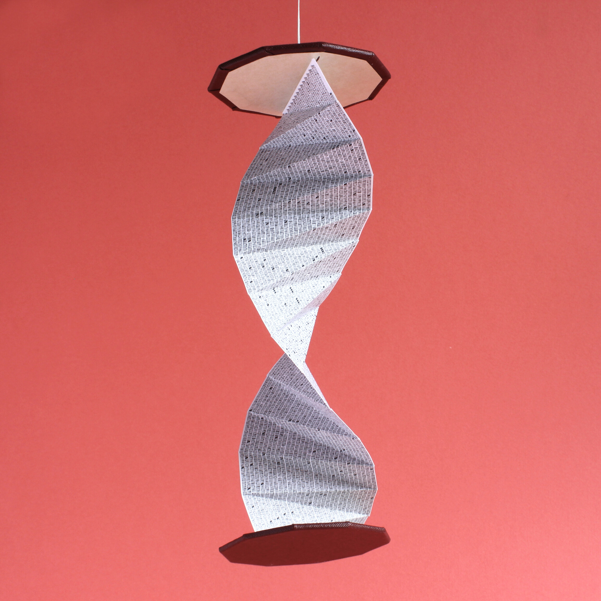
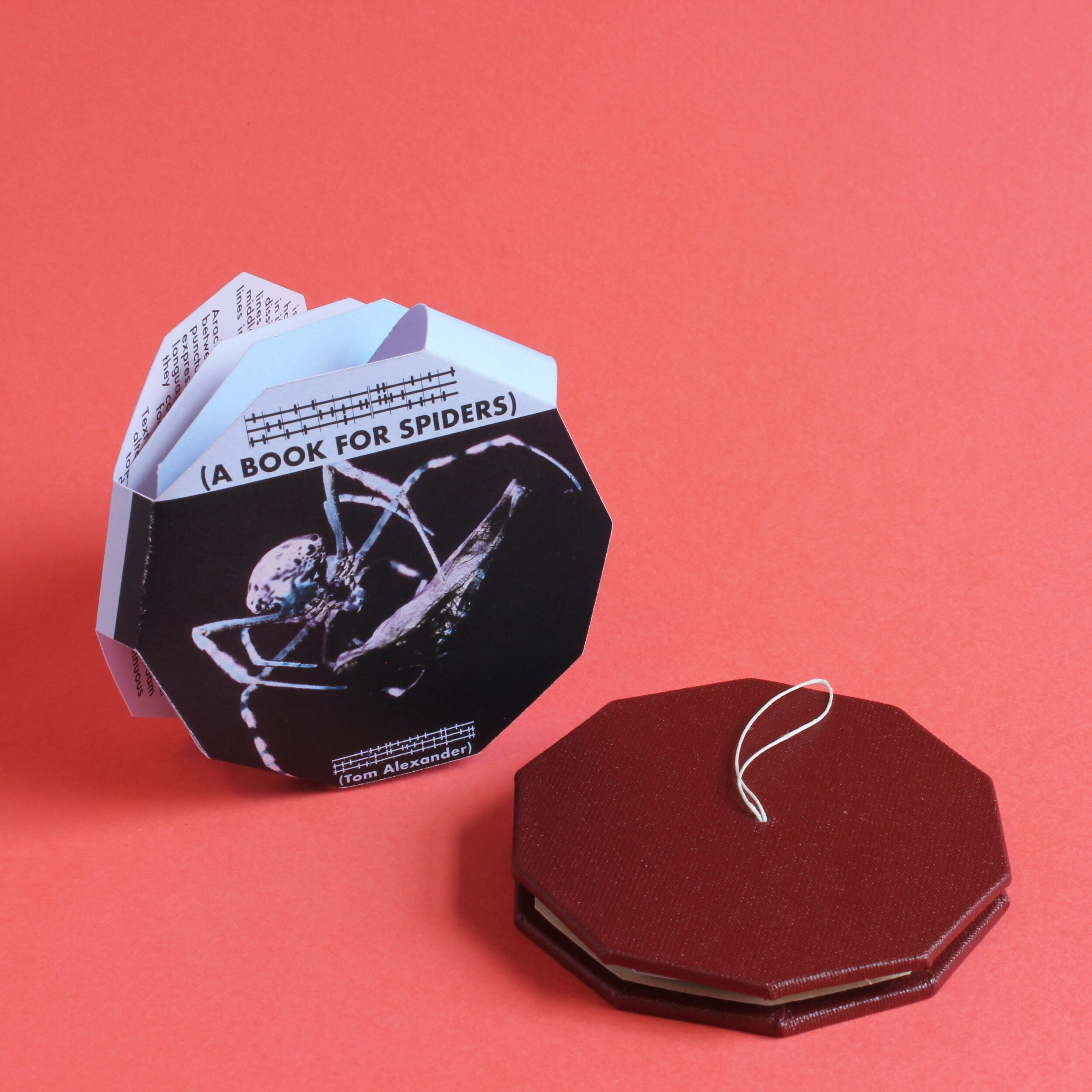
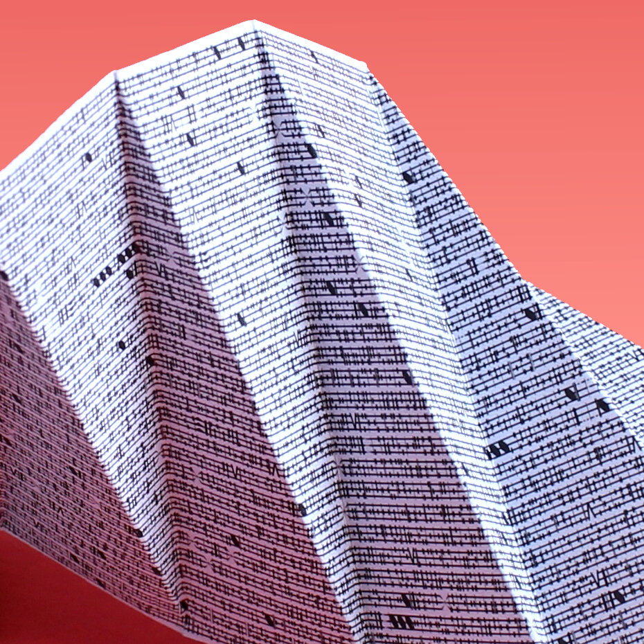
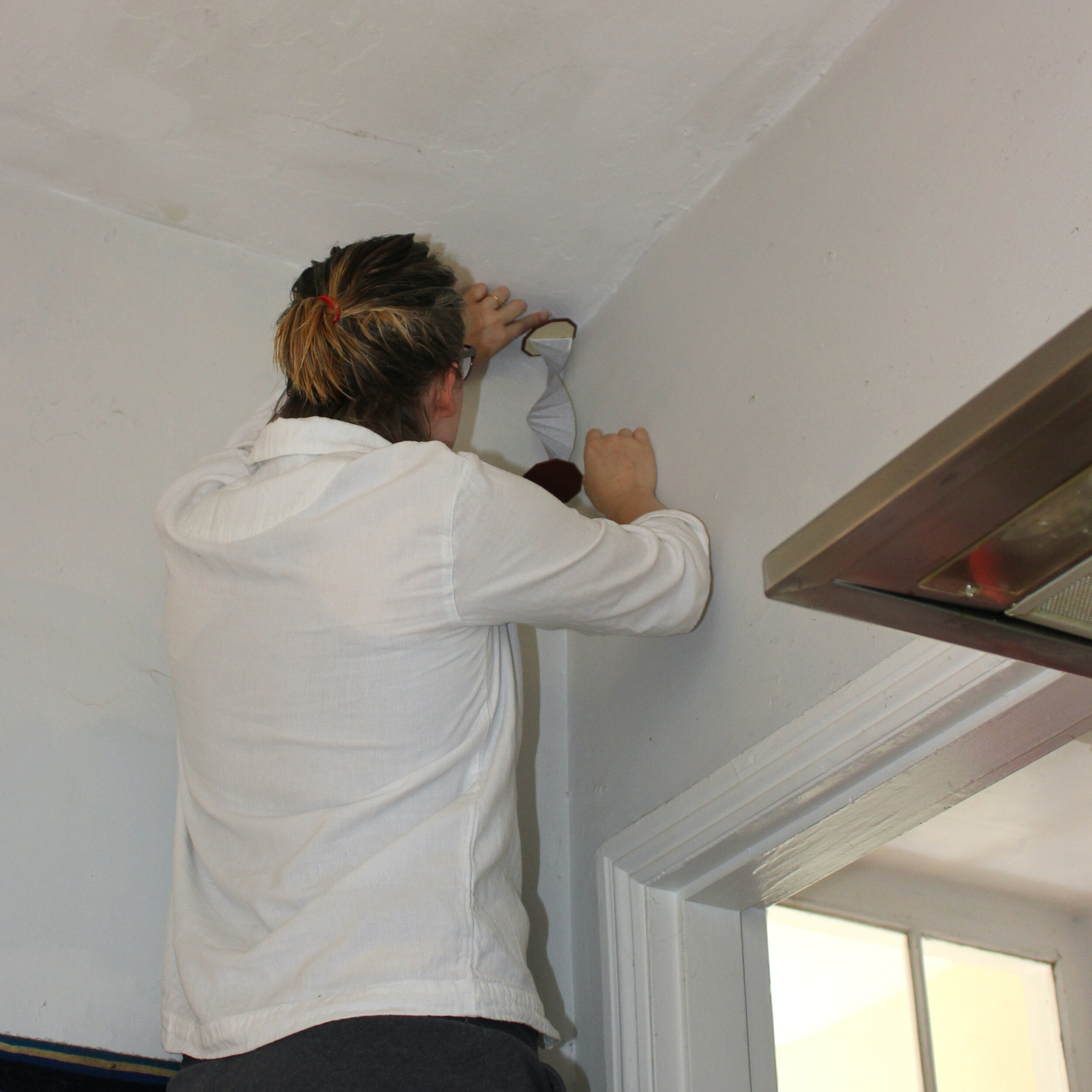
A commercial crime thriller, written for the arachnid reader. The text is set in a custom typeface, running up and down the length of the single central page. An outer dust jacket explains the concept to humans, advises them as to the best place to position the book and contains a link to an English translation of Missing Limbs - the bestselling(*) arachnid thriller contained within.
Background
A Book for Spiders started as a sort-of funny idea, quickly scribbled into a notebook for a tiny pamphlet (a la Mouse Holes) which humans would stick in the high corner of a room so that spiders could read it. My partner saw my notebook lying open and told me I should definitely make it. As an inveterate people-pleaser, I set to work. I had made tiny publications before. This would be easy.
I reasoned that spiders couldn't read English, so spent some time considering what their text might look like. I had just done some font-mashing for Portrait/Landscape and mucked around with some basic ideas for spider letterforms. I figured spiders would be sensitive to vibrations on their webs and after some doodling, made an alphabet based adapted from musical notation. This formed the basis of Vox Aranae, which is the slightly pompous name I gave my spider font.
Then, of course, I had to think about content. Obviously, a typeface that couldn't be read by humans, set at a tiny size, could have any old filler in there and no-one would be any the wiser. But I would know, so obviously I was compelled to write a complete thriller about two mis-matched spiders grudgingly working together in order to take down a murderer. It wasn't an 80,000 word novel, but a genuine attempt to create the spider equivalent - smaller in size, but similar in structure and packed with as many genre tropes as possible.
With that done, I set my 30 odd chapters of clichéd crime fiction into a small pamphlet. I decided that while the book itself would be all for spiders, I also wanted an outer wrap for humans, explaining the book, offering the possibility of translation and also giving instructions on where to put it so spiders could read it. I laid out the text and wrapped it around the small volume I had created. It was exactly what I had set out to do.
But... eh. It didn't feel that different from Mouse Holes and I don't like making the same thing twice. It was, quite frankly, a bit of a bummer, because I had already spent more time on this throwaway idea than intended and I knew that there was more to come.
At this point, I had a break enforced upon me. I had signed up for the summer school at the London Centre for Book Arts - a week of hands-on instruction on various bookbinding techniques. It was a good experience and I learned a lot - namely that I am a slow learner, brutally impatient with myself and that I find group situations cripplingly stressful. I also learned how to bind books. (Seriously, if you're interested in learning book arts, LCBA is a great place to do it. The people are all really nice and knowledgable and they have a ton of cool stuff in the studio. If you can't make it there, then the book they created - Making Books - is a great overview of technique.)
With the course finished, I realised that I could actually make a Book for Spiders. So I began the process of prototyping a hardback version.
One of the issues I had with the traditional spine-bound version was the thought that spiders could get crushed between the pages. This hazard would become more dangerous with thick, heavy hardback covers, so I had to re-think the form and make it more spider-friendly. I decided that as spiders lurk up in corners, so too should the book. A paper-folding course I did at the Working Men's college (as well as this book here) had given me some ideas for alternate structures and I pretty soon hit on this dangling spiral that can fold up into a compact shape that can possibly fit on to a bookshelf.
Getting the construction right took a few goes. I'm not very adept with glue and getting the right amount of PVA in such a small space was... challenging. By the end of the project I had sworn off glue entirely, vowing only to use bindings that don’t require adhesive. We'll see how long that lasts.
The text runs up and down the length of the paper and then over to the other side. One of the problems with making small printed objects is that your margin for error is very small. This came through in both the print and construction. The paper folding was done to exact measurements, but no-one's perfect and any small deviation from the line means errors compounded on themselves and took the paper out of alignment. Trying to find a way to make the text block sit properly in the covers was annoying. Eventually, I stopped trying to find a system and took each one as an individual piece.
Overall, I’m pretty happy with them. Although I spent most of this project wondering why I couldn’t just do something simple and straightforward, I think the end product turned out real purty.
—
(*) - Show me one that’s sold more.
Portrait / Landscape
Orientation defines story in this two postcard set.

If you buy a set, please note that stands are not included.


Postcards, colour, 2021
Overview
Orientation defines story in a pair of digital mosaics.
Background
The idea for this was originally an interactive HTML piece, where the text would change depending on the shape of the browser window or the orientation of the phone/tablet. That proved too much for my rudimentary coding skills and was thrown away into a dark folder on an old hard drive. Later, it occurred to me that it would be better as pieces of paper and that led to the postcards you see now.
The intersection of pixel art, mosaic and monospace typography seemed to be a pretty straightforward one. I could just take a picture, reduce the resolution, slap a fixed-width font on top of that and wait for those sweet postcard bucks to come rolling in.
I sourced two pieces of art from the same artist, Jean-Pierre Renoir. The Portrait of Alfred Sisley and The Bay of Algiers seemed to scale well, in that they were still identifiable as a portrait and landscape when scaled down to a resolution of 37 x 44 pixels. The aspect ratios of the paintings didn’t quite match the target page size, so I had to fill in some bits of background and crop others.
The tiles are a customised version of the ‘scrabble squares’ in the Apple Symbol font. I used Font Forge to hack together a version that corresponded to their actual letters. Font Forge is a pretty frustrating piece of software to use. I’m sure it’s very powerful, but it has that inscrutable, in-depth technical sheen that a lot of open-source applications use to scare off users.
With that done, I wrote several versions of the short stories on the cards. Obviously, one was going to be about a person and the other was about a place, but it took a couple of drafts to get the right tone.
As with a lot of my pieces, writing and design process go hand-in-hand, but pull in different directions. The needs of the story are often constrained by the physical space that contains it. I don’t know if this is making me better or worse as a writer, but I find it’s an interesting way to work. It’s not so much “what’s good” as “what fits”.
Like a lot simple ideas, this one proved to be really fiddly. Trying to work out correlations of pixels to points and getting the colours balanced so they would be both readable and recognisable was a bit of a pig. It’s worth mentioning that Affinity’s ability to swap instantly between Publisher, Designer and Photo toolsets was a really handy. It’s one of the things I like most about it (as well as not having to pay a monthly fee).
Printing was outsourced to Print24, who are pretty good - fast and well priced, although they do send a ridiculous amount of emails about delivery. Most importantly, their postcards seem like they would stand up to the rigours of the postal system.