Butterfly Mask
A short story printed on a mask which must be read in a mirror.
Paper / card
2023, 20pp, paperback
Overview
A short story printed on a mask which must be read in a mirror.
Background
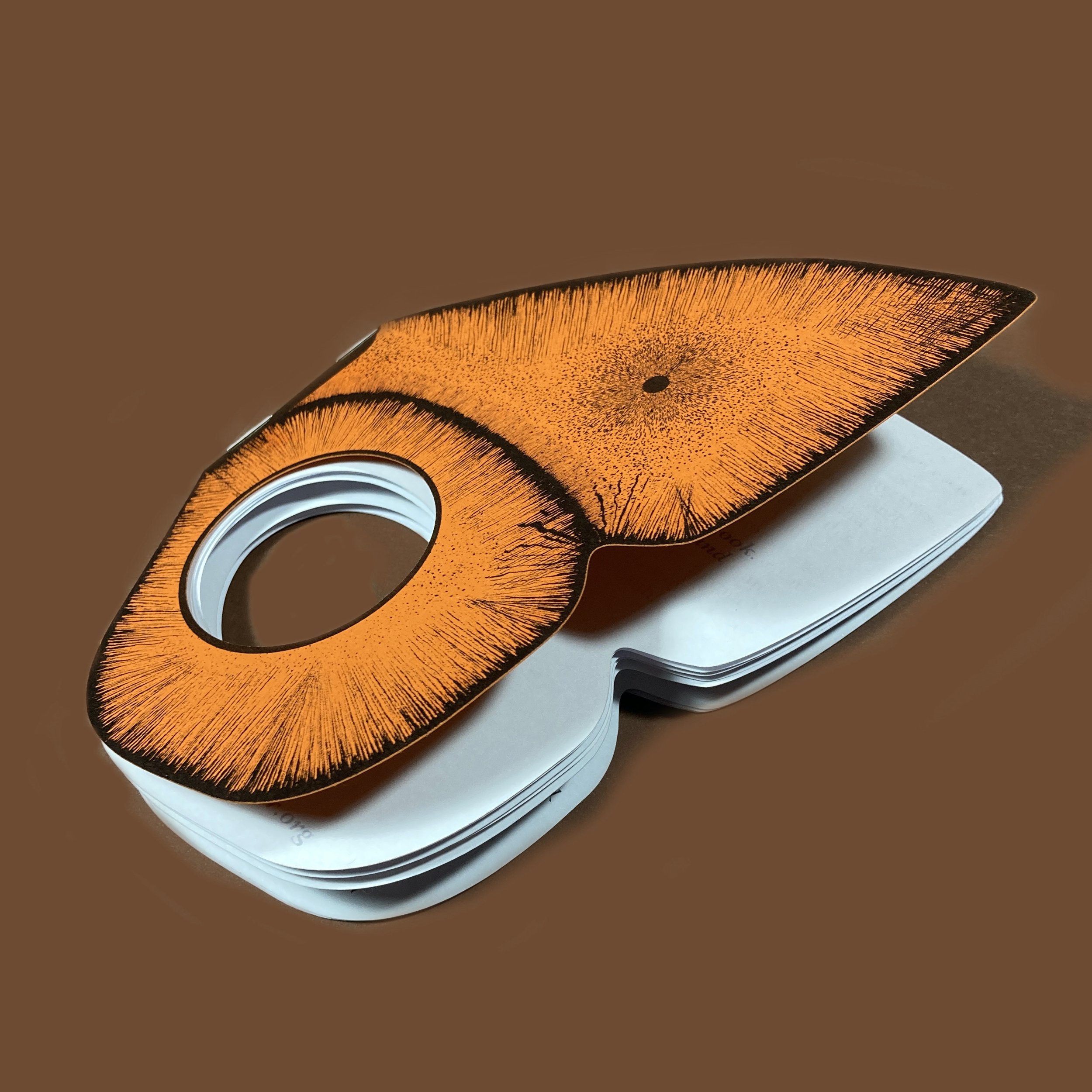
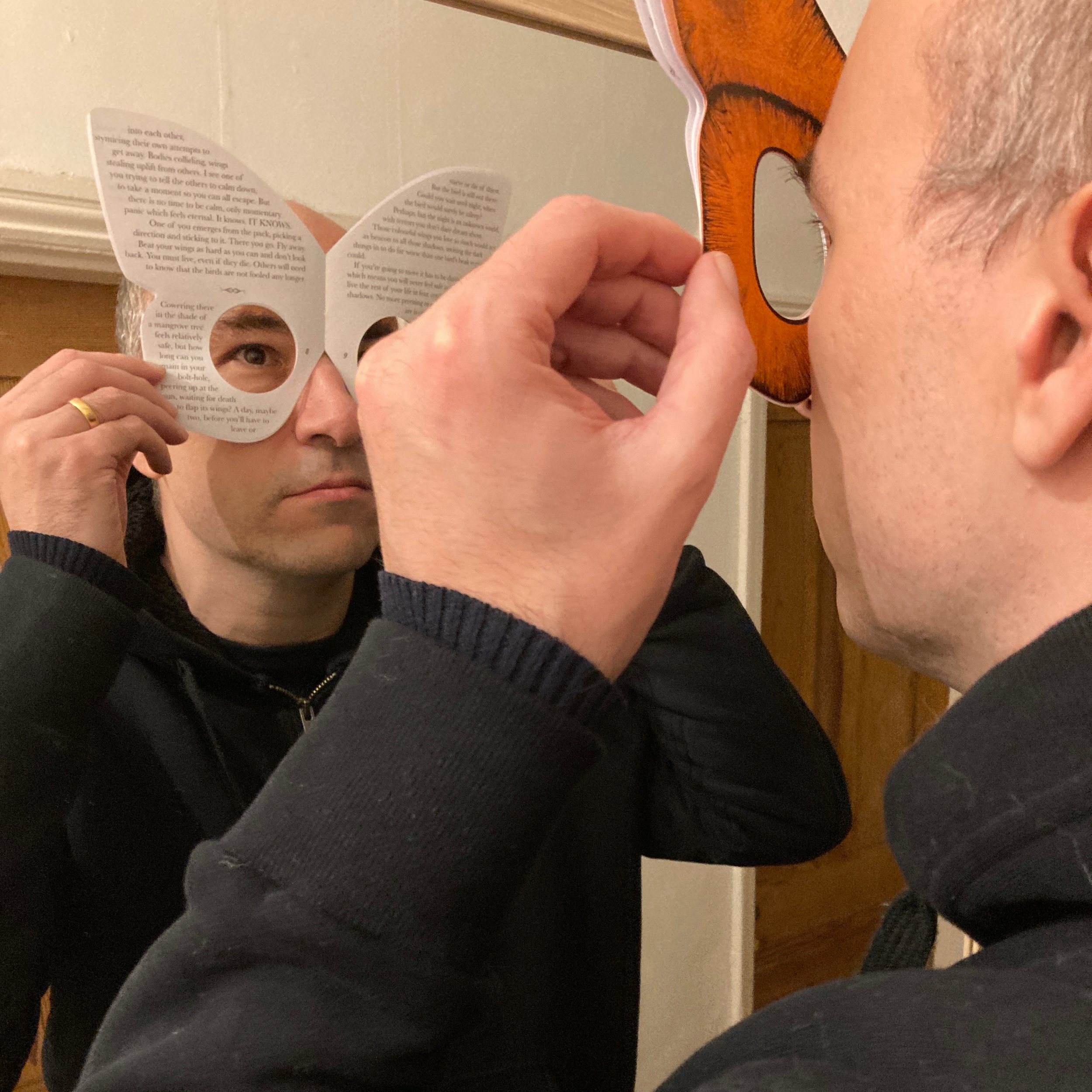
Butterfly Mask started as an expansion on some of the ideas presented in Oubliette, namely that of mirrored text and an uncomfortable physical process to read the story. Rather than using an implement like a dental mirror, I thought it would be interesting to have the story on the reader’s face. Obviously, you can’t see through the pages so cutting holes out would be necessary.
A rough prototype was made out of scrap paper and something about the blank face that I saw put me in mind of classical horror film bogeymen like Michael Myers and Jason Vorhees. I didn’t really want to write a horror story, though - at least, not one like that. Further experiments pulled me towards the ideas of camouflage and I found myself thinking about the deceptive wings of butterflies, which represent themselves as the faces of big, scary creatures to scare away predators. I thought the process of looking at oneself in order to read this story could have an interesting side-effect on the text. Rather than the text being out there, on a separate plane, it would be one’s own reflection, the face that you’re wearing to the outside world. Furthermore, there was the opportunity to do some playful stuff with the narrator - the ‘you’ of second person perspective giving way to the ‘I’ of first person as the story progresses.
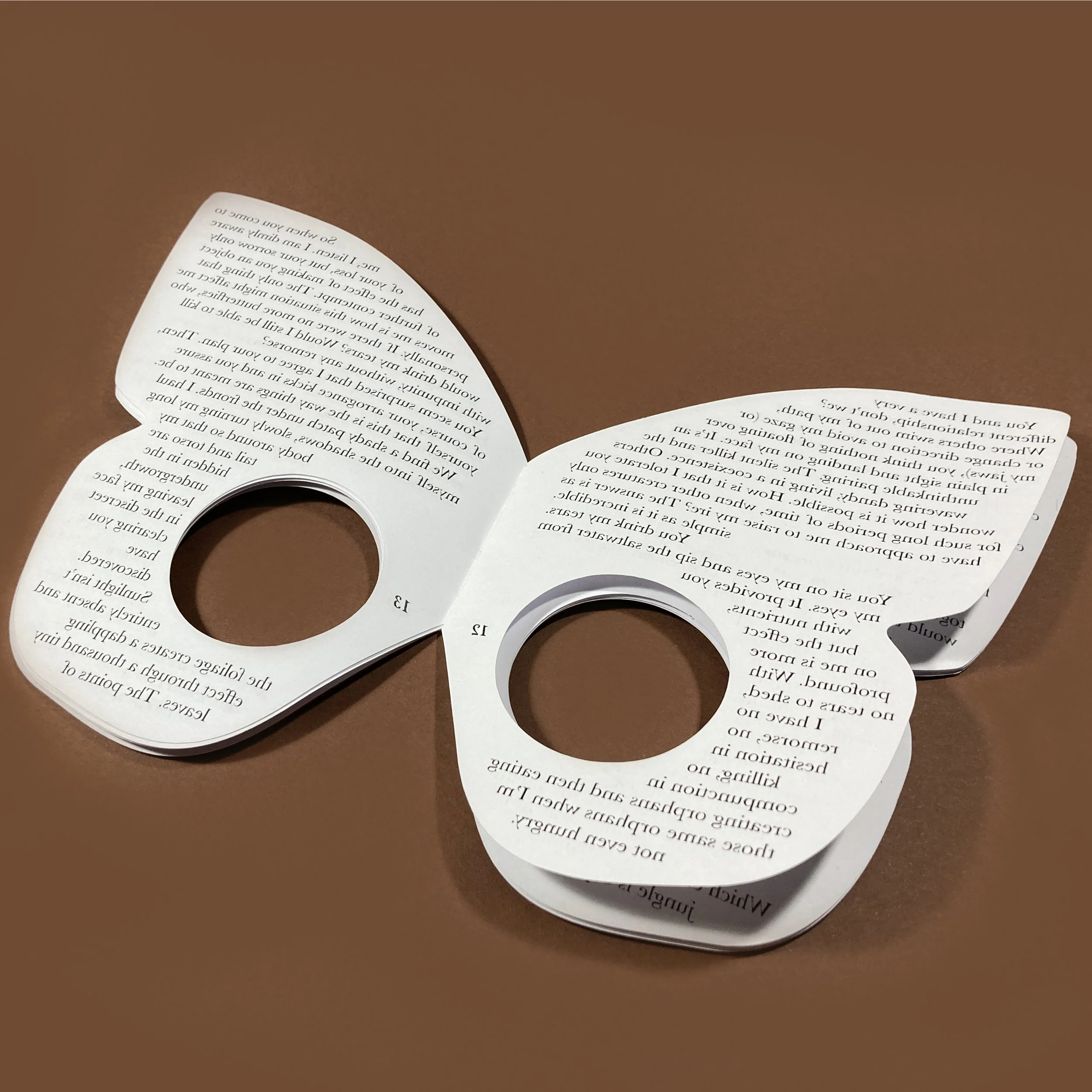
Although the prototype was a plain book, I got it in my head to form it in a form more like that of a butterfly. This proved to be a pretty stupid idea. At first I wanted the text to flow on non-straight lines and spent a loooooong time setting text on various different arcs which were supposed to look like butterfly wings. They didn’t, and just looked crap. I then allowed myself the benefit of straight typesetting, albeit in a butterfly-shaped text frame, with the words flowing around the eye holes. The first versions had these towards the top of the page, but moving them to the bottom allowed for the curve of the wing to form a more natural shape for the reader’s nose.

Although the basic principles had been set out in the early prototype, finding the right sort of binding was a time-consuming process. I really wanted an elasticated strap that would keep the book secured on the reader’s face, but this proved too difficult to work out. I just couldn’t get the right combination of materials that would stay in position, but also allow the pages to fall open and allow the reader to see them properly. The strap had to be abandoned, much to my annoyance. It is for the best. Masks can be hand-held and so are books. I tell myself this in order to keep the loathing at bay.
There was no way I was going to be able to cut this consistently by hand, so I used the Cameo 3 cutter for both the pages and the cover. I’m getting a little tired of this process, particularly as Affinity Publisher doesn’t allow for addressing the cutter directly, meaning lots of exported PDFs, which are then placed into another application, then sent to the cutter. It’s a bit of a convoluted method and I miss the Illustrator plugin I used to use. There’s also the broader issue of everything being quite computer-based. My attempts at hand-making things tend to be quite shoddy, though, so I think that’s going to continue for a while.
The end product is a lot simpler than I had in mind, although it does maintain the fundamental principle of the idea from first conception – that of reading through the book and relying on external perception for an understanding of self. The whole process took a lot longer than I would have liked, although this was partly due to personal factors in the second half of 2022. Had I known it would end up as a stapled pamphlet, I could have knocked it out a lot earlier. Possibly. It’s more likely that I had to go through all those iterations in order to get to the simple version. I’ve really got to learn how to start simple and stay there.
Writers Write
A series of stories about writer’s block, contained in a recursively bound booklet.
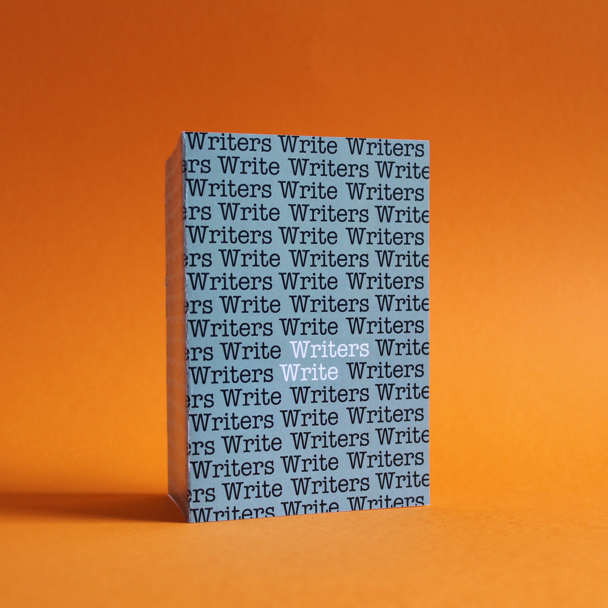
Recursive booklet, 105 x 148mm, 2022
Overview
Writers Write is a series of stories about writer’s block, contained in a recursively bound booklet.
Background
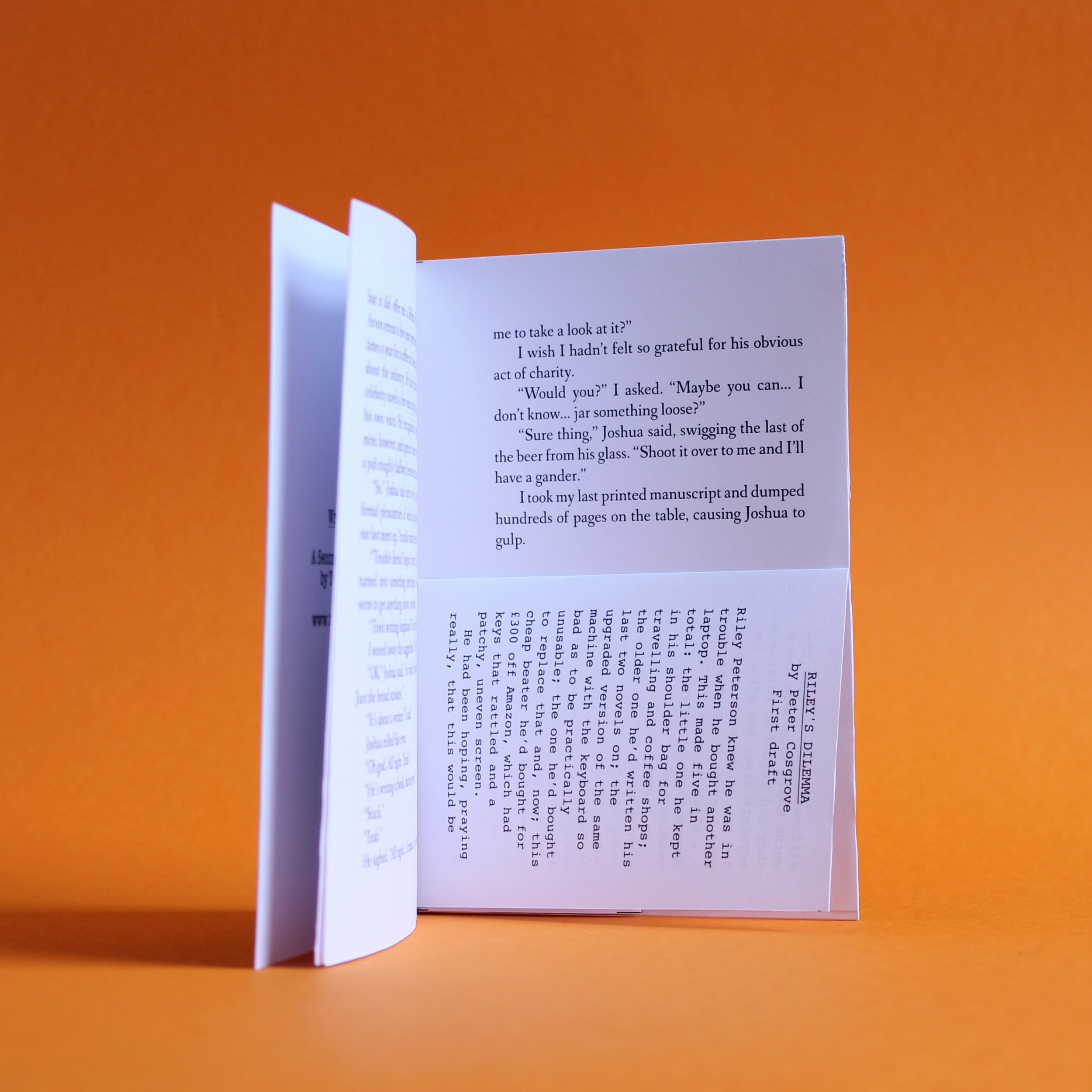
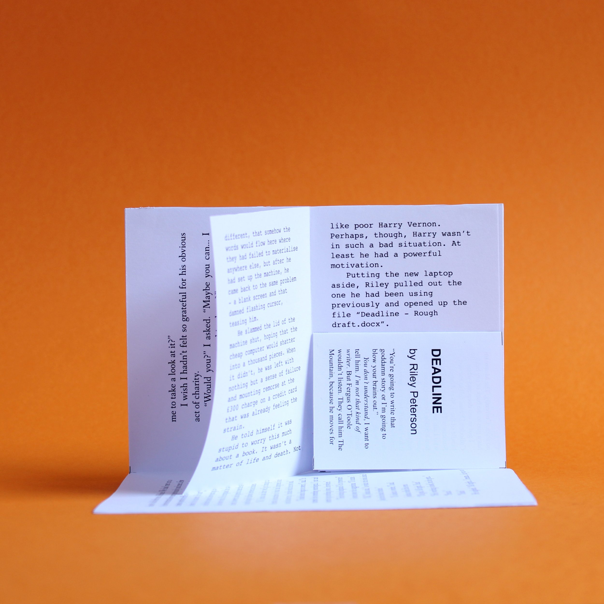
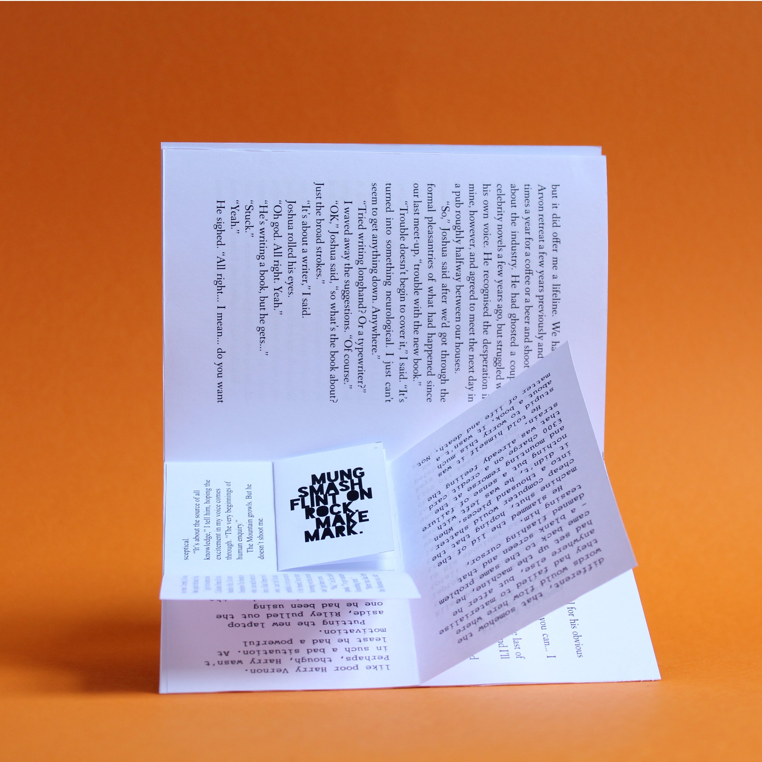
I had this idea a while ago and dismissed it because I thought it was disgustingly self-indulgent. Then I read Billy Summers and realised that some people had made entire careers basing stories on barely-disguised proxies of themselves, so figured I was joining a rich tradition. Furthermore, the edition I had in mind was just a few pages long, rather than several hundred, so I went ahead and made it.
The story is pretty much what it sounds like. One author struggling to write about another, who is, in turn, having their own difficulties writing their own story because that author is having difficulty… and so on and so on.
Praise be to the ISO paper sizing scheme, which makes this all possible. The booklet is bound by glueing the back page of the smaller booklet to bottom half of the recto in the centre spread. For someone who doesn’t like glue, I seem to be using a lot of it.
Coarse
A ‘reverse Pygmalion’ on sandpaper.

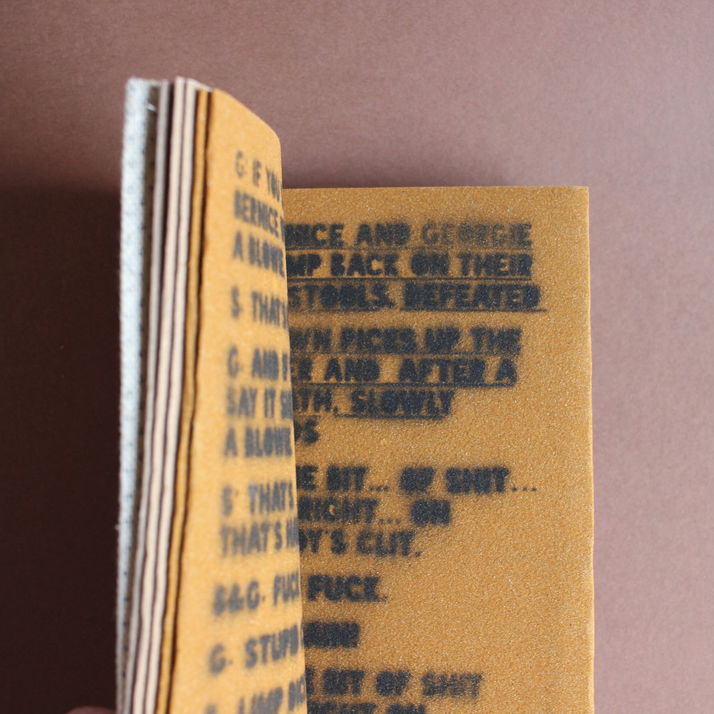
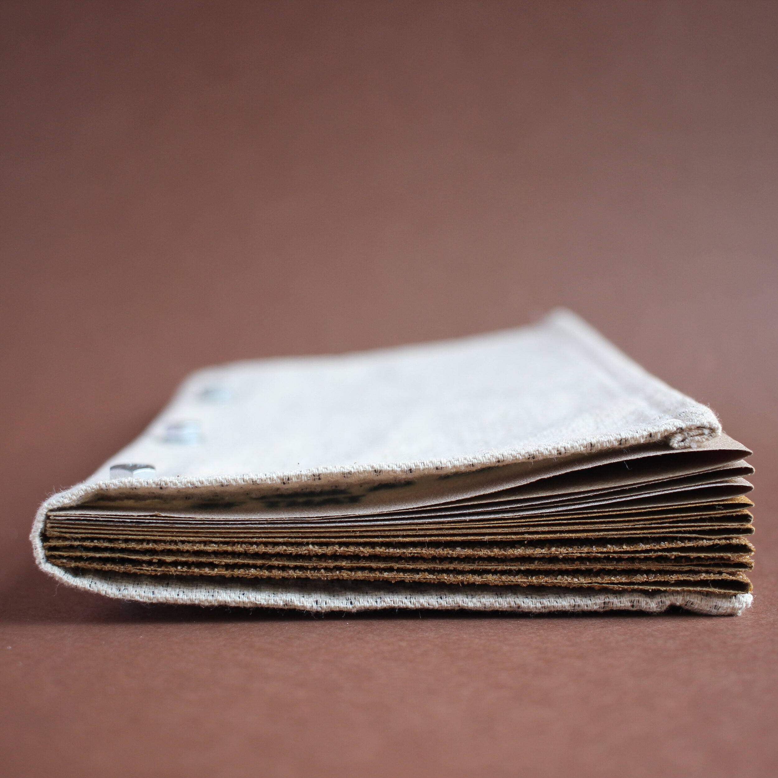
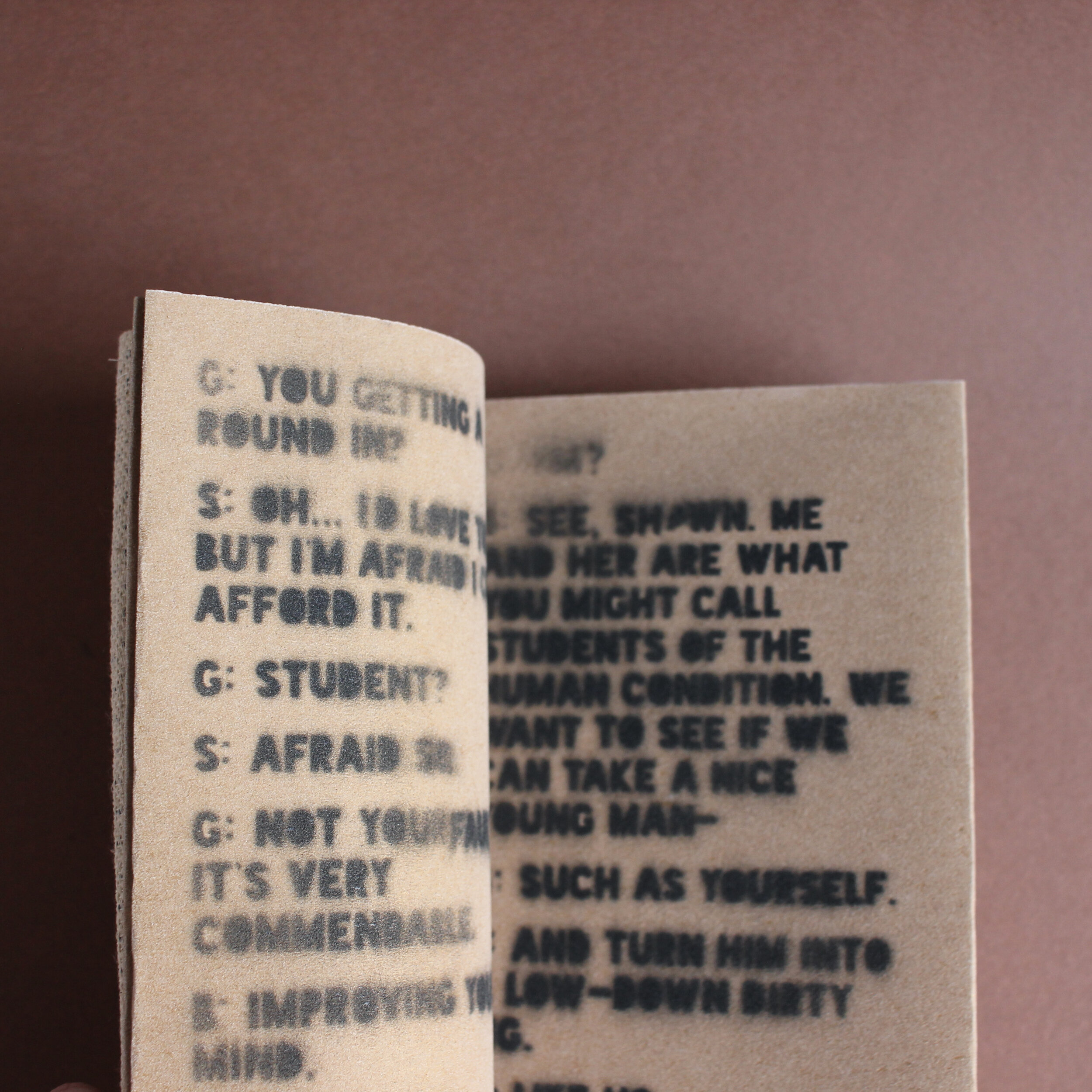
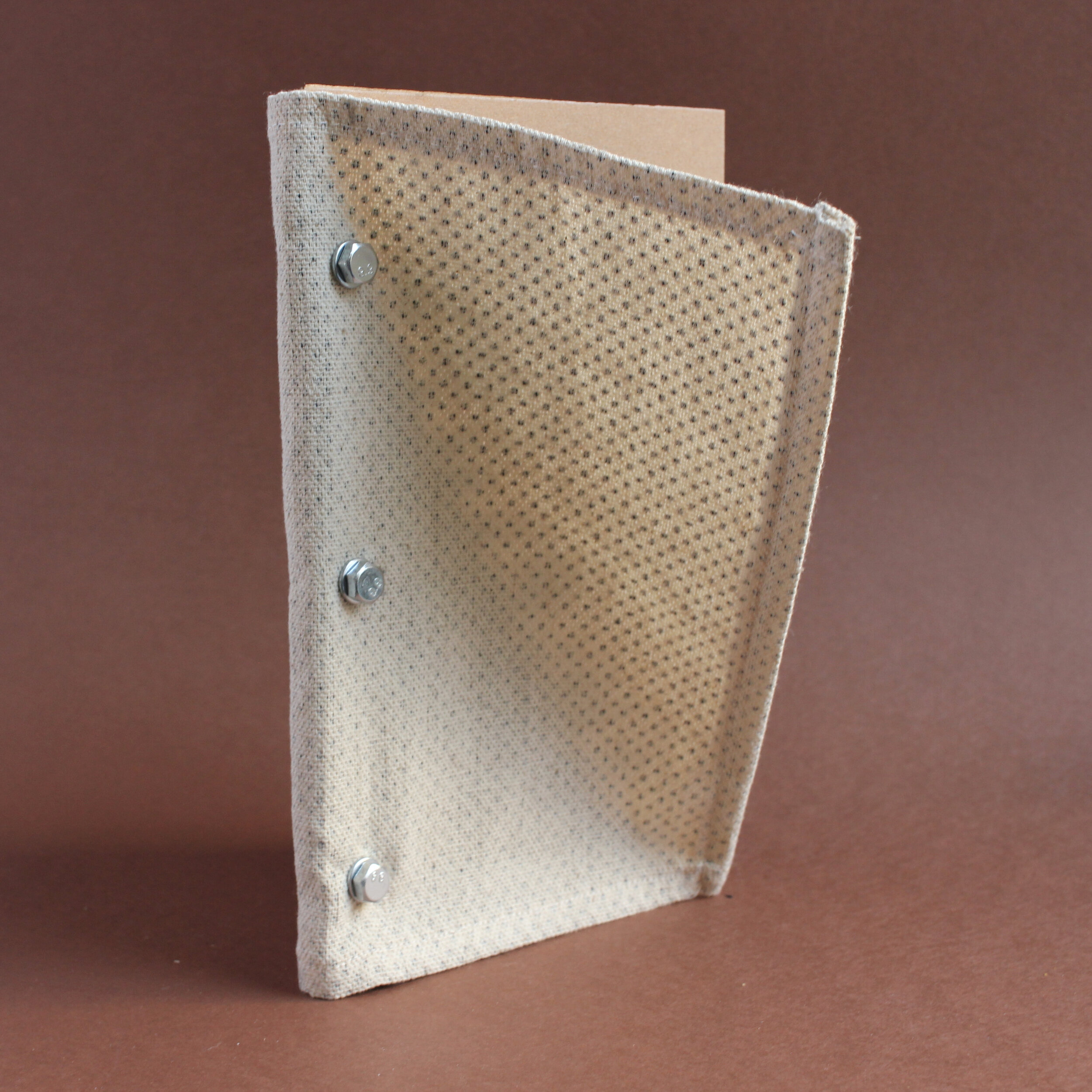
Playlet script, spraypaint on sandpaper, 18pp, one-off, 2021
Description
Coarse is a three-scene 'reverse Pygmalion' - a playlet about turning a nice person into a filthy animal. The pages are made of sandpaper and the text is printed via spraypaint and stencils. As the characters descend into squalour, the pages become coarser and the words are more difficult to read.
Background
This book owes a debt to 'Mémoires' by Asger Jorn and Guy Debord, which has a sandpaper cover. I sort of flipped it around, as I wanted the interior to be abrasive and harsh, but for the outside to be sort-of normal.
Part of making experimental books is playing around with form and content. I didn't really have any great desire to explore George Bernard Shaw's social experiment (or the musical version with Rex Harrison and Audrey Hepburn, for that matter), but when the idea of increasingly rough pages came to mind, it seemed to fit well enough. By necessity, a lot of the text is exceedingly vulgar and I was fine with it being rendered illegible.
The text is set in Blackout, an open source font from the League of Moveable Type. I created stencils on the Cameo cutter for each two page spread and used black spray paint to render the text on the page. Honestly, this process was a little slapdash (the flat stank of aerosols for a couple of days) but, as previously mentioned, I wasn't too concerned about the typography being sharp.
Using a modification of a Japanese stab-bind technique, the book is bound using three 25mm stainless steel bolts. Having decided to use sandpaper, I wanted to use only items I could buy from a DIY store. The cover is a section of the dust sheet I used to protect my floor as I sprayed the pages. Honestly, it may be a little too slack to effectively protect the pages and the bolts are perhaps a little too long for the book to sit comfortable on a shelf alongside other volumes. This makes it closer to Mémoires than I consciously intended.
A Book for Spiders
A commercial crime thriller, written for the arachnid reader.
Hardback, 2021. First edition of 10 (+2 Archive copies)
Overview
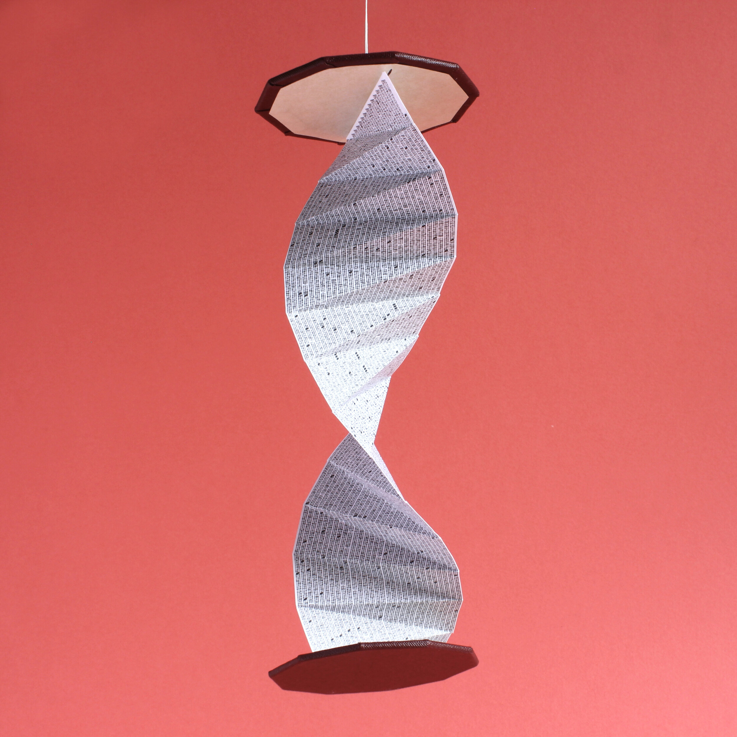
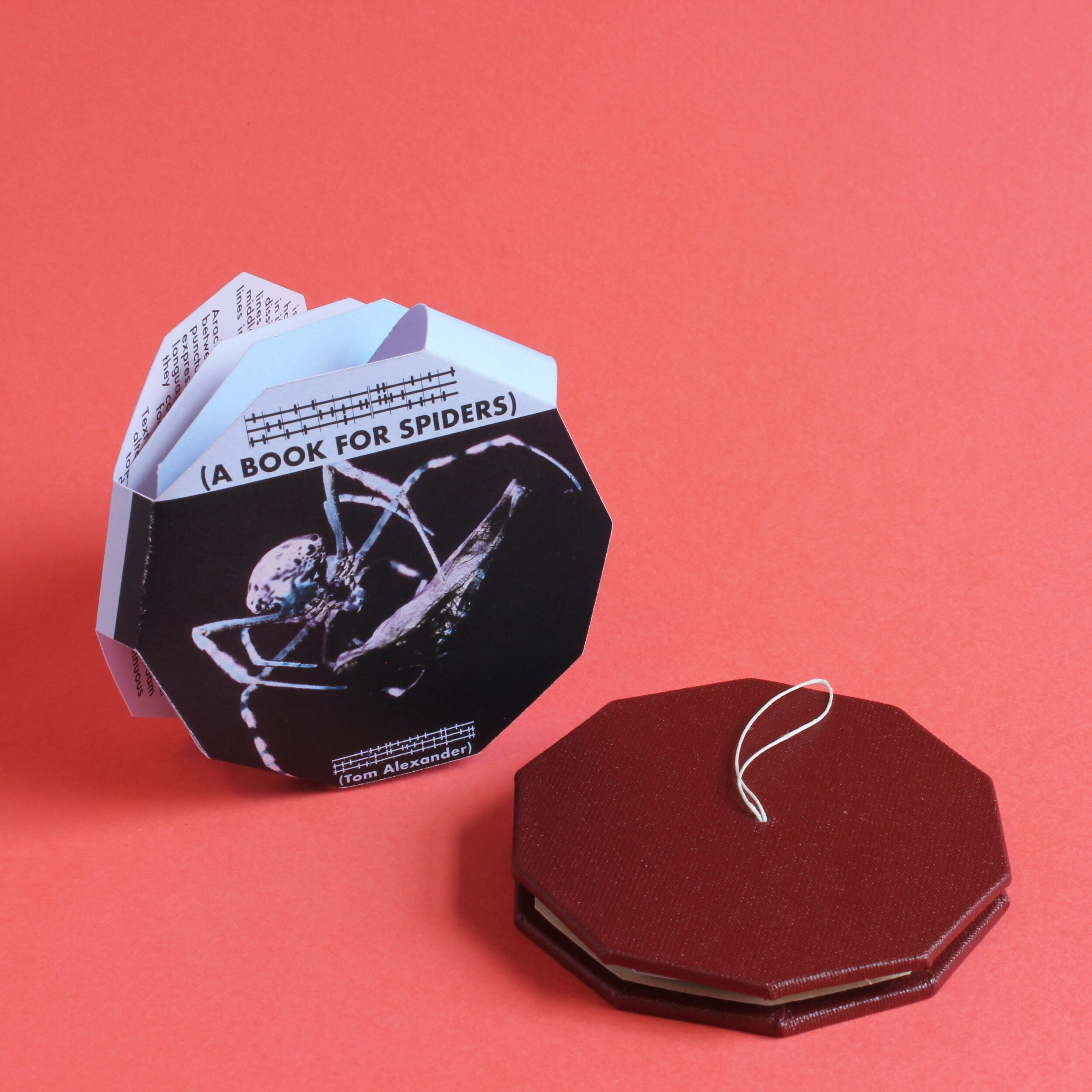
A commercial crime thriller, written for the arachnid reader. The text is set in a custom typeface, running up and down the length of the single central page. An outer dust jacket explains the concept to humans, advises them as to the best place to position the book and contains a link to an English translation of Missing Limbs - the bestselling(*) arachnid thriller contained within.
Background
A Book for Spiders started as a sort-of funny idea, quickly scribbled into a notebook for a tiny pamphlet (a la Mouse Holes) which humans would stick in the high corner of a room so that spiders could read it. My partner saw my notebook lying open and told me I should definitely make it. As an inveterate people-pleaser, I set to work. I had made tiny publications before. This would be easy.
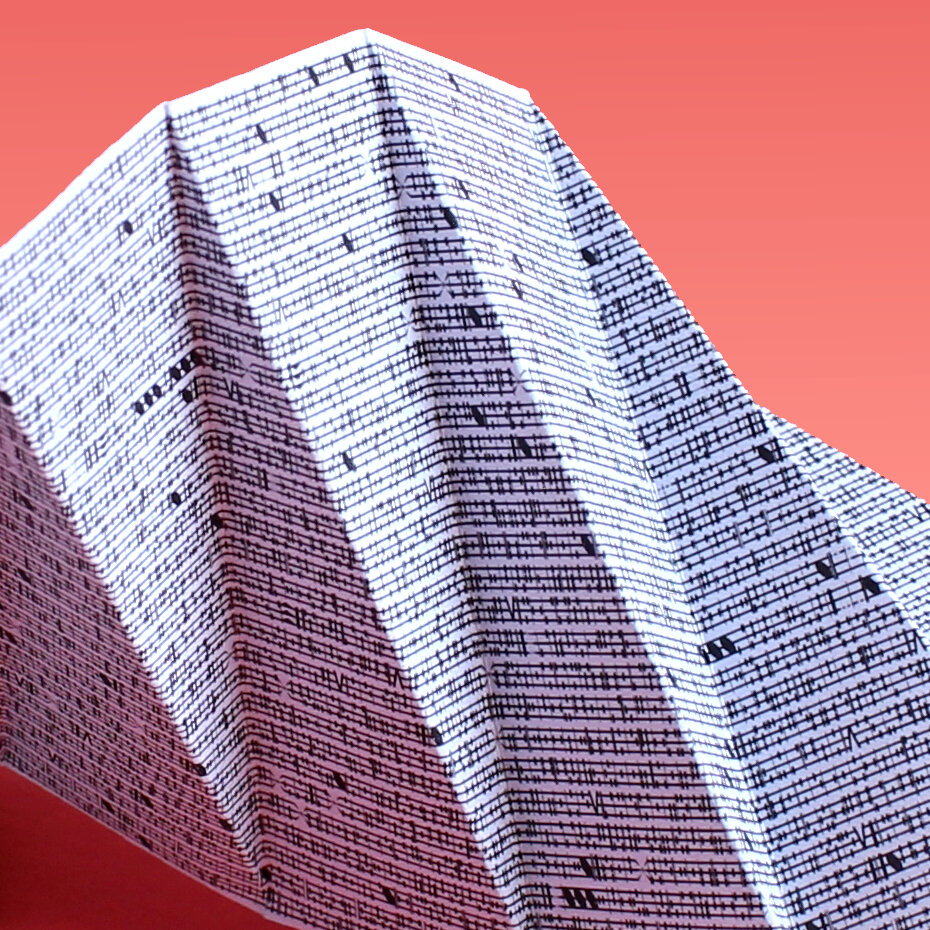
I reasoned that spiders couldn't read English, so spent some time considering what their text might look like. I had just done some font-mashing for Portrait/Landscape and mucked around with some basic ideas for spider letterforms. I figured spiders would be sensitive to vibrations on their webs and after some doodling, made an alphabet based adapted from musical notation. This formed the basis of Vox Aranae, which is the slightly pompous name I gave my spider font.
Then, of course, I had to think about content. Obviously, a typeface that couldn't be read by humans, set at a tiny size, could have any old filler in there and no-one would be any the wiser. But I would know, so obviously I was compelled to write a complete thriller about two mis-matched spiders grudgingly working together in order to take down a murderer. It wasn't an 80,000 word novel, but a genuine attempt to create the spider equivalent - smaller in size, but similar in structure and packed with as many genre tropes as possible.
With that done, I set my 30 odd chapters of clichéd crime fiction into a small pamphlet. I decided that while the book itself would be all for spiders, I also wanted an outer wrap for humans, explaining the book, offering the possibility of translation and also giving instructions on where to put it so spiders could read it. I laid out the text and wrapped it around the small volume I had created. It was exactly what I had set out to do.
But... eh. It didn't feel that different from Mouse Holes and I don't like making the same thing twice. It was, quite frankly, a bit of a bummer, because I had already spent more time on this throwaway idea than intended and I knew that there was more to come.
At this point, I had a break enforced upon me. I had signed up for the summer school at the London Centre for Book Arts - a week of hands-on instruction on various bookbinding techniques. It was a good experience and I learned a lot - namely that I am a slow learner, brutally impatient with myself and that I find group situations cripplingly stressful. I also learned how to bind books. (Seriously, if you're interested in learning book arts, LCBA is a great place to do it. The people are all really nice and knowledgable and they have a ton of cool stuff in the studio. If you can't make it there, then the book they created - Making Books - is a great overview of technique.)
With the course finished, I realised that I could actually make a Book for Spiders. So I began the process of prototyping a hardback version.
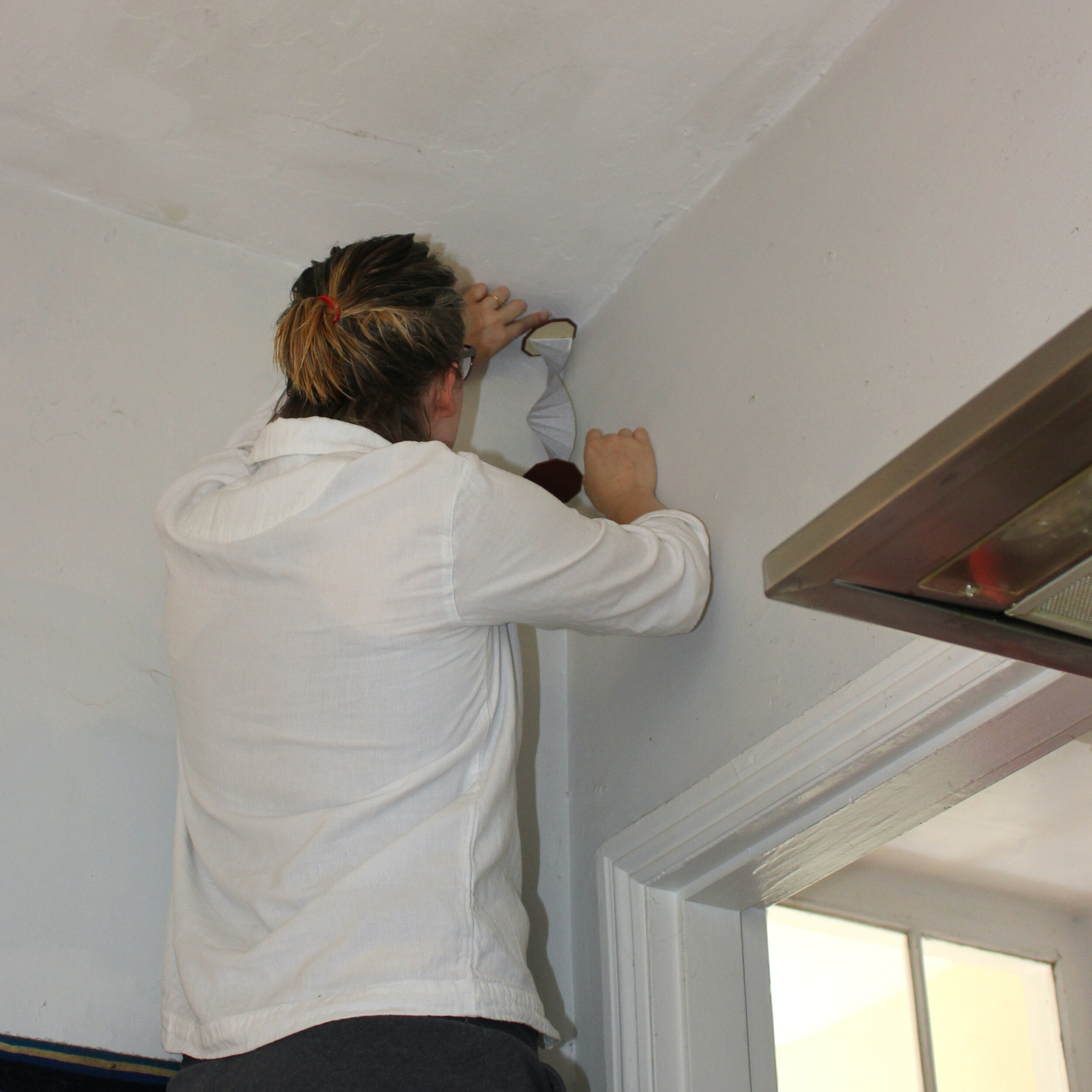
One of the issues I had with the traditional spine-bound version was the thought that spiders could get crushed between the pages. This hazard would become more dangerous with thick, heavy hardback covers, so I had to re-think the form and make it more spider-friendly. I decided that as spiders lurk up in corners, so too should the book. A paper-folding course I did at the Working Men's college (as well as this book here) had given me some ideas for alternate structures and I pretty soon hit on this dangling spiral that can fold up into a compact shape that can possibly fit on to a bookshelf.
Getting the construction right took a few goes. I'm not very adept with glue and getting the right amount of PVA in such a small space was... challenging. By the end of the project I had sworn off glue entirely, vowing only to use bindings that don’t require adhesive. We'll see how long that lasts.
The text runs up and down the length of the paper and then over to the other side. One of the problems with making small printed objects is that your margin for error is very small. This came through in both the print and construction. The paper folding was done to exact measurements, but no-one's perfect and any small deviation from the line means errors compounded on themselves and took the paper out of alignment. Trying to find a way to make the text block sit properly in the covers was annoying. Eventually, I stopped trying to find a system and took each one as an individual piece.
Overall, I’m pretty happy with them. Although I spent most of this project wondering why I couldn’t just do something simple and straightforward, I think the end product turned out real purty.
—
(*) - Show me one that’s sold more.
Primates
A set of two backpack-like volumes about a pair of animals sharing their habitat.
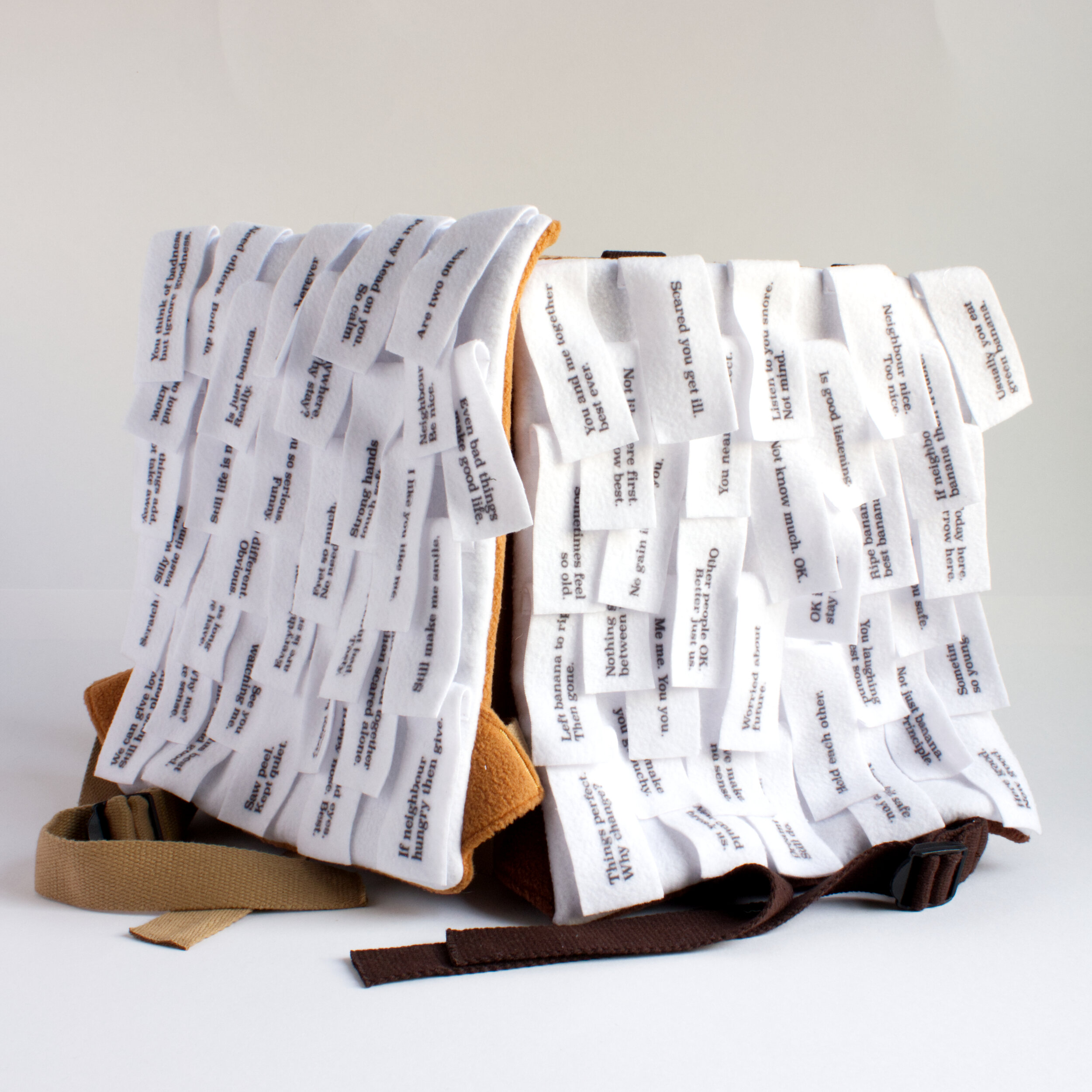
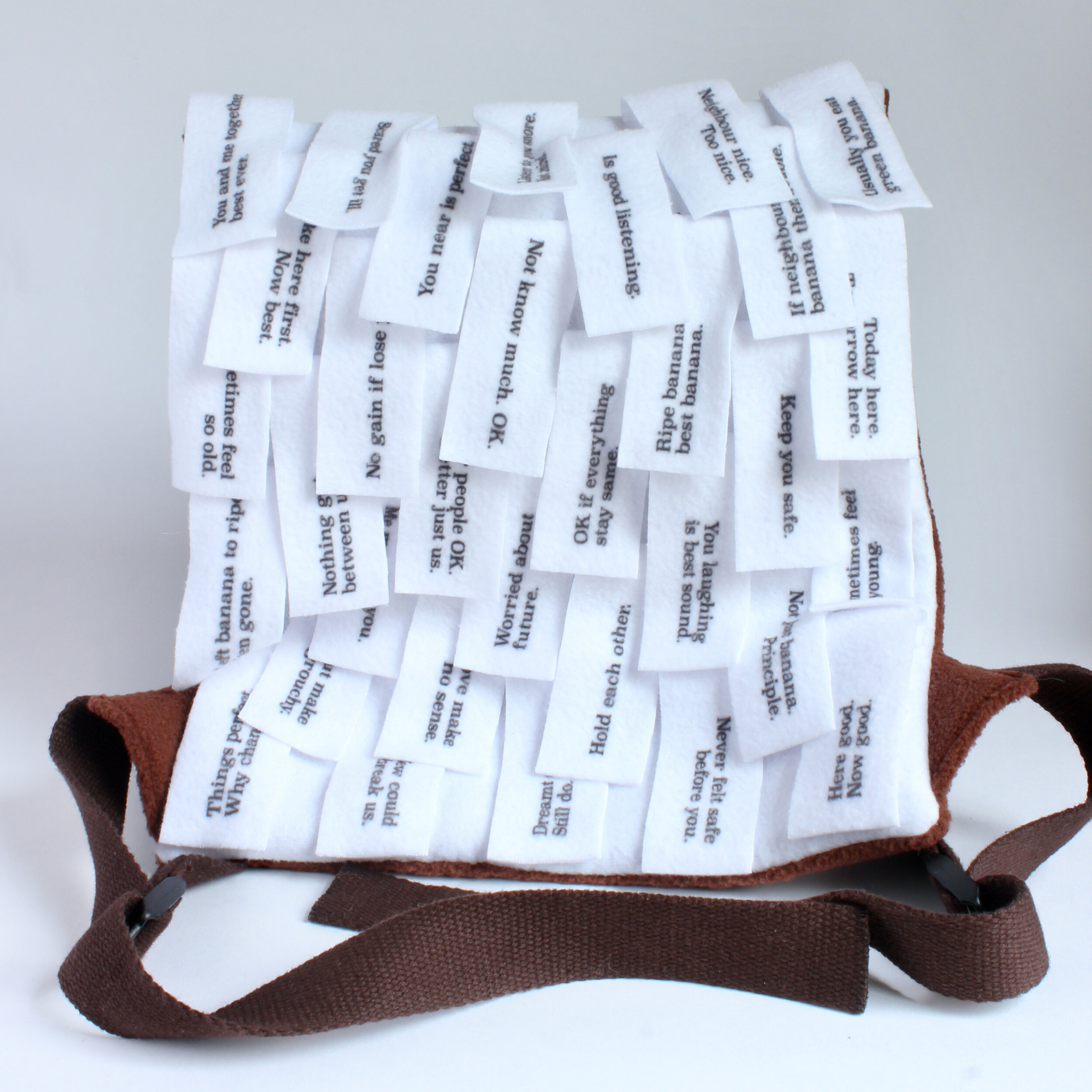
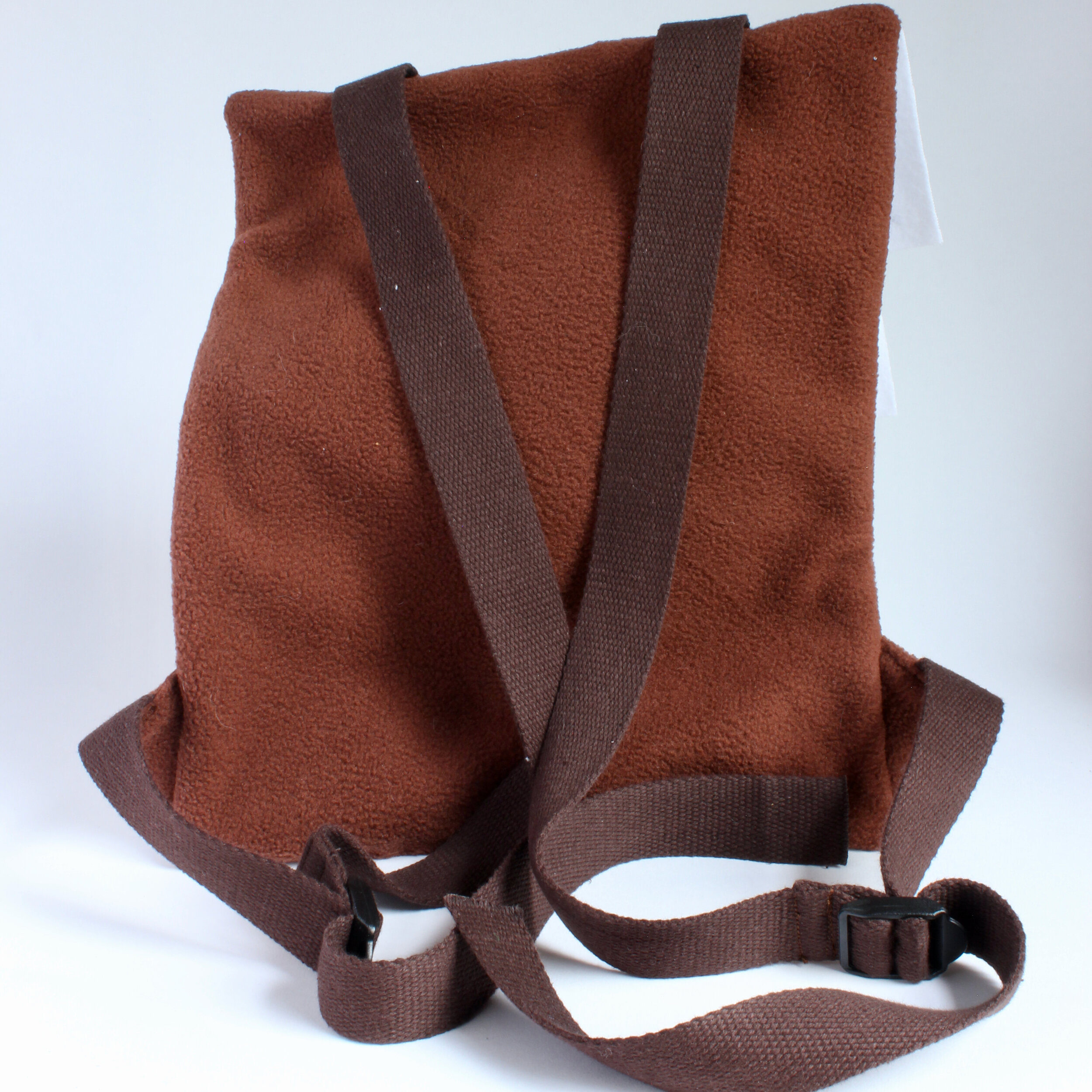
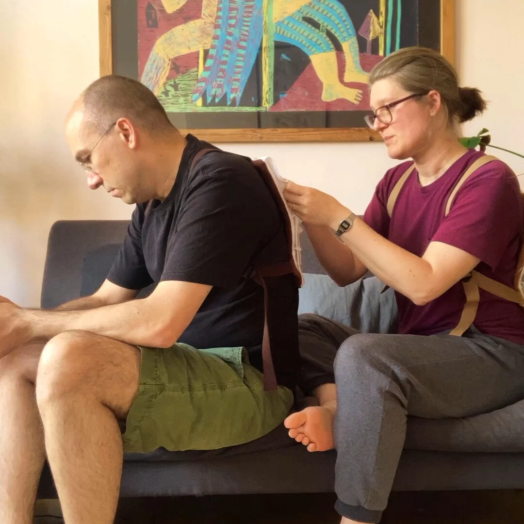
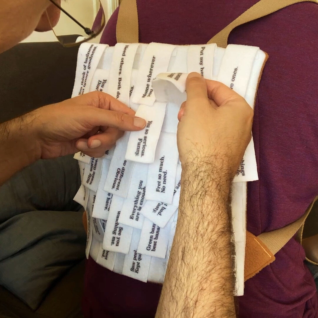

Set of two back-pack like volumes, made of fleece. It is designed for two people to read aloud to one another. It tells the story of two animals sharing a habitat.
Click here for more information about the book and how it was made.
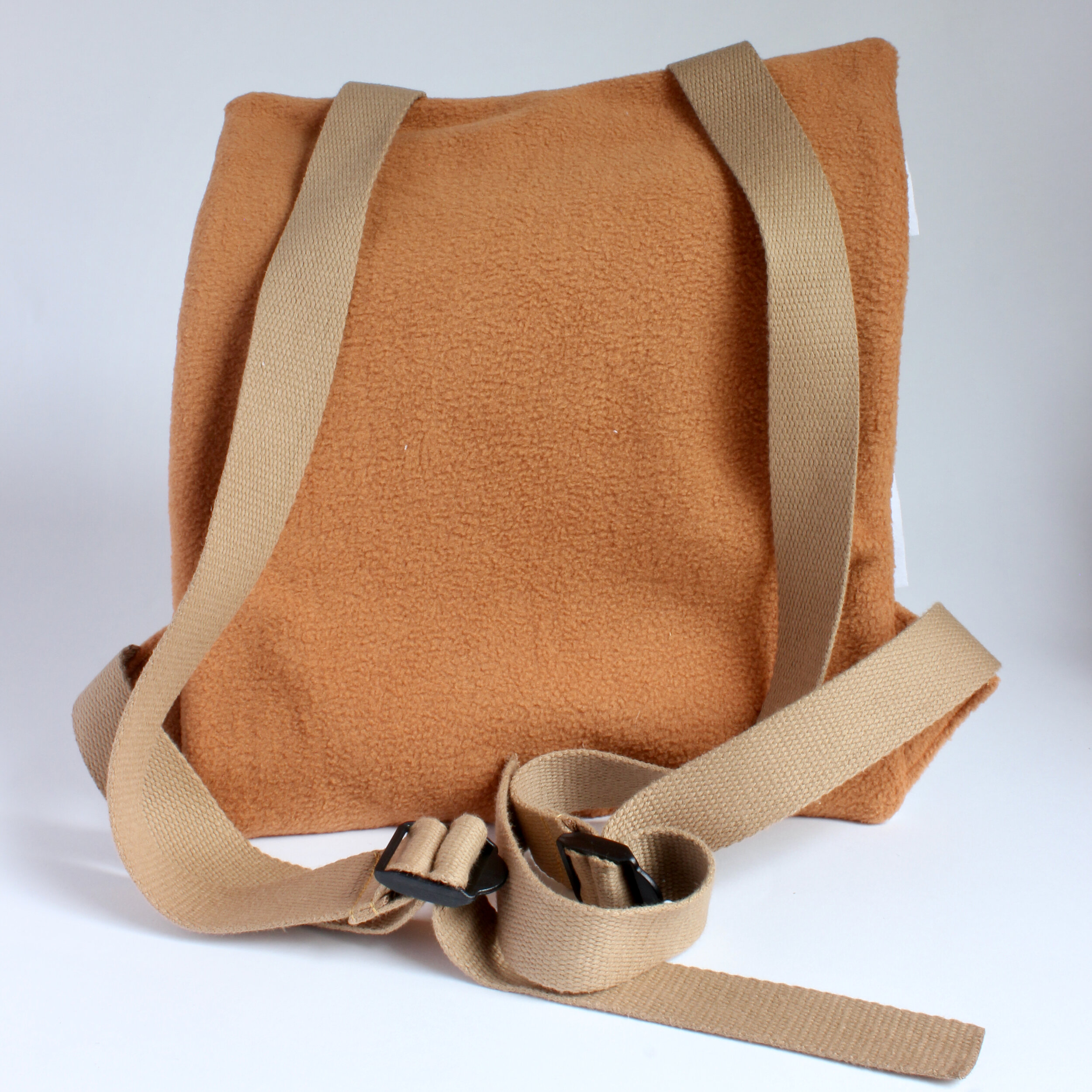
Printed fleece and fabric rucksacks, two pieces
Overview
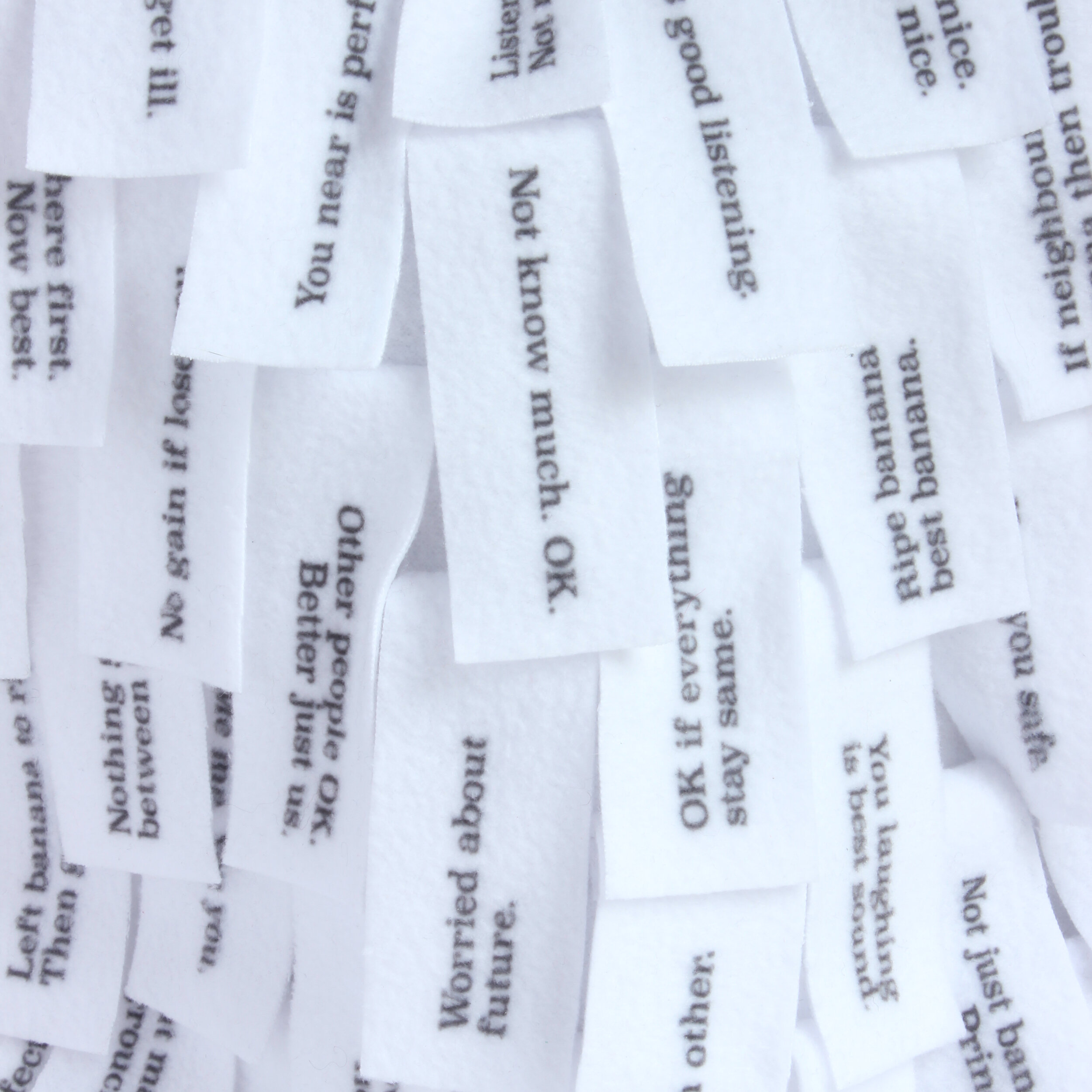
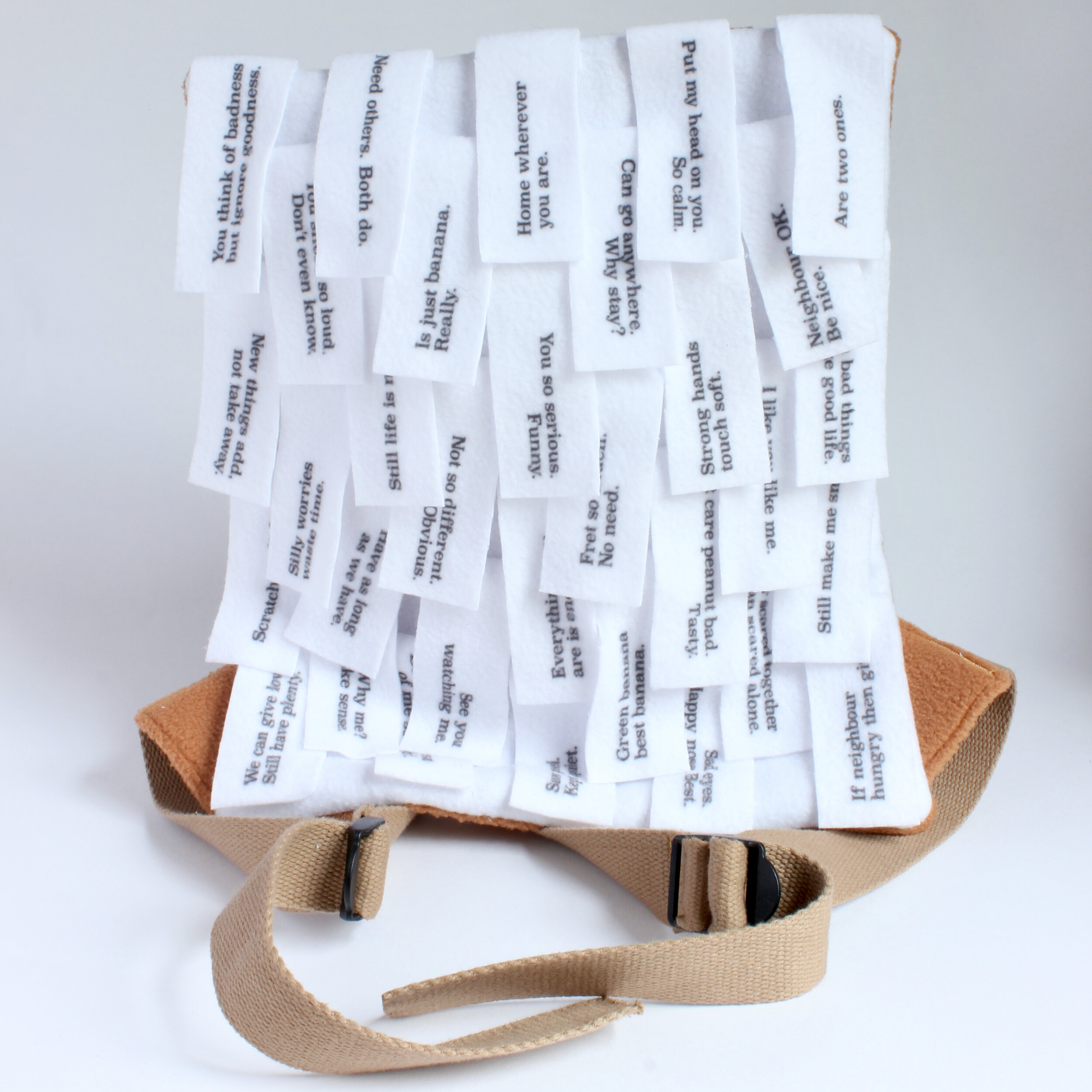
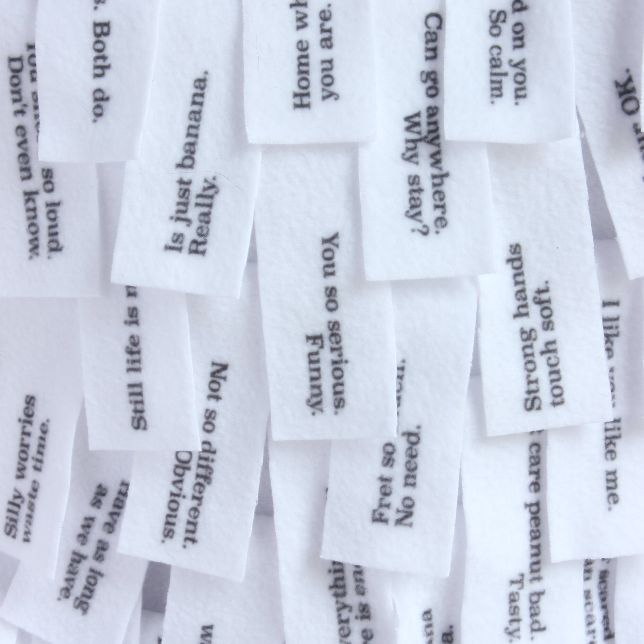
Primates is a set of two volumes, intended to created a shared reading experience. The pieces are worn on the readers' backs, meaning each has to read to the other. The text is a fragmented narrative in two halves, from two perspectives, about the shared lives of the two protagonists and their differing perspectives thereof. The text is printed on fleecy fabric and the tactile experience of stroking, smoothing and preening the material is an inherent part of the book. This sensuous element, combined with the suggested position of the readers, creates a sense of closeness, care and intimacy.
Background
For a while now I've been wanting to do something that allowed the reader to get more hands on and really dig in to a text. I experimented with a few things, but these early prototypes were unsatisfying, as I didn't really have understanding of what I could and couldn’t do.
Two courses helped bring this project in to focus. The first was a five-week paper folding and pleating course at the Working Men's College, taught by Thomas Prendeville. This gave me a better understanding of what was possible and also deepened my appreciation for the hands-on feel of working with paper and card.
The second was Artists Books - Theory and Methods by Ben Denzer, taught online from the Center for Book Arts in Brooklyn, NY. In just two short sessions, Ben introduced the wide world of artist's books and explained a lot of the theory and practice involved in making them. The first week was this overview and we were briefed to come up with our own artist's book for the next session.
The vague notions of folds and tactility combined with the living situation we were experiencing during Coronavirus lockdown. My partner and I get on well for the most part, but each of us was the only person the other saw for several months at a time. Being in such close quarters for so long requires patience and kindness to be active practices.
The image of apes grooming each other struck me as an intimate act of caring. Reading books is usually a solitary act and adults seldom get the opportunity to read aloud to one another. I wanted to explore the idea of reading as a shared experience. I sketched out a rough idea of two backpacks with strands of words on them that each person would have to untangle and read to the other.


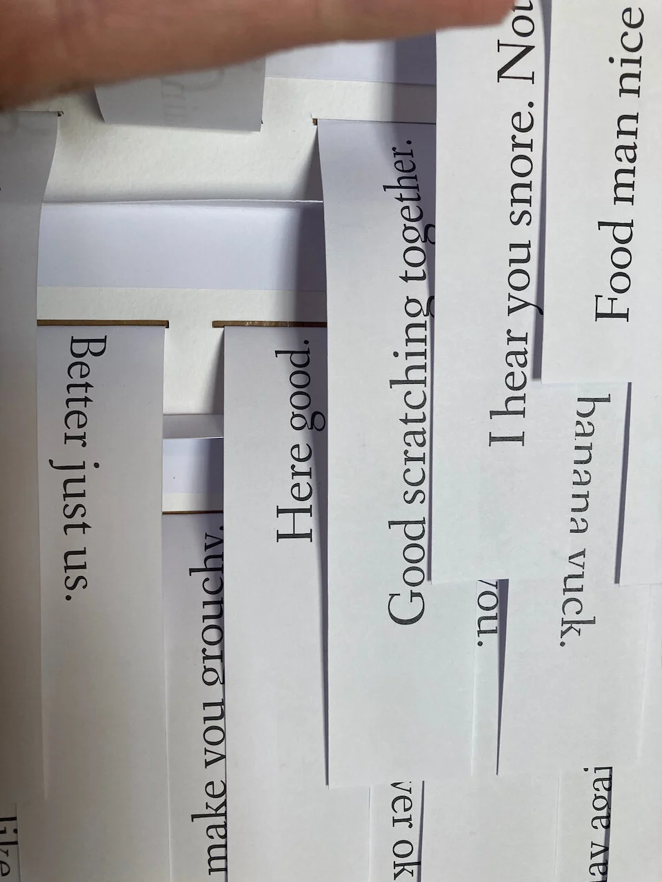

The first prototype took the entire week to make. While I had the physical form very much in my head, trying to find the right tone for the actual words was difficult. I knew that the writing would be piecemeal, that a reader would not necessarily read things in any particular order, or might skip some. This meant short sentences and I had a lot of difficulty making it feel genuine without it being pretentious and poetic. In the end, form and content combined and I turned the text into a simplified ape-speak that could still be read by humans. (I also added in an unnecessary amount of references to bananas.)

Test printing with felt and thermal transfer sheets.
Having made the prototype from paper and card, I looked into fabric printing options. T-shirt transfer sheets had a weird film on them and washproof markers were too fuzzy to read at the size I wanted. In the end I went with digital printing through a company called Contrado, who have a wide range of fabrics. After running through samples, I settled on polar fleece because it’s furry, feels nice and doesn’t fray.
Octavia was able to cut and assemble the printed pieces into these two wearable volumes.